The night before a client launch day always feels like Christmas Eve around here. So much intention, time, and effort goes into a brand and website design on both my end and my client's end, and it's a good thing I only work within 2 week timeframes because the anticipation to reveal the final product gets me every time.
But while you can look through my design portfolio and get a glimpse at the final designs, you might miss out on my favorite part of the entire project: the process. Because while it might seem like design only involves creating pretty things, there's much more intention and effort that goes on behind the scenes.
So today I'm giving you a behind-the-scenes look at the creative problem solving that took place behind my latest design project for Alex Estes with Prairie Letter Shop. The hand lettering, bright color palette, and fun illustrations make this project one of my favorites to date, and I'm excited to walk you through the design process!

1 | Inspiration Board
Inspiration boards are my starting place for every design project. Not only are they helpful to refer back to and gain ideas from throughout the entire process, they're helpful for making sure my client and I are on the same page visually.
In the client homework Alex filled out before the 2 weeks started, she used the words charming, warm, joyful, creative, detail-oriented, fresh, and light to describe Prairie Letter Shop (which, I've come to realize, are all words that describe her to a T). She also did a great job of pulling together inspirational images in a secret Pinterest board to give me a good idea of the colors and aesthetic she's normally drawn to (although after following along with her growing business and beautiful Instagram account for months, I had a pretty good idea already!).
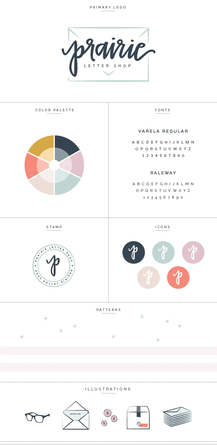
On the first day of the design process, I pulled photos from the inspiration board and began to develop a color scheme. To keep it fresh, light, and creative, I chose a bright color palette with a variety of colors: navy, minty blue, saffron, and coral. The pretty yellows lend to the joyful, warm feel, the peachy pinks and lilacs add a feminine touch to the brand, and the blues add freshness to the board.
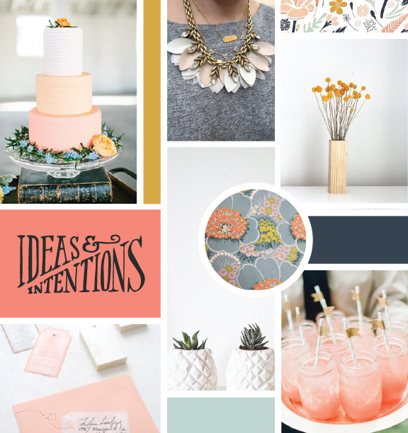
I also focused on the content within the images. The necklace, cake, and floral patterns add feminine touches, the illustrative patterns hand lettering add creativity and character, and the stationery, pineapple planters, and straw flags add a crafty, handmade element.
2 | Logo concepts
Once I received Alex's stamp of approval on the inspiration board, I pulled out my sketchbook to began to get my ideas on paper.
In all honesty, sketching used to be my least favorite part of the process; I couldn't seem to get past all of the imperfections. But sketching is an exploratory exercise, and I started to have more fun with it when I realized that there are no "wrong answers." While many of these ideas are never shown to the client, some of them transform into a new concept that I may not have come up with otherwise.
For example, the concept in the bottom righthand corner with the envelope started as a simple idea that I didn't expect to amount to much, but it ended up being one of my favorite concepts (it was also a fan-favorite among my Instagram followers and more importantly, my client).
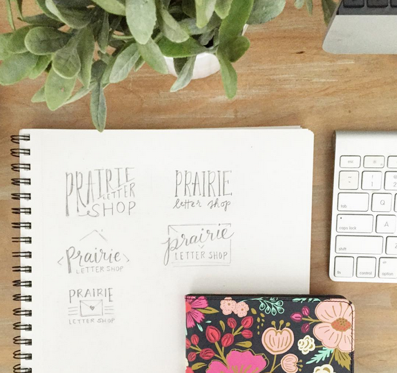
Once I came up with some solid ideas in my sketchbook, I took them into the computer to digitize them and add type and color.
This project was a little different than most because we wanted to use Alex's hand-lettering, so I mainly focused on the composition of the logo and opted for some fun fonts as placeholders.

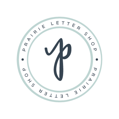
We both agreed that concept #3 was the strongest option, especially after we added Alex's fun lettering into the mix.

3 | Brand Elements
After the logo was finalized, I began to bring in other brand elements like fonts, icons, colors, patterns, and alternative logos.
4 | Collateral items and website
Creating a "system" with all of the brand elements makes the process for designing collateral items and the website much easier (and quicker).
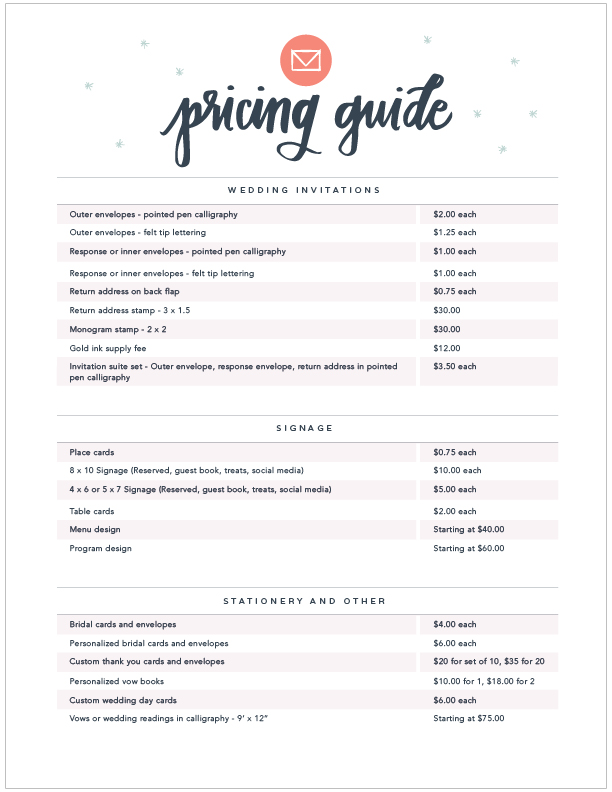
For Alex, I designed her pricing guide...

...a header for Etsy shop...


And we can't forget her pretty new website!
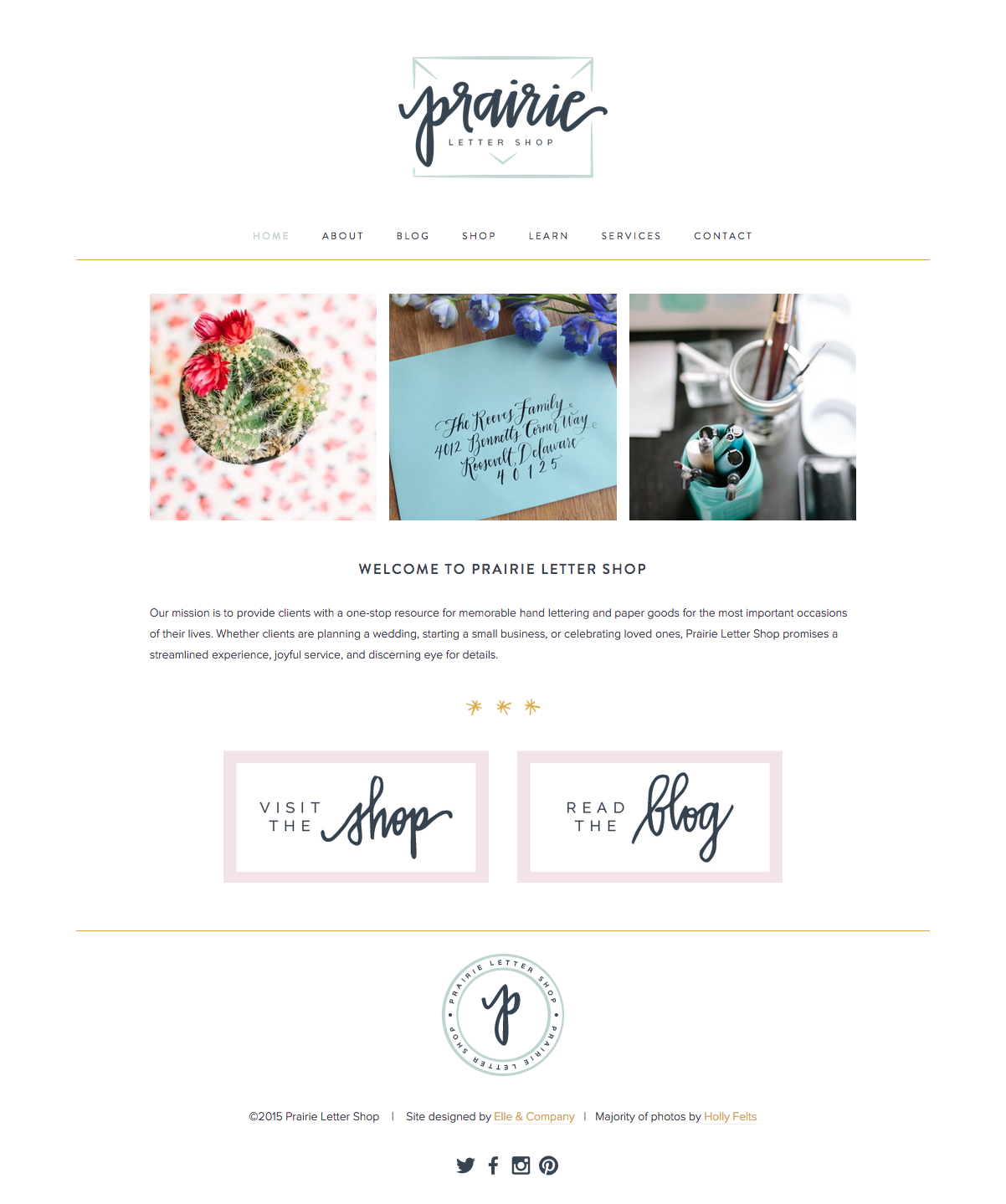
I was excited to use Alex's beautiful lettering throughout the website in headers and buttons, and those 3 little asterisks added a fun pop of color. I'm thrilled with how it all turned out!
Alex deserves a huge round of applause for all of her hard work and preparation for this project. She made my job so much easier with her thorough attention to detail, prompt feedback, and organized Google Docs with all of the photos and information in their proper place. Her work ethic and talent set her apart as it is, but Alex's charming disposition, creativity, and joy truly made this project one of my very favorites.
So if you aren't already, be sure to head on over to her new website and start following along with her!
And I would love to know: Which part of the design process is your favorite? What is your favorite aspect of Prairie Letter Shop's new brand?