

Have you ever been scrolling through Instagram or Pinterest, come across some gorgeous business graphics (hello, Rifle Paper Company!), and thought to yourself: “I could never do that. I just don’t have the design eye”?
While most people may be able to spot good design and bad design, few know exactly what makes some graphics more visually appealing than others.
And for that reason, they don’t think they have a “design eye.”
But designing eye-catching graphics isn’t a guessing game!
There’s 7 simple design fundamentals that can instantly make your work look more professional (even if you didn’t go to design school), and I’m sharing about them in this blog post!
Regardless of your design experience, you’ll be able to take these 7 rules of thumb and implement them the next time you’re sitting in front of Illustrator or Canva, frustrated by the vision in your head not coming to life on the screen.

Episode 13 Livestream Replay
Slides


Transcript
Lauren Hooker: Hello everyone, and welcome to this week's Ellechat on 7 simple ways to create better business graphics, that you can start implementing today for your business. I'm really excited to jump into that. It's been a couple weeks since we've had a live Ellechat, so I'm excited to be back, and to be sharing about this with you all. If you haven't already said hello in the comments, I would love to know where you're tuning in from. I also asked you, what your biggest struggle is, when it comes to creating graphics for your business? I think Shayla said her biggest struggle is that she doesn't always go by the rules, and her designs sometimes look chaotic. I think Sue, yeah it was Sue, who said that coming up with ideas is usually the hardest part. I can totally understand both of those, and I think that after these seven tips, hopefully, you'll be in a better position to do that.
Awesome, so I have good news for y'all. You don't have to have a design background, in order to create great graphics. I think a lot of people think that you have to have a design eye, or you have to have a design background. The truth is, is that some people, design comes easy for. They had that design eye. But it isn't because of some ... That doesn't mean that it isn't accessible to those of you who don't have the design eye. It just means that the design principles come naturally to them. But you can learn design principles, and implement design principles, to create great graphics for your business. I'm excited to share more about that with you today. Hopefully you'll walk away with seven new ideas, or seven guidelines, as you create graphics for your business.
Hi Sai, glad you're joining in. All right, with that being said, I want to show you around this window really quickly. Then I'm just going to dive right into the content. It looks like you found the comment section. Right below here is an ask a question section, so if you have a question about something that I'm sharing, and you want more details, or clarification, or something along those lines, feel free to ask a question there. I'll leave about 15, 20 minutes at the end, to answer as many questions as I can. Is always a fun aspect of these Ellechats. That's about it. No polls today, so I'm just going to go ahead and jump right in. Let me focus this screen, awesome.
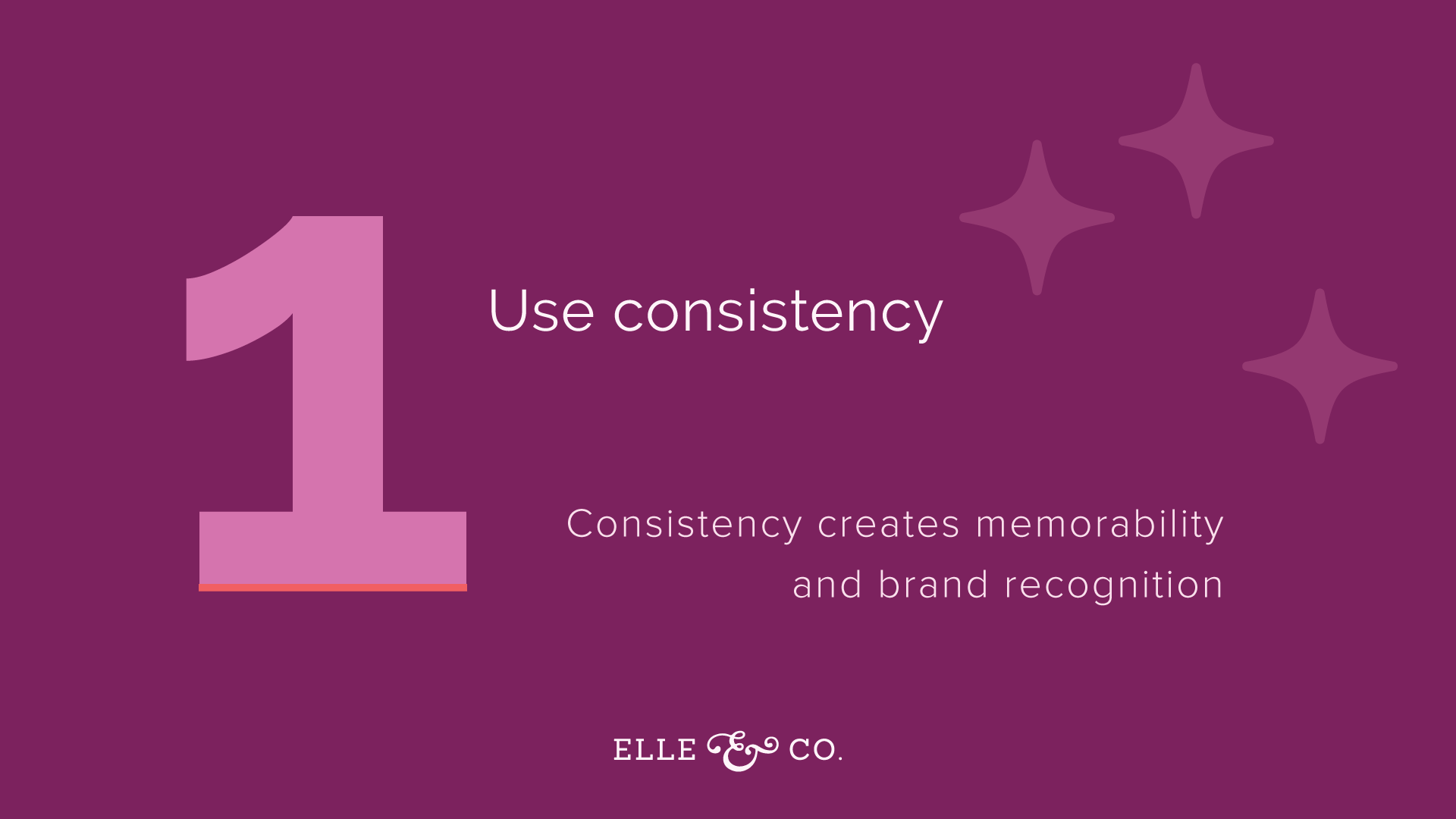
1 | Use consistency
This is the biggest design rule of thumb, and is consistency. The reason that you want to be consistent with all of your graphics, and all of the components of your graphics, is because you want to create brand recognition. You want people to be able to see a graphic, not even see your logo on the graphic, and know that it's coming from your business. That means using consistent colors, using consistent fonts, using consistent design elements like icons, and orders, and patterns. You want to be consistent, because you keep switching it up every single time, people won't be able to recognize your graphics. I think for creative business owners, this is especially hard, because we all have so many ideas. We get bored really easily, and we want to switch things up.
You might get bored with using the same colors and fonts, over and over again, but what you're doing is reinforcing your brand, and making it more memorable to people, so that hopefully, if they see one of your blog images, and they see it pop up on Pinterest, that they don't even have to see your logo in order for them to know it's from your business. So I would say to start off with using consistent colors. Do you have a color palette for your brand? If not, you should create one. You should create one that has primary colors, and [inaudible 00:04:43]. Even in branding this presentation for you guys, I created a color palette. I'm using purples and a pop of orange. I kept it really simple. My primary colors are this medium tone purpley color, and a dark purple. Then secondary colors are a pop of orange, there's some white, and then there's a lighter purple in there too. Just creating that color palette allows every single slide in this presentation to be consistent. It helps you understand that they all go together. The same should be true for your brand.
Create some primary brand colors, and some secondary brand colors, and stick to them. You might even notice that for the Elle & Company brand, I use a bunch of different colors. But my primary brand colors are the black of my logo, and a lighter blue, that's seen in the links and buttons on my website. Then you see a lot of leeway with secondary colors. But it's consistent over, and over again in the color pairings that you use. So stick to your color palette, and that will create brand recognition.
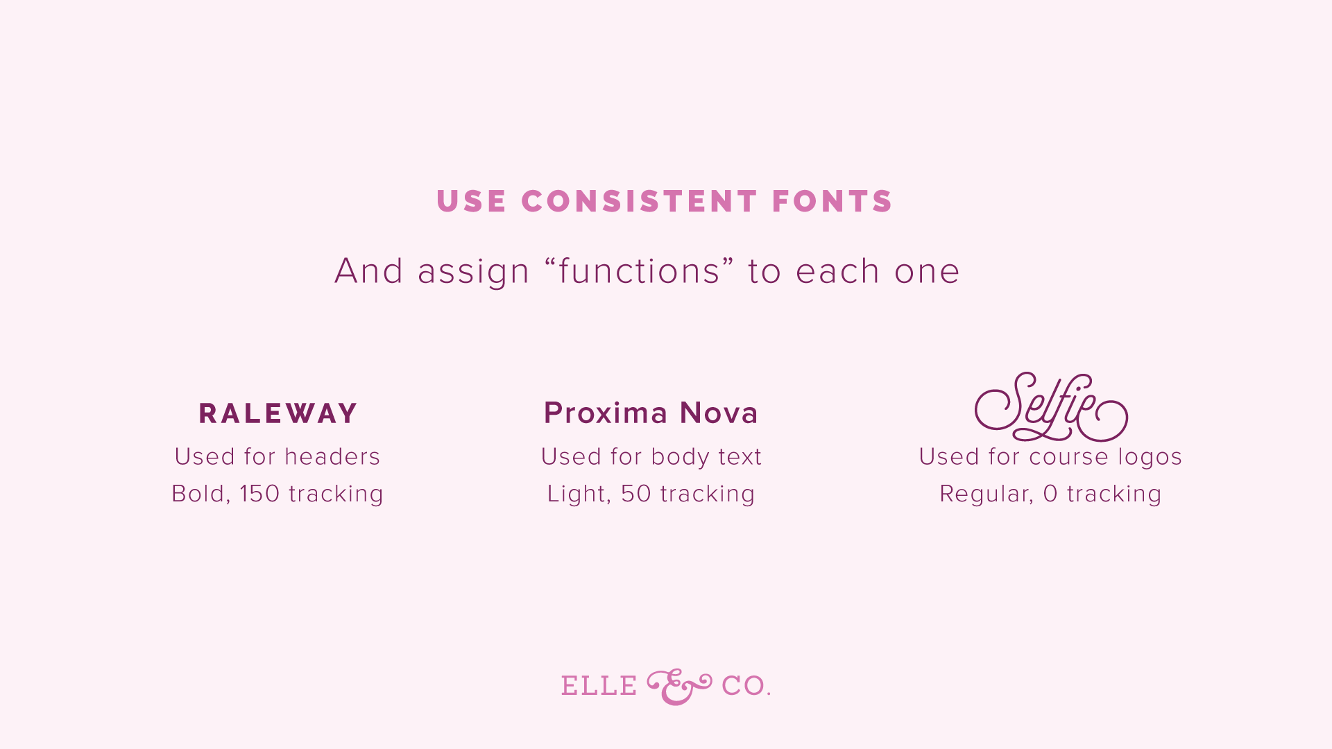
Same goes for fonts. I would encourage you to assign functions to each one of your fonts. For example, I use the Raleway fonts for all of my headers, on both the website, and in any graphics that I create for Elle & Company. Even in this presentation, the header font is Raleway. I usually use bold for it. The tracking, the amount of space between each one of the characters is usually set to 150. That is the same across the board, for every presentation, for every graphic on social media, even in the Instagram story graphics. I keep it the same. I want to use that consistency. For body text, I use Proxima Nova. I usually use a light version of it, with about 50 point tracking in between my characters. Then for course logos, and really special instances, I use the Selfie font. I don't use a bold Selfie, or a light one. It's just regular, and I don't put any space in between the characters, because it's more of a hand-lettered font.
The same should be true with your brand. Use consistent fonts, and assign them functions. Say, "This is the font I'm going to use for headers. This is the font I'm going to use for body text. This is the font I'm going to use once in a blue moon for a specific logo, like a logo for a course, or maybe one of your offerings, or something like that. I also, this is just a branding rule of thumb, I usually don't use my logo fonts for clients, or for Elle & Company, anywhere else on the website, or throughout the brand. It's specific to the logo, unless it's the tagline font, or something like that. So use consistent fonts, assign them functions, and use them over and over again. You might feel bored with them, but again, you'll create brand recognition, and allow people to remember your brand, so that when they spot it, they associate it with your business right away.
Then also, use consistent design elements. This look like the same patterns, icons, borders, the same even style, for your icons, or patterns, or borders. Again, you want people to be able to see it, and know immediately that it comes from your business. So a great way to do this, I know that Canva has some icons. In the Elle & Company library, I have an icon set in there that you can customize for your business. There's a lot of different ways that you can create design elements like this. But just be mindful of it, and use the same ones over and over again.
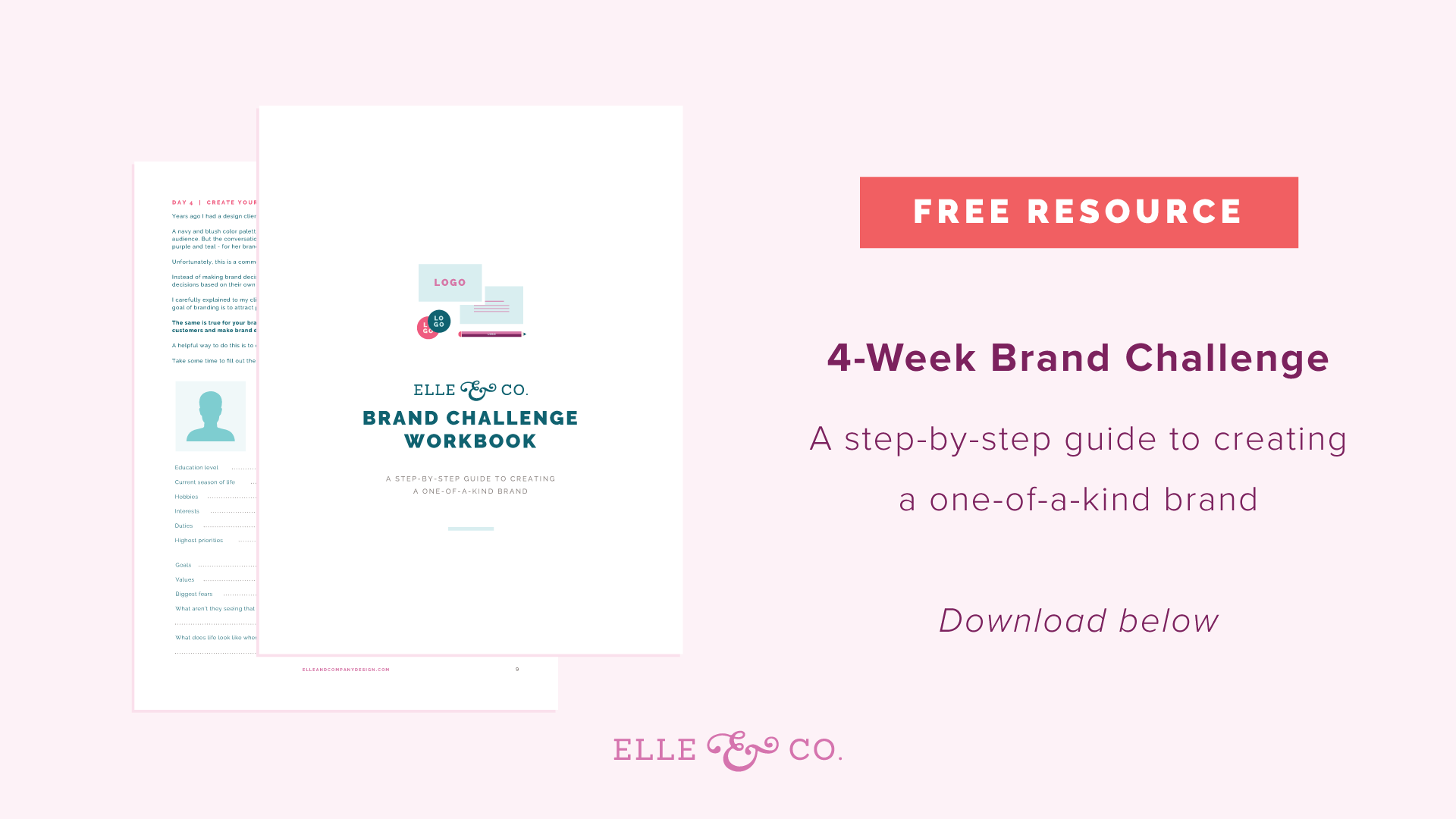
A great starting place, if you're having trouble with consistency, if you feel like your brand isn't really nailed down, that you don't have specific colors and fonts, and you haven't outlined those brand standards, a great place to start is my four week brand challenge. Last year, and I forgot to put a call to action, but I'll include the link in both the show notes, and in the comment section, but I actually created an E-book, and a workbook to help you. This four week brand challenge actually took place a year ago in February.
I made it so that you had one action step for each weekday, so just Monday through Friday, one action step to complete. Very manageable and doable. You can work through it, and create a full brand from start to finish, in under a month. That's a free resource for you. I had a lot of people use it, and really enjoy it, and walk away from it with a one-of-a-kind brand. So if you're having trouble with that, feel free to take advantage of that brand challenge, and the free resources in that, both the E-book, and the workbook. You can go to elleandcompanydesign.com/brand-challenge and I linked to that in the comment section for y'all. Has anybody, who has tuned in live, taken the brand challenge, or gone through it? I'd love to hear from y'all, if you haven't already. So the first thing that I recommend is consistency. If you're having trouble with your graphics, use those same design elements over, and over, and over again.
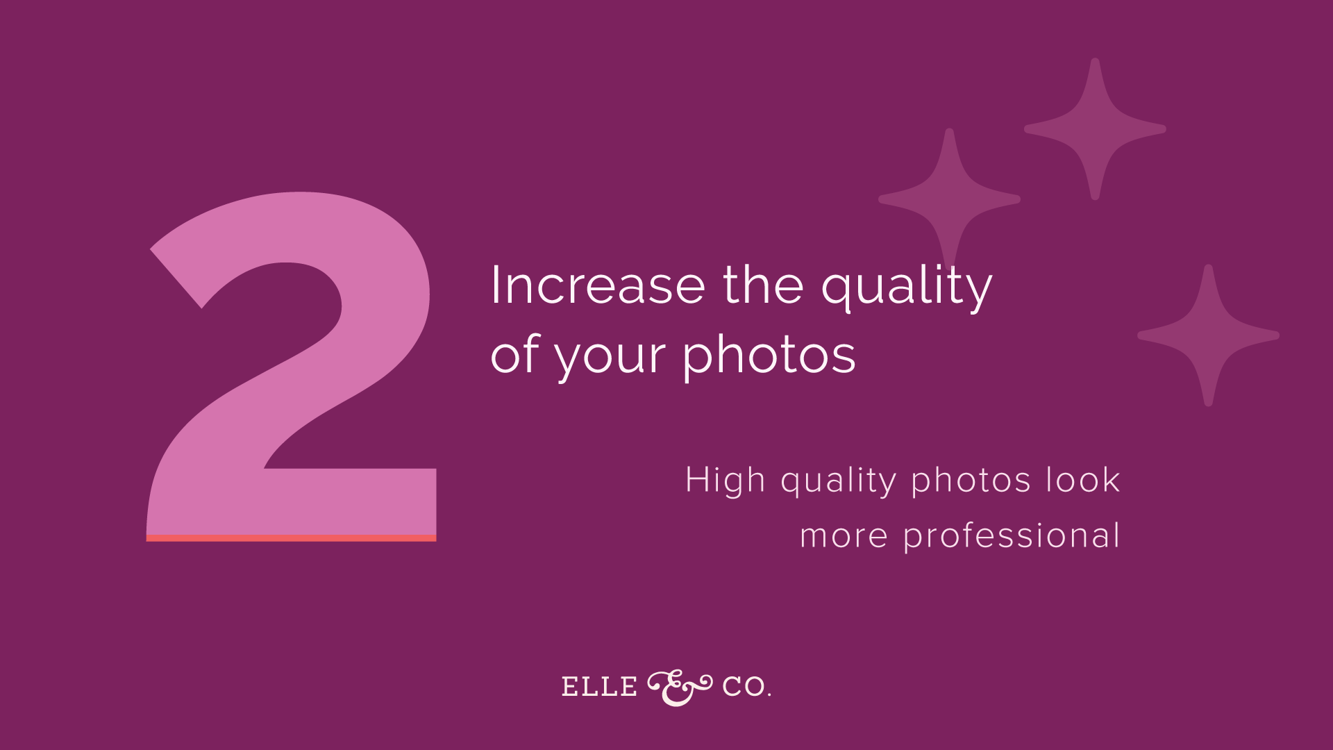
2 | Increase the quality of your photos
By taking better photos, your brand, and your graphics will thousand times more professional. I think this all the time with my clients. But I can create a beautiful brand from the graphics perspective, with logos, and fonts, and all that side of it, but if there aren't great photos to accompany those brand graphics, then it will fall short. I am not a professional photographer, but I have, over the years, learned a few things to bump up the quality of the photos for my own brand.
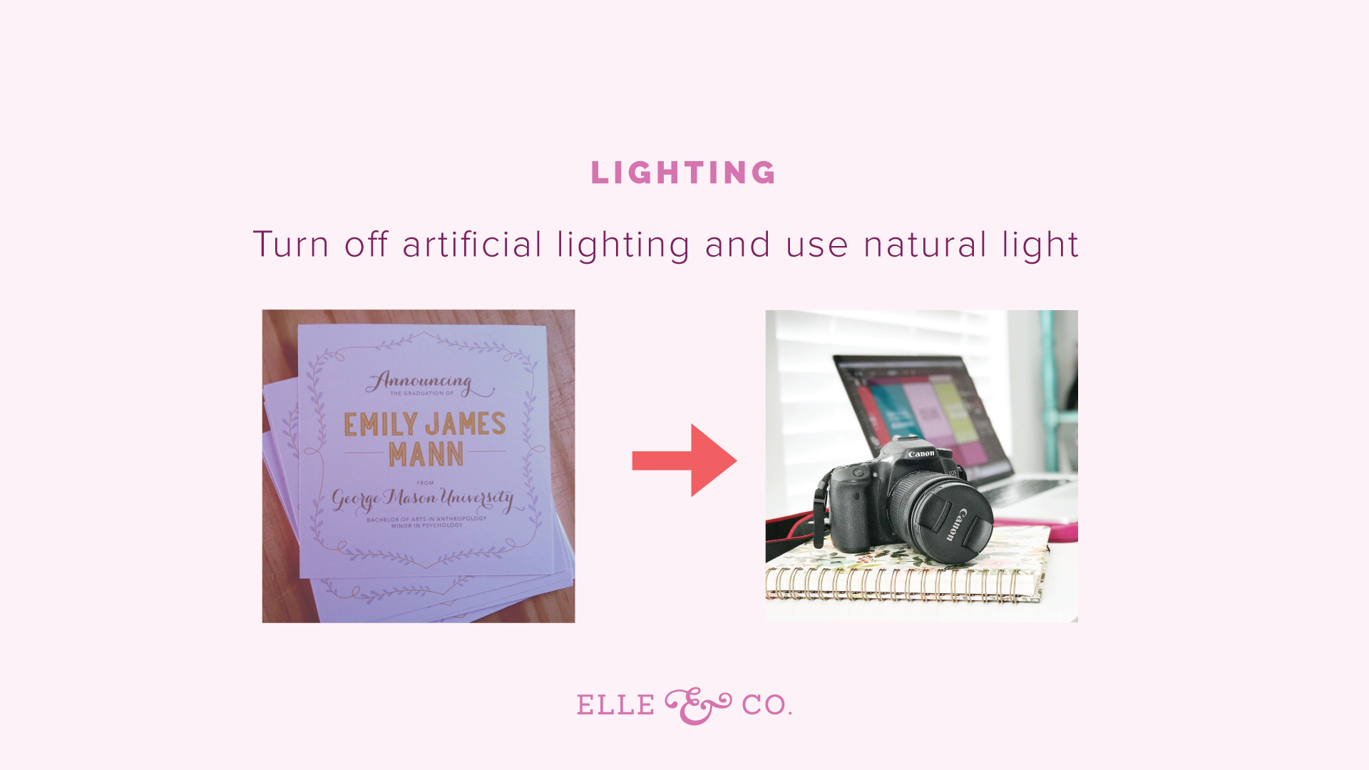
The first is to turn off all artificial lighting, like lamps, overhead lighting, and use natural light. The reason for this, well a couple of reasons, one is that artificial lighting usually has a tint to it. If you have a lamp, for example, if might give off this yellowy light, than can interfere with your photos, especially your brand doesn't have those yellowy, warm tints to it. The second thing is that it has competing shadows. If you're just positioning the object of your photo near one window, the light is coming in from one source, and so you aren't having all of these competing shadows. Something as simple as turning on artificial lighting, using that natural light, position things by window, if you can, can make your photos look so much nicer, and so much more professional.
This photo on the right, of the camera, was taken by my iPhone. iPhones take great photos as well, so just by positioning it near a window, you can make your photos look so much better. If you have a full-time job, and you're trying to create business graphics on the side, and you're not home very much when it's light outside, especially in the winter, I would suggest taking a bunch of photos on the weekend, just all at once. Maybe if it's for your website, if it's for social media graphics, whatever it might be, stock up. Have a mini photo shoot, and stock up on images. When it comes to taking the photo, focus on lighting.
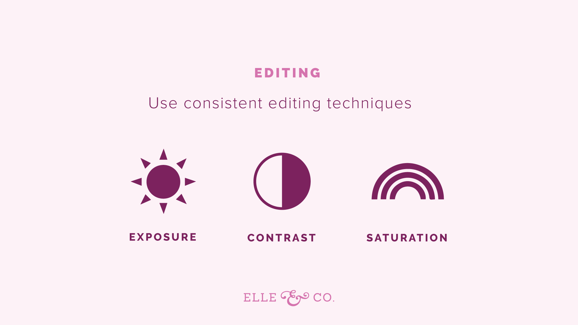
Also, use consistent editing techniques. If you are increasing the exposure, and maybe bumping up the contrast and saturation a little bit on one photo, keep that consistent across all of your photos, so that they all look cohesive. I usually edit my photos, if I take them with my iPhone, and I'm sharing them on social media, I like to edit them with the VSCO app, V-S-C-O. I also just use the editing options right inside of Instagram most times. But VSCO is a great one for editing. Then, if I'm taking them on my DSLR, I usually edit them in Lightroom too. But just use consistent editing techniques. If you aren't editing your photos, something like bumping up the exposure just a tad can go a long way with your images.
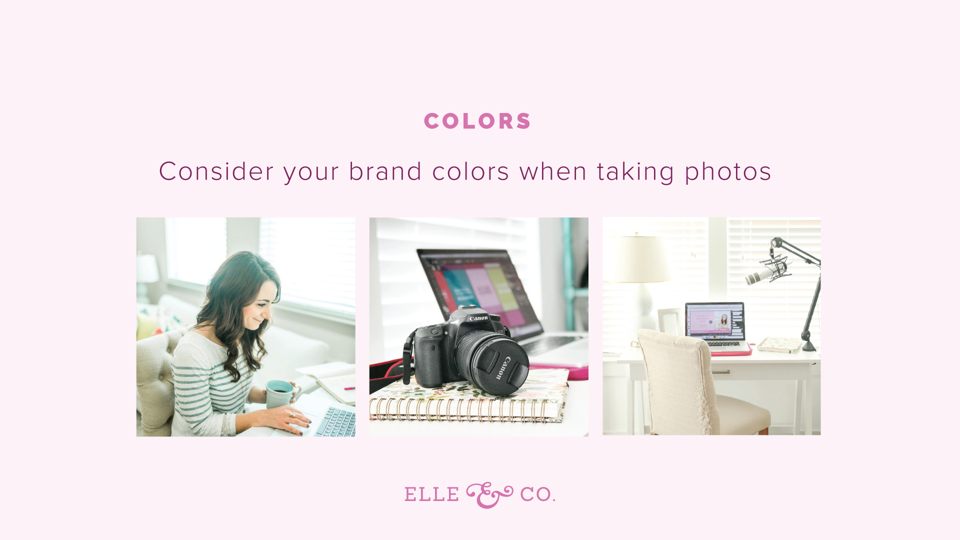
Then the third thing is colors. Consider your brand colors when you're taking photos for your website, and for graphics that you're going to use for promo graphics, or social media. Think about your color palette. Think about that color palette that you outlined for your brand, that I just talked about, those consistent colors. Try to have those consistent colors in your images. It's not going to work 100% of the time. There might be a photo that's a little bit off, but this can really increase the quality of your photos, and reinforce your brand. So if you are looking for a light and airy brand, with pops of color, similar to the Elle & Company brand, then you might want to bump up the exposure, and bump up saturation just a tad. Go for white muted backgrounds, with pops of color in your subject matter. But really think through what your visual style for your photos is going to look like. Is it going to be a little bit more moody? Do you want to be mainly black and white? What do you want to look like? How does it fit your brand?
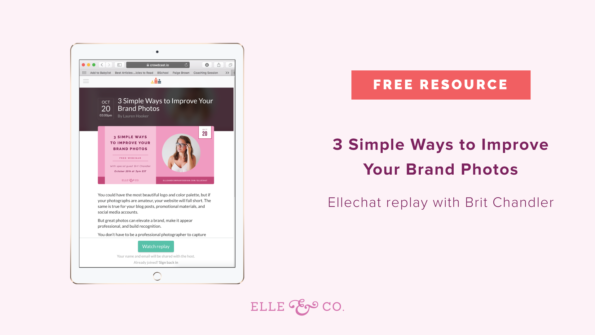
Actually, the Elle & Company brand challenge that I just talked about, walks you through your photo style too. But just simple ways to enhance your photos, and make it more high quality is lighting, editing, and colors. Keep track of the colors you're using. Gina says the Color Story app. I think that's through A Beautiful Mess, which is a great website. They have editing steps. Yes, thank you for mentioning that Gina. If y'all have other great photo resources, and apps, feel free to mention them in the comment section. I would love to hear them as well. Another free resource, this is actually one of the most popular Ellechat replays, is this Elle & Company Replay with Brit Chandler, on Three Simple Ways to Improve Your Brand Photos. If you haven't seen that already, and you're struggling with your photos, feel free to check that out. I'm going to drop that link in the comments as well, and included it in the show notes for this episode. That's a great one to refer back to as well.
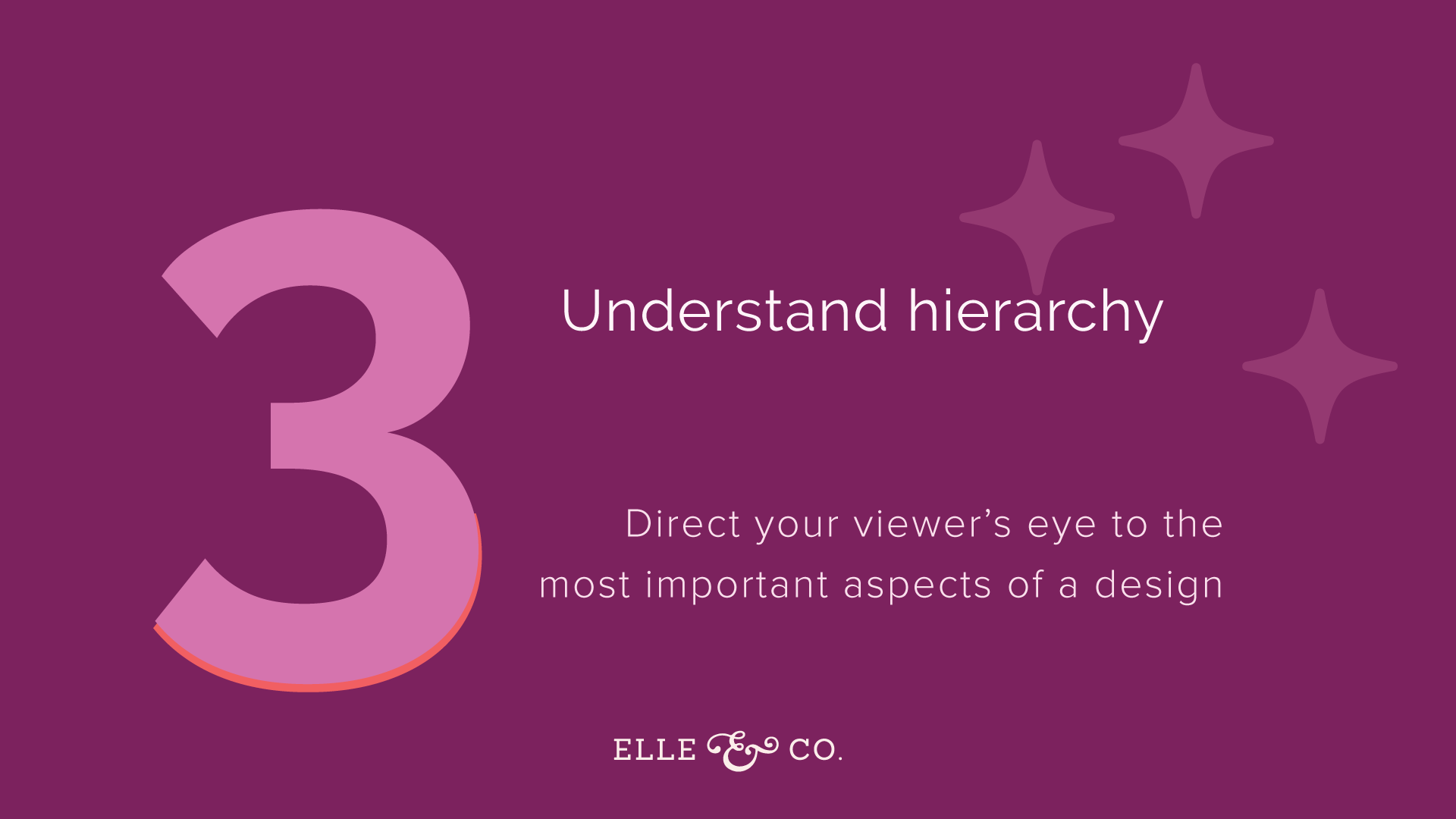
3 | Understand hierarchy
Hierarchy is a term used to explain the ranking of elements in a design. Your brain, when you are looking at an image, will rank the elements of that image, in order of importance. For example, for those of you who are tuning in live, and looking at the slides as I go along, the very first thing that you probably saw for this slide was the number three, because it's large, it's a different color, there's more emphasis on it. Your brain probably ranked that at the element with the highest importance, and so your eye went there first. Then it probably went to the header, which is understand hierarchy, and so on. So without even realizing it, even if you have no design background, your brain is ranking elements of design, in order or importance.
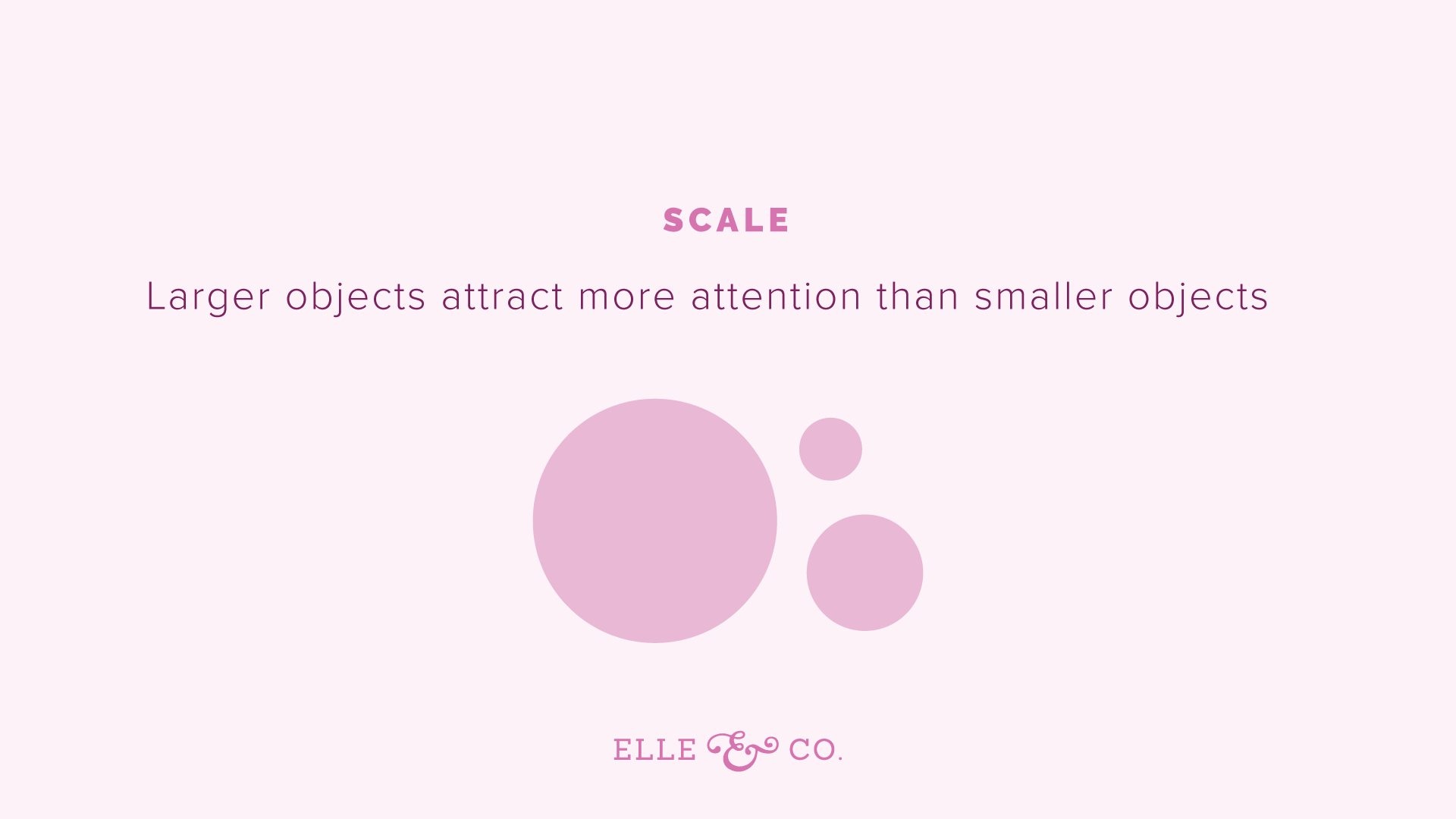
You can, I don't like using the word manipulate, but you can use certain design principles to guide people's eyes around your image, and point out the most important aspects. For example, the first rule for hierarchy, or the first way you can use hierarchy in your design, to draw your eye a specific design element, is through scale, size. Larger objects are going to attract more attention than small objects. So as you're creating a design, think about that. What needs to be the biggest thing? What are you trying to call the most importance to? Where you want to draw their eye first? The second element would be color. Our eyes are immediately drawn to bold pops of color. On this slide, I have a lot of purple, and I have three purple circles. But the smallest circle is orange. So I guess two purple circles. There are three circles. One of them is orange, and your eye goes immediately to that bold pop of color. That's using hierarchy to guide your eye around this slide.
You can do it by scale, you can do it by color. Some other ones are proximity, and alignment. There's actually, I think, five that I've listed in a blog post that I'll link to in just a second. But understanding hierarchy, and thinking about, "Okay, what is the most important element?" Usually something like a photo is going to call the most attention. Then you probably want their eyes to go to a header. Then the details can be in a smaller font. Then calls to action usually need to be a bright pop of color. You want people to see that very quickly.
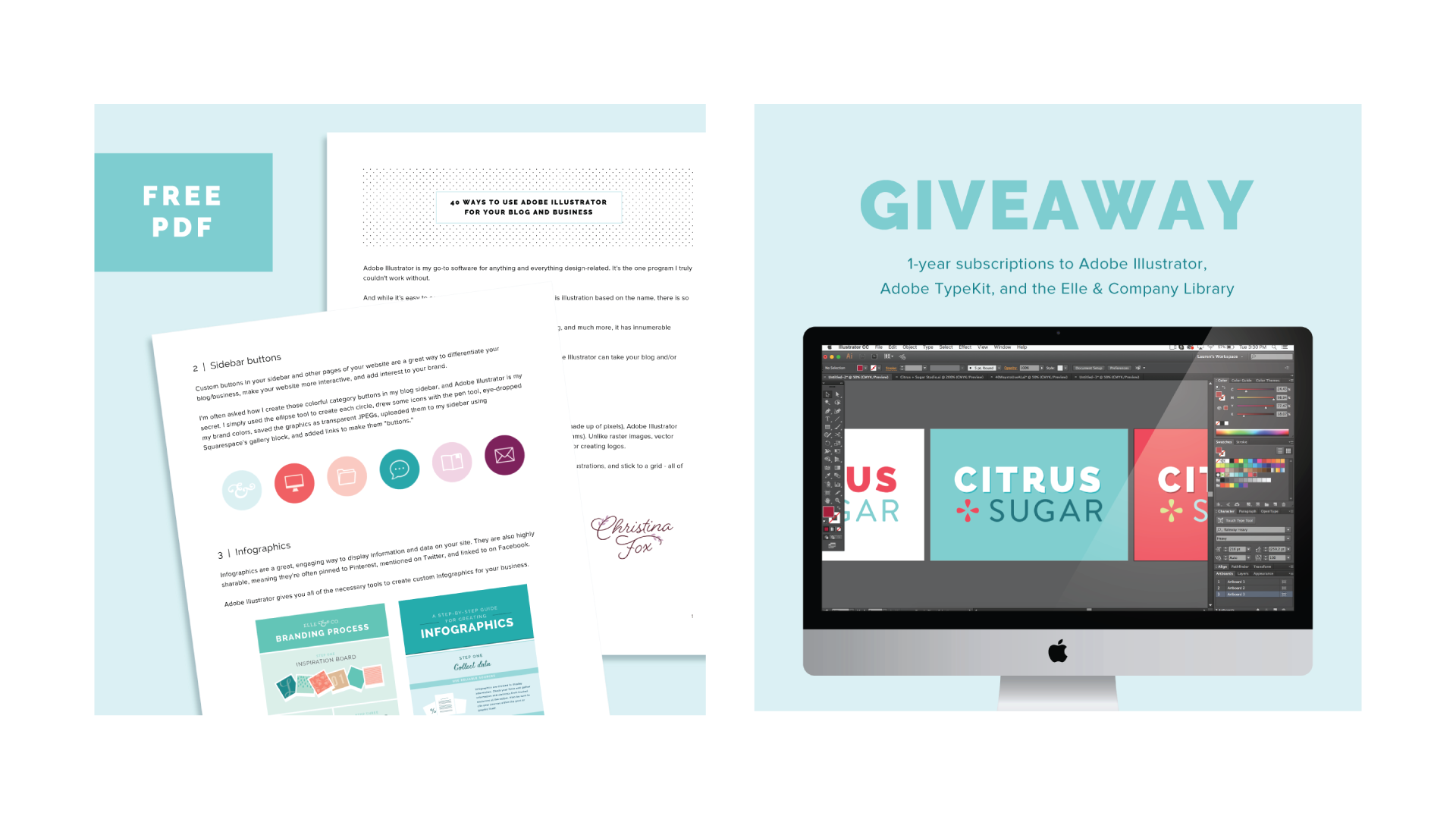
For example, those of you who are listening to the podcast episode of this later won't be able to see this well, but you can always hop back over to the blog to see the slides, or catch the replay. But as I was creating promo graphics for my Adobe Illustrator course that launched a couple of weeks ago, I wanted to utilize hierarchy. I have two images here. One was for the Adobe Illustrator Give away, and another was for a free PDF. It was a content upgrade, leading up to the launch. They're really simple. The biggest things that your eyes are drawn to right away are the images. I have some mock-up images of the PDF. Then you see a box where it says free PDF, because there's just this pop of color there. Then the background, really simple.
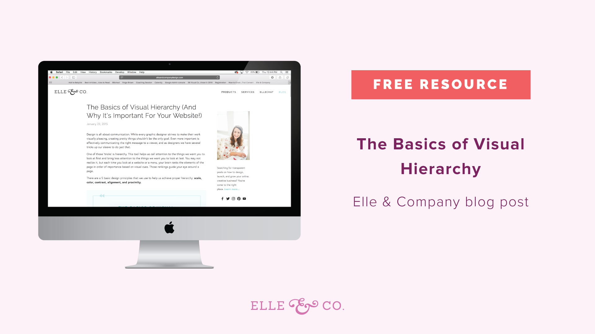
Same thing with the giveaway graphic. Your eye is immediately going to go to the computer graphic, that mock-up image. Then it's going to go to the header, which is bigger than the smaller font there, with more of the details. So think about that as you're creating your designs. Think about hierarchy. The more and more that you are intentional with hierarchy, the more it will just become second nature to you, as you are creating graphics. Maybe you were already doing this, because it is very straightforward, but you just didn't realize it. But hierarchy is an awesome tool to use. If you aren't thinking about it intentionally already, start thinking about what you want your viewer to see first when you're creating graphics. Again, another free resource that I'm going to link to the blog post, in the comment section, it's just the basics of visual hierarchy. There's even an info graphic there for you, that you can take a look at. It goes over five tools that you can use for hierarchy, so be sure to check that out.
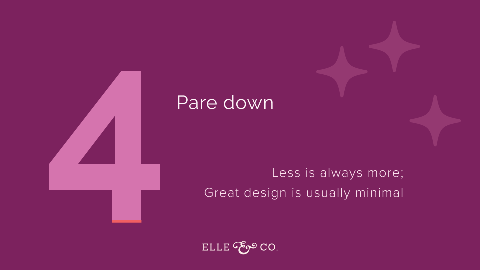
4 | Pare down
A lot of times, and I think it was Shayla who mentioned this before we dove in, you have a hard time adding too much onto the design. I think a lot of times it's easy to over design. One of the things you have to learn to do is take away from the design. Less is always going to be more. If you look at great designs out there, they're usually very minimal, because the designer has thought about what the most important aspect of the design is. They draw your eye there, and they get rid of all the other things that are going to be distractions. So pare down.
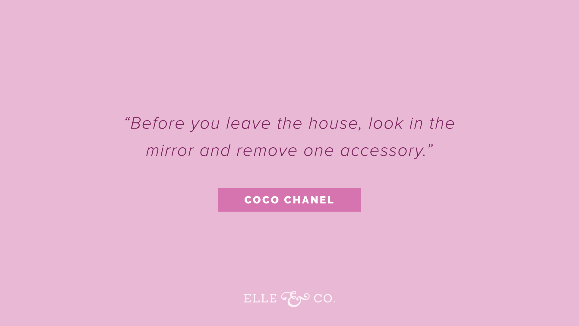
I loved this quote. I'd heard it a long time ago. It's actually a Coco Chanel quote. It's referring to jewelry, the same principal, "Before you leave the house, look in the mirror, and remove one accessory," because we tend to go overboard. Simple is usually best. Apply that same rule to design, when you're creating graphics for your business. Look in the mirror, and remove one accessory. Or look at what you've designed, and remove something that isn't necessary, because often we'll add a border, and we'll add all these lines that don't need to be there, and maybe even a background that's a little faded out. All of these things that aren't necessary.
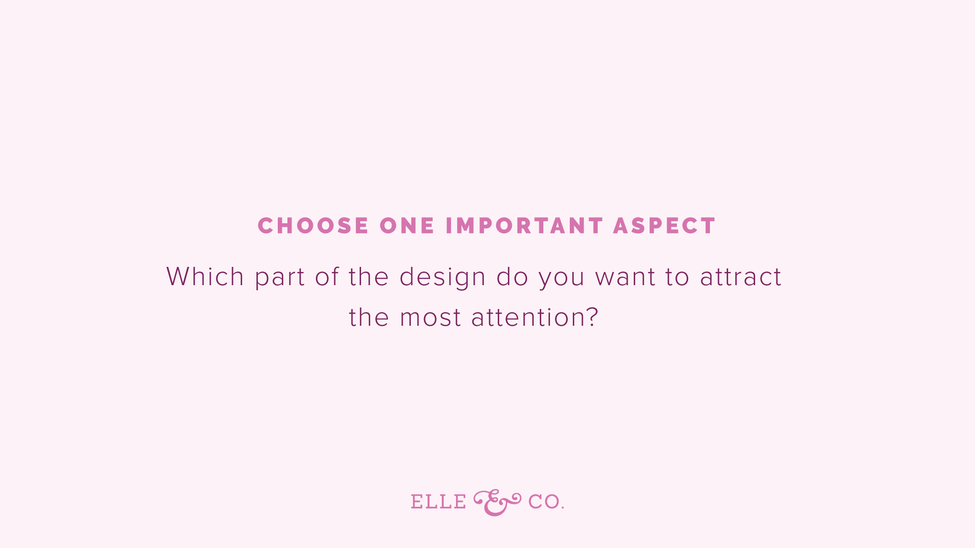
A couple rules of thumb when it comes to paring down, is to chose one important aspect. It goes back to hierarchy, like we were talking about a moment ago. Consider which part of the design you want to attract the most attention to. Start with that one thing. It's just like with logo design. People tend to over design when it comes to logos, and try to add every cool aspect in there. Really, you just want one memorable aspect of a logo design. One memorable thing, get rid of the rest. Same applies to business graphics, or whatever graphic you're creating. You want one thing to stand out. Then the rest to just complement, or enhance that one important aspect. So think of that first.
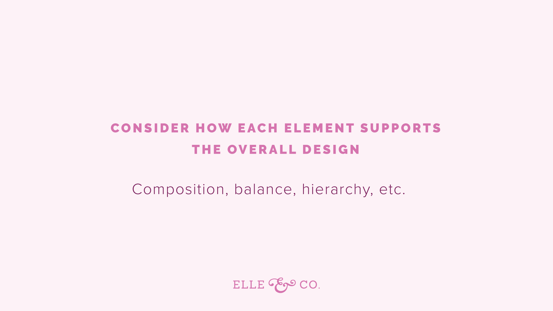
Second, consider how each element is going to support that overall design. Is it going to add balance to it? Is it going to add to the hierarchy? For example, just going back to these header slides, number four is the main thing that I want you to look at, and so it's a different color, and it's really big. The second thing I want you to look at is this header for paring down. The third thing is probably these little, what should I call them, sparkle icons, that are just a shade lighter than the background, not because too much attention to it. Then there's these little taglines, "Less is always more. Great design is usually minimal." So thinking about the one thing that I want to stand out, the detail that have to be on there, that need to be on there, and considering how each one adds to the design, and enhances it.
Now I could have put a border around here, and I could've put a border on the bottom. I could have added more graphics. Or I could've added a photo behind it. All of that is totally unnecessary. It doesn't add to the design, and so I can take those away, and just have the bare minimum there, and it's simple. It guides your eye exactly where I want it to, hopefully. Hopefully you saw the number four first. So consider how each element will support that main design element. Then if you can't take anything else away from the design, you know that you can't take away the header, you know you can't take away the details that need to be mentioned, then you're probably had a great stopping point, so consider that. Follow that Coco Chanel rule. Look in the mirror, and remove one accessory before you leave the house. Same goes for your brand graphics, or business graphics. Look at what you've created, and before you save it, or share it, take away one thing. Less is more.
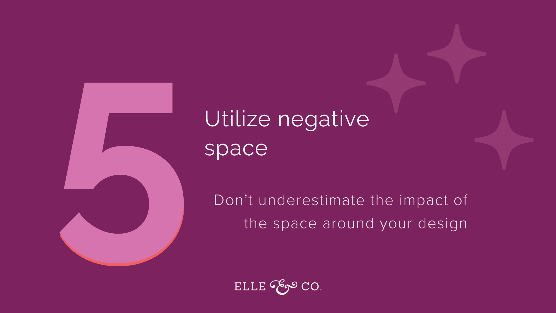
5 | Utilize negative space
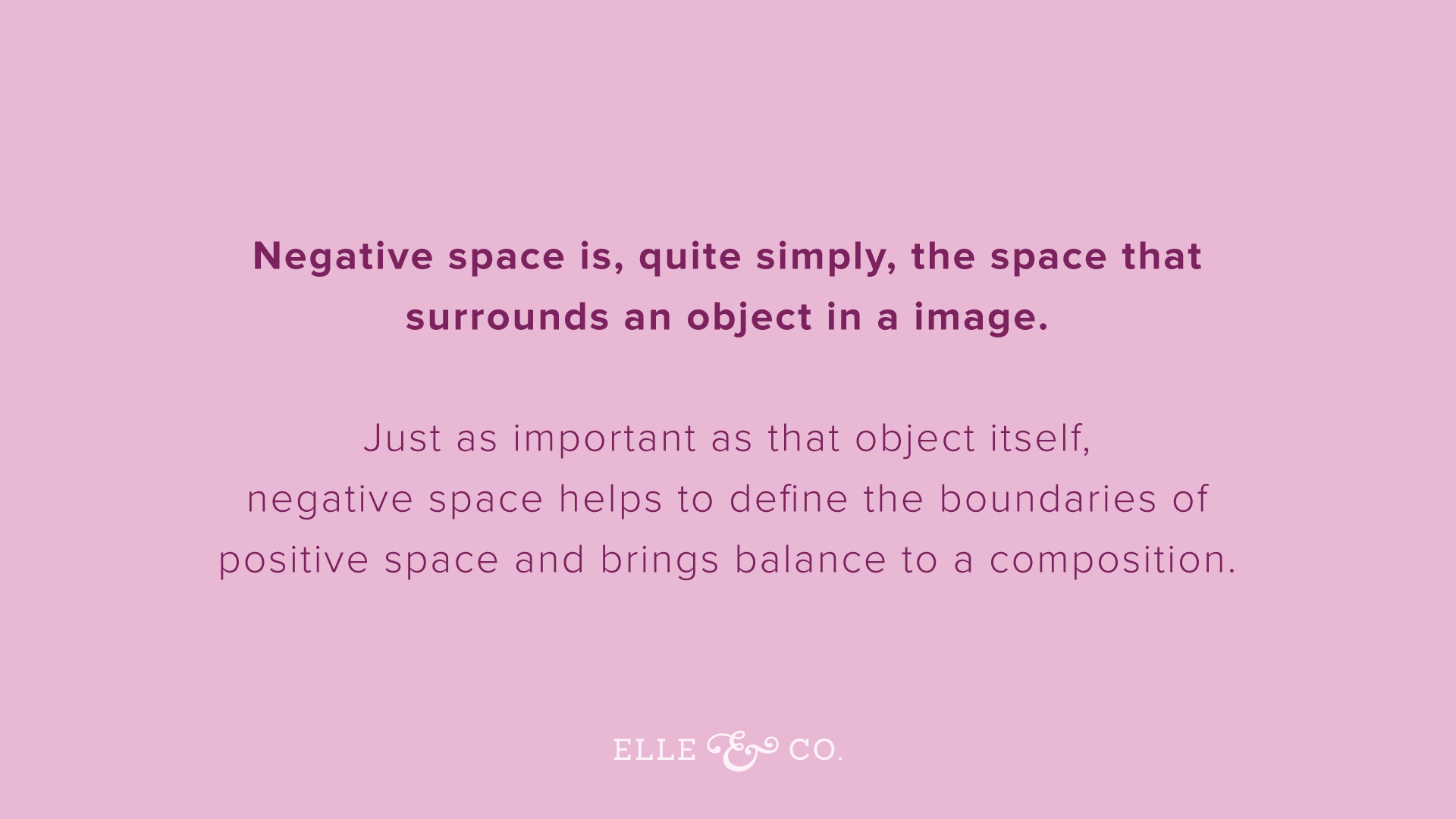
I think a lot of times we focus on the subject matter of the design; the text you're going to use, the background color, any other design elements that you're adding to the page. That it's easy to forget the negative space all around your subject matter. So, for those of you who are confused as to what negative space is, it's just the space that surrounds an object in an image. Usually it's the background of an image, and is just as important as the object itself, because it's helped define the boundaries of the positive space. It really brings balance to the entire composition.
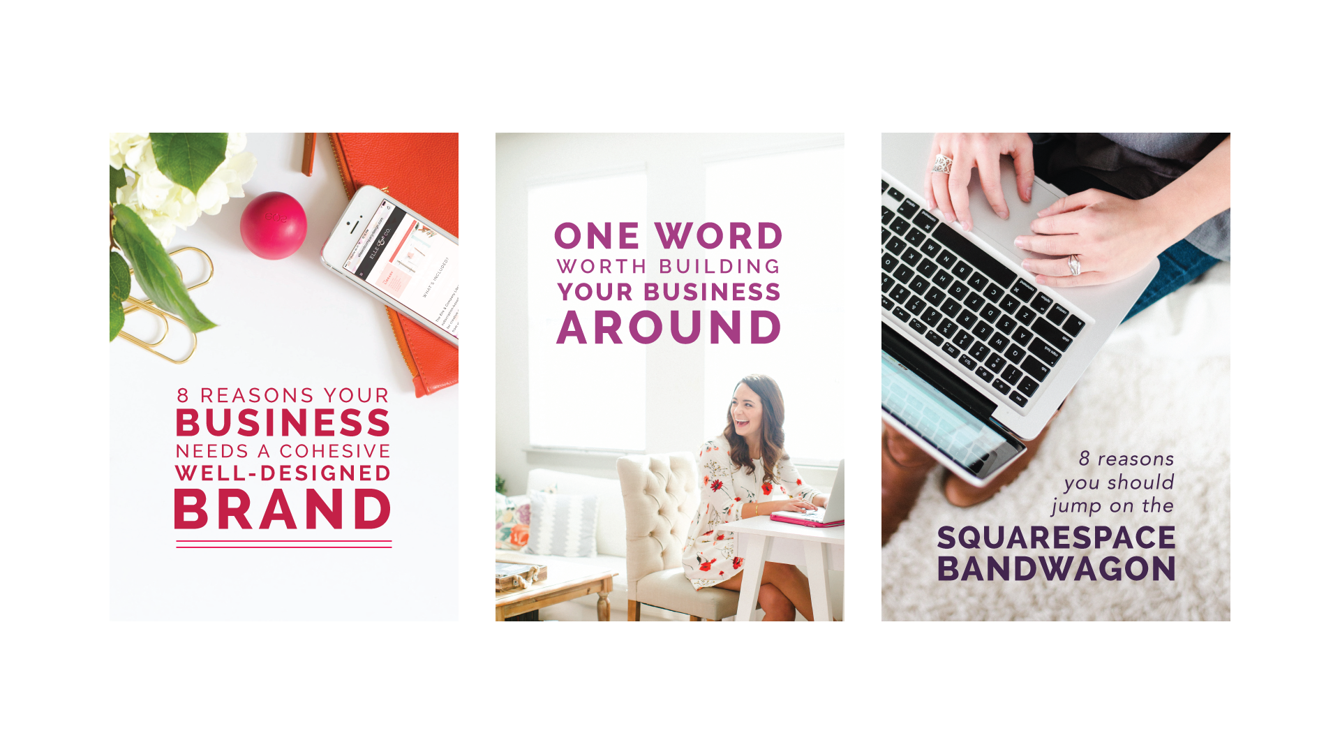
Think about the negative space. A lot of times, I tried to encourage people to do this when it comes to their photography. If you want to use graphics where you have an image, and then text overtop of that image, like blog post graphics, promo graphics, then it's really helpful to have some negative space. For example, these are some blog posts graphics. They're actually pretty old, from the Elle & Company blog. But people loved them. The reason why they were effective, was because they had negative space within the photo. There was a place for your eye to rest. There was a background. Then I put the title blog post in that negative space. A lot of people want to use photos, and then they put a white square on top of the photo, and then the text inside of the photo. That's okay, but, you're graphics are going to look a whole lot more professional and thought through, and intentional, if you are utilizing negative space.
When you're taking photos, if you have somebody taking photos for you, ask them to take some photos with some good negative space in there, so that you can add text over top of it. If you look at this image right here to the left, this blog post image that says eight reasons your business needs a cohesive, well designed brand, there's just that white desk background there, that I could layer the text on top of. It looks like the photo was taken specifically for this blog post image. It's because of the negative space.
What I actually had a photographer do, I didn't take that photo, this was years ago, probably four years ago now, three or three, and she had a white desk, and she put all of these desk accessories around the perimeter of the desk, and took one photo. So that I could zoom in, and crop off areas of the photo, maybe rotate it a little bit, and then I still have that negative space in the middle for my text. This is such a simple tip, but it can go so far with your graphics, so I would encourage you to consider the negative space in your photos especially, but also in your designs. How a couple examples of this in the next point, which kind of feeds off of this, utilize negative space point, and it is, leave some cushion.
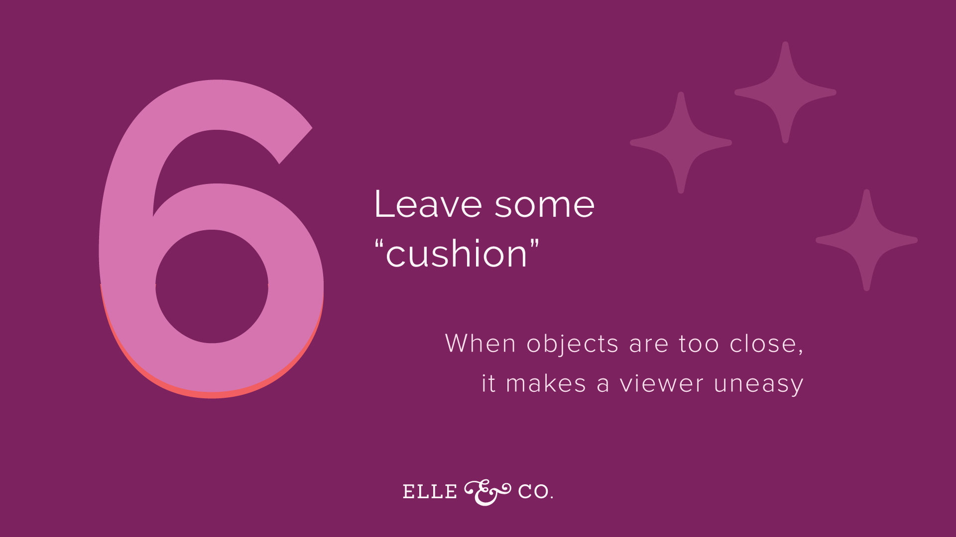
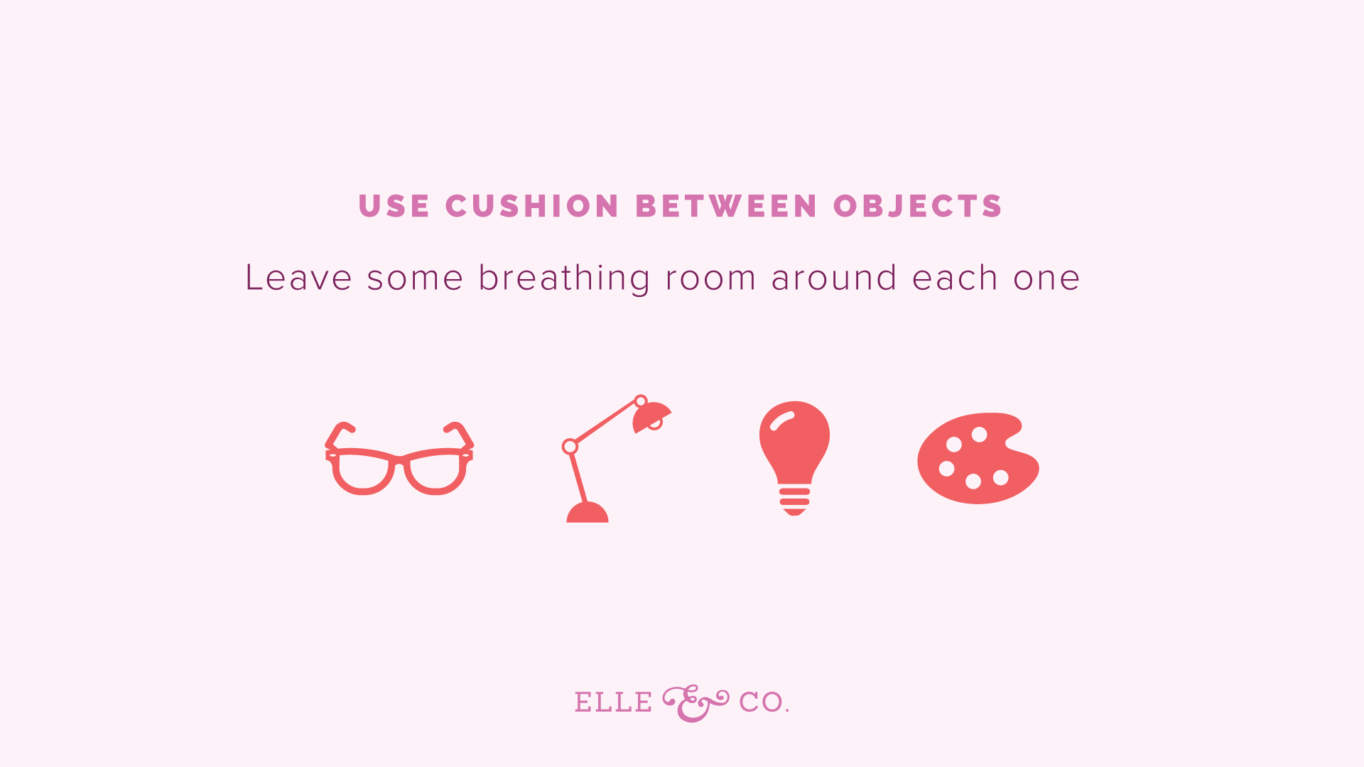
6 | Leave some "cushion"
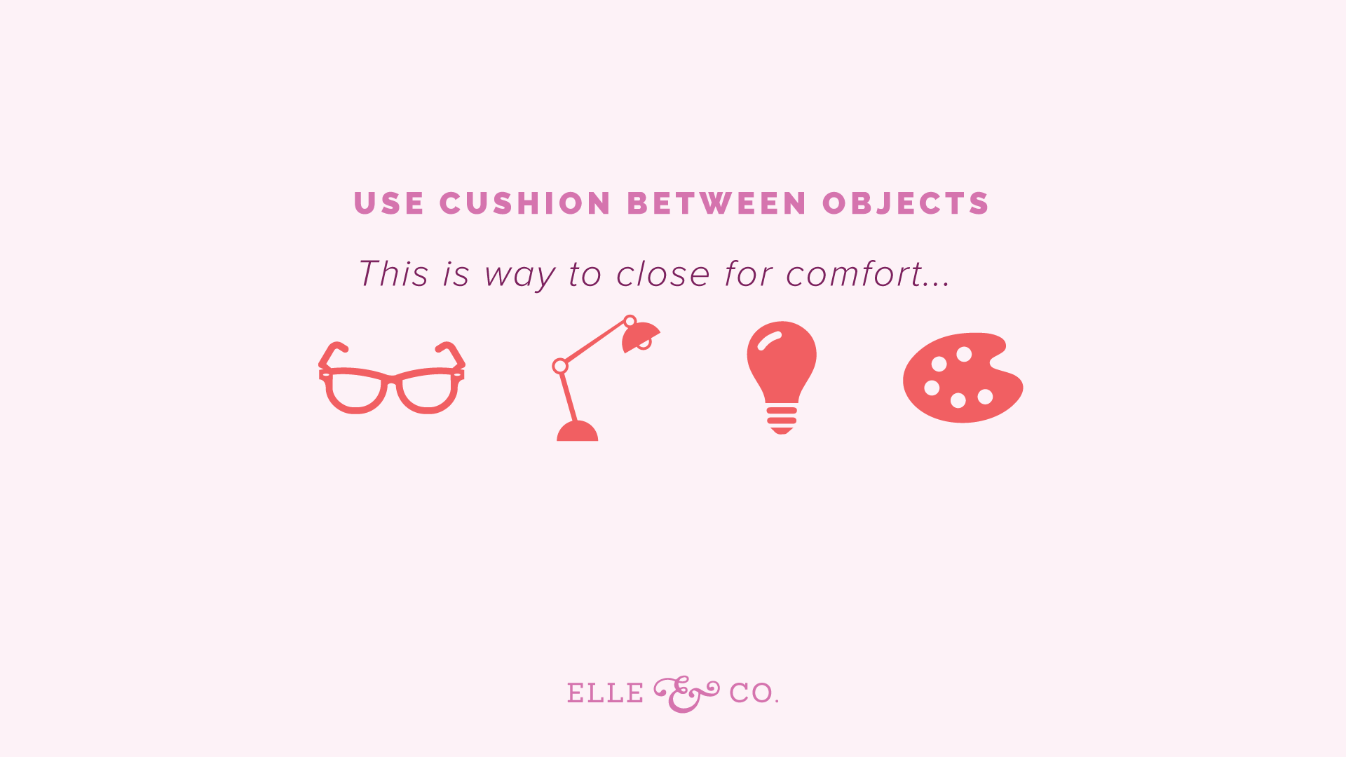
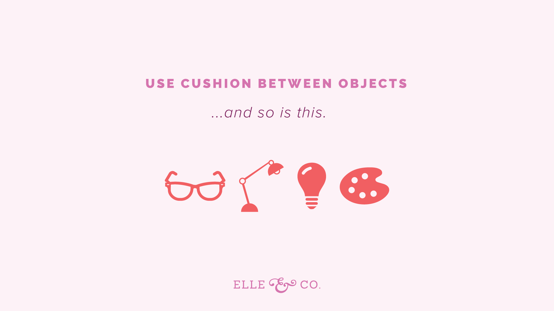
Designers use the term margin. I like cushion. You want to get some space in between objects of your design. If the design elements are too close, it's going to make a viewer uneasy. They may not realize exactly what it is that's putting them off, but they will have a reaction to it, and feel uneasy about it. For example, using cushion between objects, you want to leave some breathing room around each object in your design. So here here I have four icons. This is actually from one of the earlier slides. I wanted to put some negative space, some cushion, around each one, so that your eye could easily focus on each element of the design, and even between the icons and the text. But look what happens when I bump those icons up a little bit. They're way too close for comfort. You can't really read the text super well, because the icons are right there. Or better yet, if I had kept those icons away from the text, and just moved them closer together, you're still going to feel a little uneasy. They're too close together. There isn't enough breathing room around each one.
If I go back, you can see how leaving some breathing room between the objects in the text, leaving some breathing room around each individual icon, puts you more at ease. You're less uneasy, less uncomfortable. A lot of times, people tried to jam all these elements into an image, and what happens, is it looks overcrowded. It just makes the viewer really uneasy. You want to have a little breathing room. You want to give people space for their eyes to rest. You want to make it easy for them to see each individual element. So that's an easy trick, is just leaving space between objects.
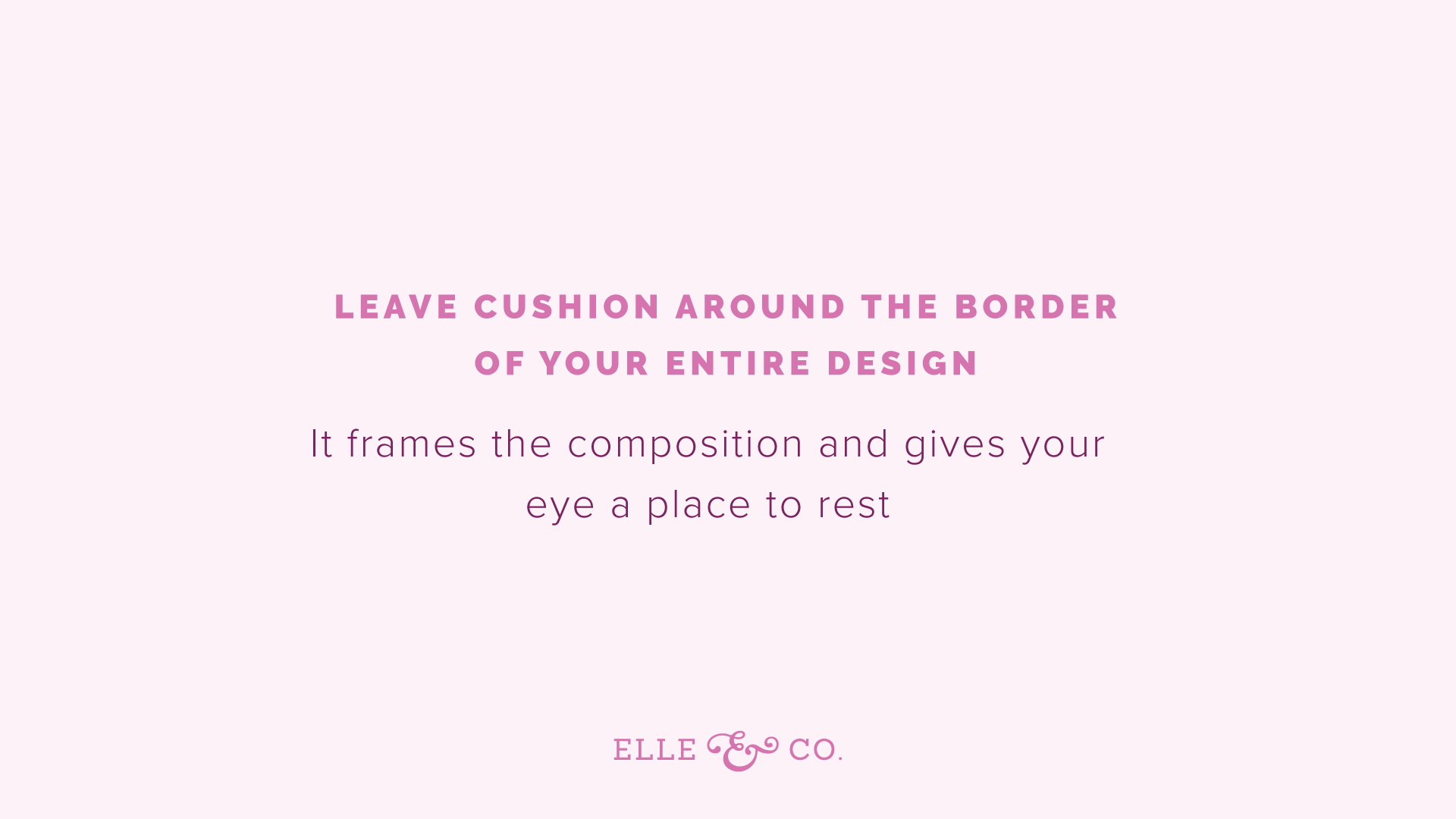
You also want to leave cushion around the border of your entire design, because it kind of frame the entire composition. Again, it gives your eye a place to rest. All too often, I see people putting elements of the design way too close to the border of the design, or the edge of the design. It's just like setting a drink on the edge of the coffee table. It makes you nervous. You're afraid it's going to fall off. Even though it's two-dimensional, these business graphics that you create for your website, and social media, and whatever else, you're still making people uneasy if you place things too close to the edge.
For example, this text being so close to the border the image up here, to the edge of the image, does it make you feel slightly uncomfortable? Probably. It's way too close to the edge. Whereas, this slide before, there was some space. You don't have to leave this much space, but there's space for your eye to rest. Same thing with this. If I move the Elle & Company logo from these slides very close to the bottom, it almost looks like it's going to fall off. Again, consider that border, that margin, that cushion around your entire design. You don't have to leave a ton, but just to make sure that it doesn't look like something is going to fall off the page. Or that it's overcrowded, and you're trying to cram way too much into your image. Again, simplifying is best.
To run these just really quickly again, before we get to number seven, number one was to use consistency. Use similar fonts. Use the same fonts over and over again. Assign them roles for headers, for body text, for logos, and that sort of thing. Also through the colors that you're using, and the style of your icons, and patterns. Be consistent. Use them over and over again. Number two, increase the quality of your photos through things like lighting, and the colors that you choose, and your editing techniques. Consistency goes a long way there too. But bumping up the quality of your images, even through those three simple things can go a long way. Number three is to understand hierarchy. Use the principles of hierarchy to guide people's eye around your design, and to be more intentional about the elements of your design, instead of just throwing everything on the page. Use some intentionality behind it.
Number four, pare down. Take things away from your design. Consider how every design element, what its purpose is. Whether it's for balancing out the design, or there are details that need to be mentioned within the design, but consider why you're adding things. Don't just add things because you think it looks cool. Use intentionality. Number five, utilize negative space. The background, and the space around the subject matter of your design, is even more important than the subject matter, so utilize negative space. The next point kind of adds to that, with leaving some cushion. Make sure there's some cushion around each object in your design. Leave some cushion around the border too, so things don't look like they're going to fall off the page.
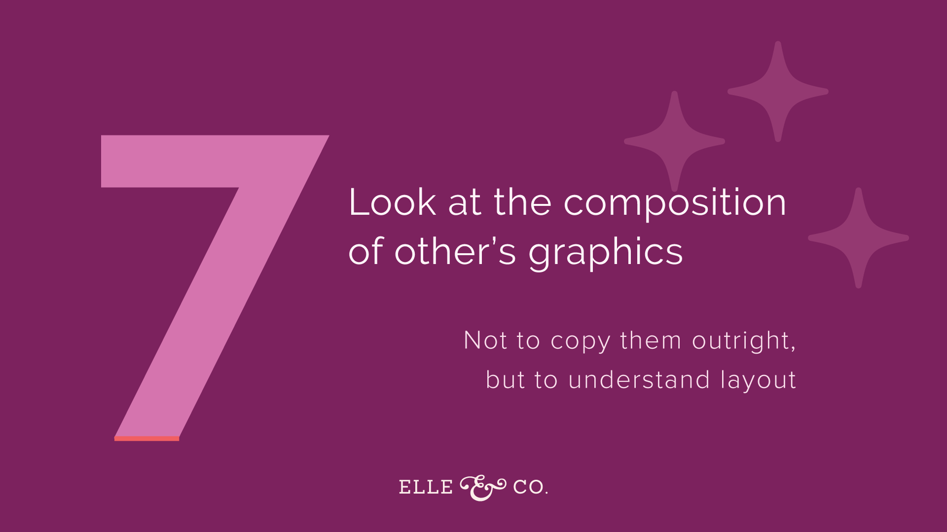
7 | Look at the composition of other's graphics
Now I'm not telling you to copy them. Don't misunderstand, and think I'm telling you to go rip off other people's designs. But in order to understand the layout of the design, or why the design works, it's helpful to look at other people's graphics, especially big brands out there, to see what they're doing right. I love Rifle Paper Co. I love looking at the composition of their graphics, and just how simple they are, how they aren't over-designed. They're really intentional with the design. It's fun to look and see what's working about this composition. What are they getting right here? How can I implement something similar, using my own brand, and my own brand standards?
You should have your own brand style. If you don't, work through that brand challenge. But by implementing your own colors, and your own fonts, your own overall style, you can pull from other people's compositions, and put your own creative spin on them. Actually in design school, they had us do this in a painting class. They had us take very famous works of art, and try to re-create them. What it did, whether gave us an appreciation for that artist. Something usually looks way more simple than it ever is when you try to implement it yourself. It also showed us what worked about that composition. It really had us think about it more. So when you try to recreate something, and put your own spin on it, usually it gives you a new appreciation, and you learn a lot from it. You learn what makes it work so well.
I'm not telling you to copy at all, but I am telling you to look at other designs, see what's working. I always love going to Barnes & Noble, and their magazine section, and just looking at different layouts. Or HOW Design, that's one of the magazines I love seeing. It's a graphic design magazine at Barnes & Noble, or most places that sell magazines, but definitely Barnes & Noble. I love just looking at other designs, and just getting inspired from them. Not that I necessarily want to copy them, but just looking and saying, "What did they do right? What did they do differently? How can I put my own creative spin on something similar?"
Those are my seven tips, and hopefully they were helpful for y'all. I would love to answer some of your questions though. So let me scroll on over here, awesome. If you have any questions about this, or just about designing graphics in the first place, feel free to ask the questions in the ask a question section. I thought about doing this Ellechat actually in preparation for the Adobe Illustrator course, because I had a lot of people asking questions about, "Well, if I learn how to use Adobe Illustrator, I don't know necessarily the rules of design." A lot of those are covered in the course. But I wanted to just give you all seven accessible ones, just that you could start implementing today, to create better graphics. Whether you use Adobe Illustrator, Canva, whatever you're using, you can implement all of these.
Let's dive into these questions. Gina says, "How the a non-designer know which colors go well together, and which are a bad match?" I actually have a blog post about that Gina, about how to create a color palette. There's three different types of color palettes. There's a complementary color palette, an analogous color palette, and of course, I'm going to forget the third one when I'm put on the spot. I'll think of it in a second. But just knowing some color theory is really helpful, and so I created a whole post on different colors, and how you can create a primary and secondary color palette. If you follow that brand challenge, you can easily find those resources, and create a color palette that way too. I don't just leave you to your own devices, like, "Come up with a color palette." I walk you through exactly how to do it.
Just by understanding, taking some time, just like tuning into this webinar, to learn about color theory, and color pairings, and how you can really utilize color to attract the right people, then you can create a beautiful color palette for your brand. So be sure to check out that brand challenge, and check out that color post on the Elle & Company site. I'm sure if you put in the search bar, color, that post will pop up pretty quickly. Great question.
Gina also asks, "Should the fonts used in a logo, carry through to a website, presentation graphics, et cetera? What I usually suggest is that the main font that you use for your business logo not be used anywhere else, because you want it to be special. You don't want that business logo to fade in the background, or blend right in with other headers, or anything. You wanted to be special. Usually for my clients, the rule of thumbs when I'm creating their logos is to only use that font for the logo. Now, if it's a tagline for something like photography, or something like that, I usually pull that font, and put it into the header, and other elements for the brand. But usually the rule of thumb is to not use those logo fonts.
For the Elle & Company logo, it's Aspera font, and I don't use it anywhere else. You won't see it anywhere else in my graphics. But, you will see those fonts that I showed you earlier, and just maintaining consistency for the header fonts, the body fonts, and other secondary logos on the website. For things like courses, and offerings, I use a different, kind of fancier, more eye catching font. So I hope that is helpful. [Kiersten 00:40:12], yeah, she has an awesome ... Canva has an awesome post on 100 color combinations that is linked to in the questions section too. Totally okay to post there. Thank you for sharing that. Yeah, posts with color combinations can be helpful too.
The only thing I would say when it comes to finding color combinations that have already been used before, is to still look into color theory, and still do some research on color pairings, just to see which ones might fit your audience best. A lot of times, people approach color, for their brand especially, and they think, "Oh, I just really like this color combination," when it might not be the best color combination to use for attracting your potential clients and customers.
For example, I worked for a client who is in the wedding industry. When it came to choosing color, or pulling together he Pinterest board, she loved the colors purple and teal, which are fine for her own personal preference. But if you're in the wedding industry, and you're trying to attract, and her ideal client was a southern bride, then purple and teal might not be the best options to choose, because you usually think of pastels, and softer romantic colors, and maybe some navy blue for a southern bride. So that's what we ended up going with. But understanding some color theory, and understanding what colors are going to attract your ideal client is also really important in choosing brand colors. With that in mind, posts like that are super helpful. But just be sure that you know a little bit of color theory, so you can discern which color combination might be best for your brand.
Rebecca says, "Can you tell us the name of that company you just referenced, as design inspiration. Yes, Rifle Paper Co. It's named that, because of Anna Rifle. Bond now is her last name, who is the artist behind it all. You've probably seen her designs, without even realizing it before. But she does a lot of stationery, and prints. I got my planner from Rifle Paper Co. But their promotional graphics on Instagram are just really beautiful. They highlight the products really well. They don't take away from it. They're really simple, and so if you aren't along with Rifle Paper Co., they're one of my favorites. They're also one of the favorites of both my assistance, especially Marissa. We talk about Rifle Paper Co. all the time, and love their products.
Janet says, "Do you prefer not to have borders on sides or graphics to allow for cushion?" Sometimes having just a simple border around the bottom of a slide, and if you put your logo in it, totally fine. Even in borders, if you use a border, and you have any text in the border, or maybe a logo, or a link, or a hashtag, just be sure to have some cushion around that link within the border. But I don't think borders are bad. Actually, I think they can add a little bit of balance to your composition. Just make sure that you don't have a border, and a bunch of lines. Just make sure that you're being intentional, and that everything you're using has a purpose. But I don't think that borders are bad. I've used a lot of borders in slides in the past. I even use the border for the promo graphic for this Ellechat. But you can see in the border, that the link, and the Elle & Company logo had some cushion, even around it, within the border. So you might want to take a look at that. But I'm not against it. Feel free to use borders. Just remember that less can be more.
Sharon says, "Is there any time when you should consider changing your existing color scheme?" Yeah, so If you find that you created a color scheme, and as your business has grown, you have a different clientele, you're trying to attract different people, different audience, then change up your color scheme, you might go through a little rebrand process. If you've been in business for a long time, and you have a color palette that you've been using, and it's kind of working, and you're getting a good number of clients, you're just sick of it, then you might leave it, or you might add a secondary color, just add some more interest to it.
I had a client came to me, probably a year ago. We worked together two or three years ago, and we came up with a color scheme for her. She wanted to add pain into her brand, as kind of a secondary color. For her, it made sense. She realized that her audience was mainly made up of women. They were attracted to the color pink, and so we just added that in there, and it was a good pop of color, for calls to action, some little accents in her brand. So that is another option Sharon. But I would say, consider your ideal audience, or the clients and customers are trying to attract with your business, or readers, if you have a blog, and consider that when you're choosing your color scheme.
Any other questions? You're welcome. I hope that that was helpful for you. If you have any other questions, if you're watching the replay later, listening to the podcast, go into the Elle & Company community, and ask questions there too. It's a Facebook group. It has about 3,000 people. It's gotten more and more active. People ask questions and get a ton of answers in there now. I'm going in there now, and trying to answer some questions as I can. But feel free to ask questions there. That's there for you, and I hope it's helpful.
Melanie also asks, "Lauren, on your site, which I believe you created in Squarespace, how do you know what size to make color blocks you used as a background in all of your galleries, like the blog catalog?" The color blocks, I guess you're asking for blog post graphics in the archive Melanie, I think is what you're asking. How do you know what size to make them? I try to make them a big enough size to where they're visible. In the archives, I want to make them big enough to where you can easily see the blog post title, but I also want cushion around it. Squarespace allows you to easily add more spacing in between, especially for the summary block, you can add more spacing in between, and add some cushion there.
Also, something to mention, we're going to be doing another Squarespace series. I did one three years ago now, just on the blog. It was a weekly Squarespace. My hope was that you could follow along at the beginning, figure out why Squarespace might be a good option for you, and by the end of the series you can totally set up your website on Squarespace. So I'm going to be doing another Squarespace series. So if you have something you're interested in learning about for Squarespace, whether it's customizing Squarespace, using CSS to customize Squarespace, some code to customize it, maybe you have questions about blogging or E-commerce, Elle & Company community, I have a post in there. Feel free to, there's a poll, weigh in with the poll, and tell me what you're interested in learning about there.
Kiersten says, "How do you choose the fonts to use for your main graphics, when there are so many to choose from? Any tips on narrowing it down?" I also have a post on fonts, which might be really helpful for you Kiersten. It's also in the brand challenge. I usually say that for your main fonts, to keep them really simple. I have a few favorites that I love. Then usually pair a really simple font, with a font that has a little bit more personality, and is a little bit more memorable. But when it comes to blog post graphics, and things like that, you usually want a really simple font. You can customize it with colors, to make it more interesting with colors, and that sort of thing. But you want it to be really legible. I have some font pairing posts as well on the Elle & Company blog that might come in handy for you, so be sure to check that out.
Again, if you go to the blog, and in the search bar in the sidebar, put in fonts. You can find some good resources for that. Canva has some good resources for that on their Design School blog, so Be sure to check that out as well. Awesome. I think that's all for questions right now. Next week I'm going to be out of town. There won't be an Ellechat. The week after that, Sai from Crowdcast, the founder of Crowdcast, is going to be joining me for an Ellechat, which I'm really excited about. I'm going to highlight him, and just learn more about his story, how he created this platform, and his plans for the future of it. So it should be a lot of fun.
If you click on my accounts, my Crowdcast account, you can find that Ellechat, and go ahead and register for it if you're interested. You can also go to elleandcompanydesign.com/ellechat, and you can register for it there. But it was so fun jumping on here with y'all today, and answering your questions, and just telling you more about how to create great graphic. I hope I set you at ease a little bit. You are totally able to create great graphics, whether you have a design background or not. You just have to use these principals. It's like a language, the more and more you use them, the less you have to think about them, and the more they become second nature. So you can totally do it. You are very welcome Sue. I'm glad that you all joined in today. I would love to see you and another Ellechat soon, and best wishes with your business graphics. See y'all.
