
Design is all about first impressions, and one of the most important factors of any design is color. Color choices, pairings, and usage can affect how someone perceives a billboard, a website, or a box of cereal. Whether you realize it or not, colors evoke emotions, feelings, and memories, and designers tap into those emotions as they're choosing colors to appeal to a brand's ideal audience. There is more psychology behind color than you may have imagined, so today I'm sharing some color associations and data that you're already subconsciously aware of but may not have picked up on before.

According to one study, 90% of snap decisions about a product are made completely based on color. As you're choosing colors for your business or blog, it's wise to keep these color psychology basics in mind to ensure that you're portraying an accurate reflection of your blog or business through color.
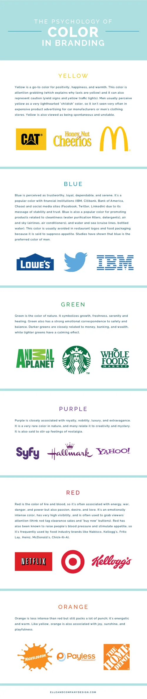
Although we each have certain preferences when it comes to color, it's more important to use colors that give off the right message that will attract your ideal audience than it is to use colors that you're generally drawn to. If you're branding your blog or business to appeal to men, it would be wise to stay away from yellow because of its "childlike" associations. If you're branding something health-related, you might consider using green because of its associations with growth and nature. And if you're in the food industry, it might be best to refrain from using blue because of its tendency to suppress an appetite. There's so much more to color than what meets the eye!
Sources: Entrepreneur.com, Psychology.about.com
Were you surprised by any of these color associations? Which colors did you choose for your brand?


