Tiffany blue.
You know you have a strong brand when something as simple as a color becomes an actual trademark for your business.
If someone is carrying that signature blue box with a white ribbon, you know they’ve made a purchase from Tiffany’s. You don’t even have to see the logo to recognize the brand.
Logos definitely help create brand recognition and add a visual face to your business, but seemingly insignificant details like colors and fonts can have just as big of an impact.
And in Week 3 of this month’s Brand Challenge, we’re diving into those details headfirst.

Elle & Company Brand Challenge, Week 3
By this point in our February Brand Challenge, you have:
- Conducted a brand evaluation
- Brainstormed your future goals
- Crafted a mission statement
- Identified your ideal client/customer
- Listed 10 brand keywords
- Developed your tone and terminology
- Utilized a Pinterest board for inspiration
- Created an inspiration board
- Refined your logo
- And designed logo variations
If you missed out on weeks 1 and 2, no worries! Read these posts and carry out the action steps included to catch up:
Week 1: Laying the Groundwork for a One-of-a-Kind Brand
Week 2: How to Come Up with a Creative Visual Direction for Your Brand
Your brand is beginning to take shape, but we still have work to do. We’re going to build upon the work you’ve done by choosing colors, fonts, and a graphic style for your brand.
But before we do, download this week’s workbook to follow along and record your progress:
Download the free Brand Challenge workbook!

Subscribe with your name and email address to access to the in-depth workbook for Week 3 of this month's Brand Challenge.
11 | Come up with a primary + secondary color palette
Color is a great way to distinguish your brand and create recognition.
In fact, color increases brand recognition by up to 80%.
Think about Home Depot, Target, and T-Mobile. Did their brand colors (orange, red, and pink) automatically pop into your mind? Of course they did!
The same should be true for your brand.
The colors you choose to represent your business should not only be memorable and recognizable, but they should appeal to your ideal clients and customers.
Easier said than done, though. I’ve found that many business owners struggle to choose colors because there are so many to choose from. Can you relate?
If so, I laid out the exact steps you should take when choosing your brand colors in this blog post: How to Create a Distinct Color Palette for Your Brand
Once you’ve worked through those steps, consider how the colors you chose match up with your brand keywords, mission statement, and tone.
For example, my former client, Amanda Jameson, used the words welcoming, delightful, joyful, inviting, refreshing, warm, intentional, invested, professional, and authentic to describe her brand.

The color palette we chose for Amanda’s brand blended in well with those 10 adjectives listed above.
The peachy pink lends itself well to "delightful" and "joyful." The soft blue/green is "refreshing" and "authentic." And the shades of brown are "warm" and "invested."
It’s important to use intention when you’re choosing colors and measure them up against the foundation you laid in Week 1.
Once you’ve landed on a solid color palette, use page 2 of your workbook to list out the color values of each of your brand colors to create consistency.

I’ve left space for you to fill in the hexadecimal colors for web and CMYK colors for print.
You can find these color values in the Color window in Adobe Illustrator.

To switch between the different color modes, click the Options icon in the top right corner of the window and choose which mode you want to view.


Consistency is key in branding. The more and more you use these same colors over and over, the more your audience will recognize your brand when they come into contact with it.
Tiffany’s doesn’t use all different kinds of blue; they use one shade, over and over and over.
Rounding up these color values will help you maintain consistency with your brand colors. It will also come in handy when you go to change a button color on your website or choose colors for collateral items.
12 | Outline your brand’s color system
I know what you’re thinking, “What in the world is a color system?”
Let me explain.
Your whole brand should be viewed as a system.
It’s sort of like an equation; you plug in the values to the framework and you get the right answer.
Throughout this brand challenge, you’ve been creating separate parts of the equation so that when you add them together to create a website, business cards, and other collateral items, you’ll achieve a cohesive, professional outcome.
Now that you’ve chosen colors for your brand, it’s time to create consistency in how you pair them together.
For example, we chose the following colors for Jen Neal’s brand:

But in order to maintain consistency on Jen’s website, social media graphics, and business cards, we needed to come up with a color system, outlining how the colors would be used.
Navy blue would be used for backgrounds.
The custom floral pattern we created for Jen’s brand would always be the lighter shade of blue on the navy background.
Pink would be used in small doses for a bold pop of color, mainly through thin borders.
Gold would only be used sparingly for the logo and headers.

You can see the “system” start to develop.
Having this system made it easy to design Jen’s website and collateral items because we simply plugged in the values and came out with a well-designed solution.

So start thinking through your color system.
It will probably continue to take shape as you add patterns, icons, and other visuals into the mix, but go ahead and define your color pairings.
Which colors will be used as background colors?
Which colors will be used on top of those background colors for text and icons?
Note that the best color pairings are usually those with contrast (which is why I had you choose light, medium, and dark tones for your color palette).
Spend some time playing around with your brand colors to see which combinations pair best together.
Once you’ve settled on some color pairings, set those standards on page 3 of your workbook.

You might find that you need to go back and refine your color palette after this step to give yourself a little more versatility or create better color pairings, and that’s okay! I usually make small adjustments here and there throughout the branding process.
But be sure to take the time at the outset to set boundaries for how you use and pair your brand colors. It will make designing your graphics so much easier in the long run.
13 | Set color options for each logo variation
Remember those black and white primary logo and alternative logos you refined/created last week?
It’s finally time to add some color to them.
(And now that you’ve already outlined your color system, this step should be easy!)
Using the color pairings you created in the last step, come up with a primary color combination for your logo.

Next, consider what your primary logo will look like on different color backgrounds and photo backgrounds.
For example, will it be white on dark images and navy on light images? Will it be navy on a light blue background and gold on a navy background?
Do the same with your alternative logos, too.

Thinking through these different instances will help you maintain consistency, create brand recognition, and make it a breeze to design things like social media graphics, presentation slides, and website icons in the future.
I left space for you to outline these logo color pairings on page 4 of this week’s workbook.

14 | Choose your brand fonts
Your colors are all set! Now it’s time to dive into fonts.
Just like with the color process, I already have a detailed blog post on all the steps you need to take to choose and pair brand fonts: Finding, Choosing, and Pairing Brand Fonts
Once you work through the steps in that post, take some time to choose your header font, body text font, and possibly one accent font.
I’ve left space for you to list these fonts on page 5 of your Week 3 Brand Challenge workbook.

Be sure to pay close attention that all 2-3 fonts work together.
If you chose an accent font, consider how and when that font will be used (again, creating a system of sorts). Scripts and decorative fonts can make great accent fonts, but they should be used sparingly and in small doses to call attention to certain words in your designs.
But whatever fonts you choose, stay consistent.
Don’t switch them up every month or choose one font for social media graphics and another for blog post images.
Some of you artsy creatives might get bored with using the same fonts over and over, but consistency is key to creating brand recognition and appearing professional.
15 | Determine the style of your graphics
Your logo is taken care of, your fonts and colors are good to go. Next up: graphics.
But before you create icons, patterns, and borders, you need to consider the overall style of your graphics.
Are they going to be minimal? Detailed? Geometric? Handdrawn?
What style would make the most sense for your brand based on your keywords, mission statement, logo, and font choices?
Skype’s brand style guide is one of my all-time favorites because they do a fantastic job of outlining their graphic style. Take a look:
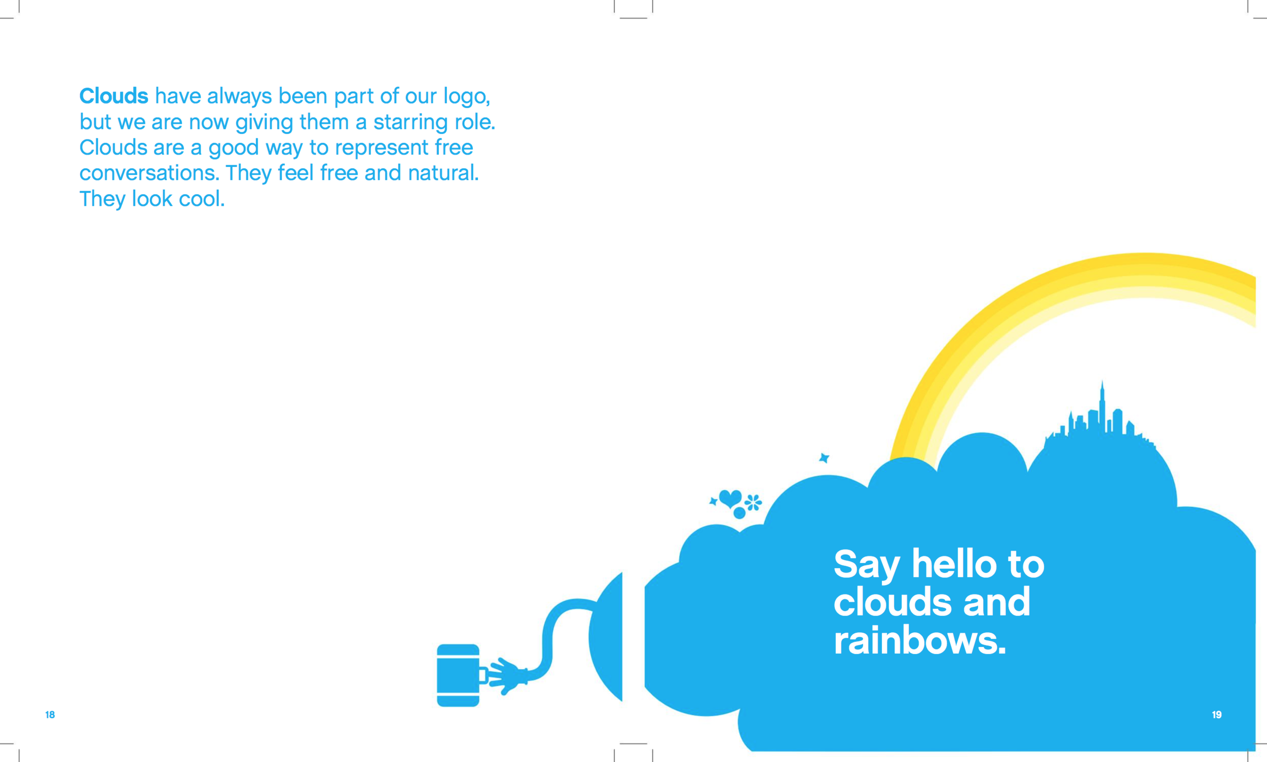
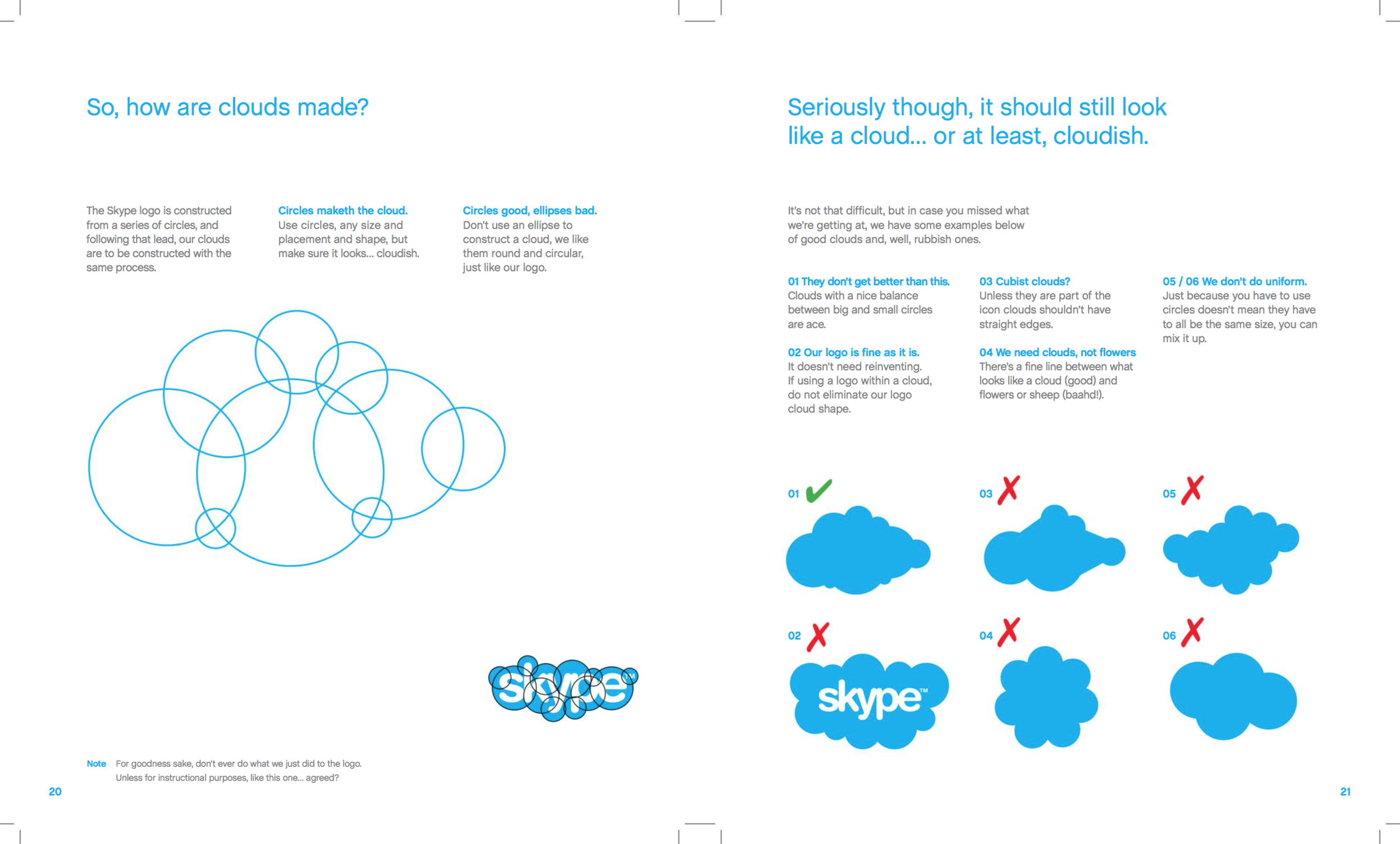


“The Skype logo is constructed from a series of circles, and following that lead, our clouds are to be constructed with the same process.
“Circles maketh the cloud. Use circles, any placement and shape, but make sure it looks… cloudish.
“Circles good, ellipses bad. Don’t use an ellipse to construct a cloud, we like them round and circular, just like our logo.
“Our illustrations are all about visualizing the richness of conversation. So once you have your basic cloud shape you can incorporate some illustrations to the cloud.”
Skype outlines their graphic style and creates parameters around the types of graphics they’ll use throughout their brand.
This creates consistency and cohesion, so even if you don’t see the Skype logo, you’ll recognize the Skype graphic style.
The same should be true for your brand. Take some time to determine the style of your graphics.
You don’t have to go into as much detail as Skype did, but having a graphic style in mind will be super helpful for you as you create borders, patterns, and icons next week.
I left space for you to define your graphic style and sketch ideas on page 5 of your workbook.

Download the free Brand Challenge workbook!
Subscribe with your name and email address to access to the in-depth workbook for Week 3 of this month's Brand Challenge.
We are flying through this Brand Challenge! I hope you’re enjoying the process and seeing a lot of progress with your brand each day.
Remember to share your progress in Elle & Company’s new Facebook group and share your colors, fonts, and graphic style on social media using the hashtag #elleandcobrandchallenge.
Best wishes - only one more week to go!