It takes an average of 5-7 brand impressions before someone will remember your brand.
Which means that people have to come into contact with your brand through website views, social media posts, or third-party mentions an average of 5-7 times before they can recall your business from memory.
I don’t know about you, but I would rather someone remember my brand during the first or second point of contact. 5-7 seems like a lot.
But in today’s day in age - where all brands seem to run together and look the same - it seems to be getting even harder to stand out from the crowd and create a brand that potential clients and customers will remember.
There’s so much competition.
So how do you stand out? How do you catch people’s attention and increase the likelihood that they will remember your brand?
The answer lies in consistent, one-of-a-kind visuals.
Icons, patterns, borders, backgrounds, photography style - they all give you the opportunity to differentiate your brand and become memorable. And I’m sharing exactly how to create them in this post, during the final week of Elle & Company’s Brand Challenge!
Elle & Company Brand Challenge, Week 4
By this point in our February Brand Challenge, you have:
Conducted a brand evaluation
Brainstormed your future goals
Crafted a mission statement
Identified your ideal client/customer
Listed 10 brand keywords
Developed your tone and terminology
Utilized a Pinterest board for inspiration
Created an inspiration board
Refined your logo
Designed logo variations
Came up with a primary and secondary color palettes
Outlined your brand’s color system
Set color options for each logo variation
Chosen your brand fonts
And determined the style of your graphics
If you missed out on weeks 1, 2, and 3, no worries! Read these posts and carry out the action steps included to catch up:
Week 1: Laying the Groundwork for a One-of-a-Kind Brand
Week 2: How to Come Up with a Creative Visual Direction for Your Brand
Week 3: A Guide to Choosing Brand Colors, Fonts, and Graphics
Also, be sure to download the free Week 4 workbook to help you follow along!
Download the free Brand Challenge workbook!

Subscribe with your name and email address to access to the in-depth workbook for Week 4 of this month's Brand Challenge.
16 | Consider borders + backgrounds
Differentiation is all in the details.
While borders and backgrounds may seem insignificant and small compared to logos and color palettes, they can have a large impact on the consistency and professionalism of your brand.
You already determined your graphic style last week, so considering your borders and backgrounds should be a fairly easy task.
A few things to consider:
How will you divide sections of content on your website and collateral items? Will you use a simple line or will you mix things up with a custom border like Sincerely Amy’s postage-inspired brand?
Will you use solid color backgrounds? Will you use semi-transparent blocks of color over images for text?
Will you use chalkboard backgrounds? Textured backgrounds? Wood? Metallics?
Will you utilize white space and keep things clean and airy?
All of these questions should be considered and addressed before you start implementing your brand on your website, collateral items, etc.
As you work through this step, think back to the work you did in Week 1 with keywords and your mission statement, as well as your graphic style, and consider which options make the most sense.
Get creative with it, too!
Small details like this may not seem to make much difference at the outset, but they can play a huge role in brand recognition and memorability. They’ll also make designing brand graphics much easier in the long run.
Use page 2 of your workbook to work through your borders and backgrounds and list them for future reference.
17 | Create one-of-a-kind icons
I don’t know about you, but I’m a big fan of emoji’s. Not a text goes by to friends and family where I don’t include at least one.
Not only are they fun (and usually hilarious), but they help communicate ideas and expressions that aren’t often easy to portray through words.
The same is true for the icons you use throughout your brand.
Icons can also be a great way to:
Add interest to your website and collateral items
Create engagement
Differentiate your brand and help you stand out
Create memorability
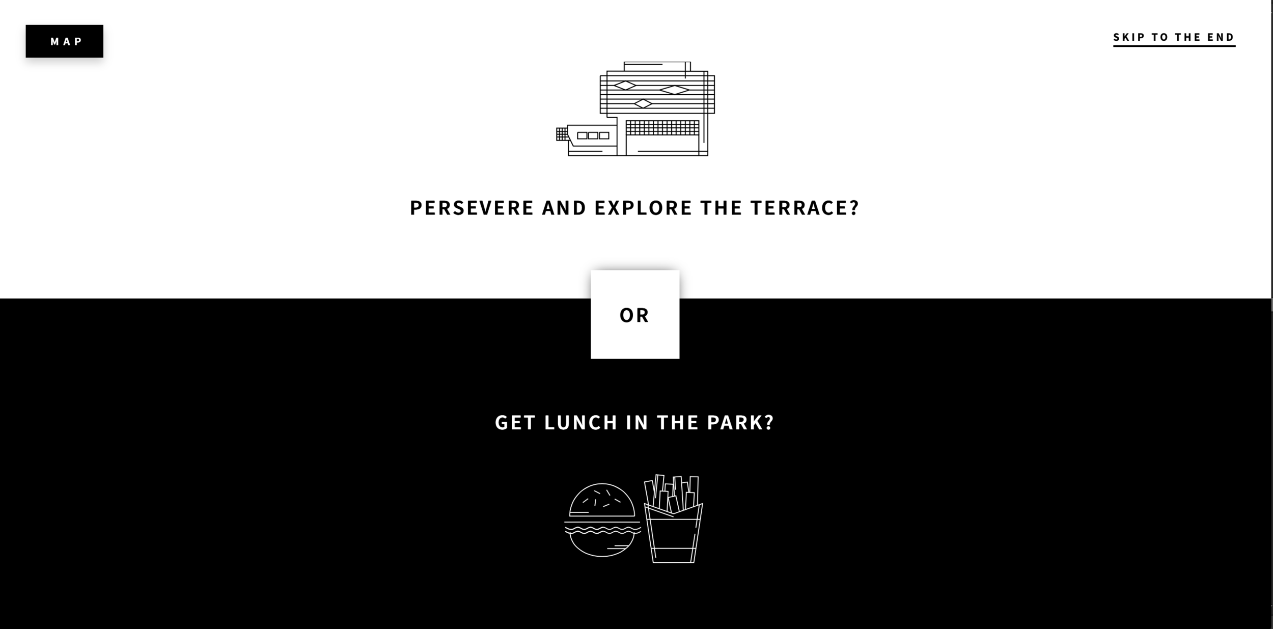
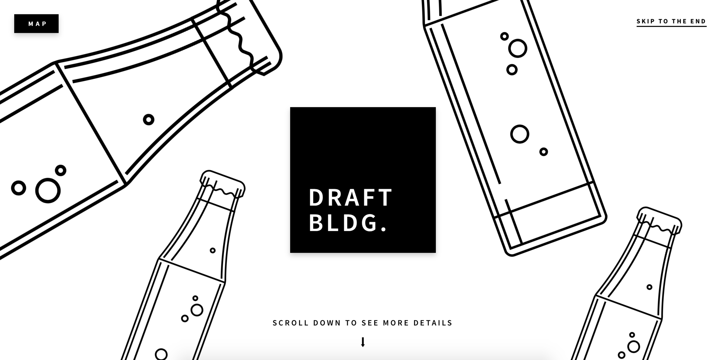
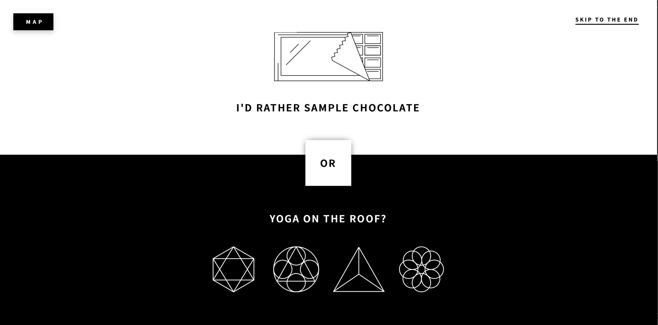
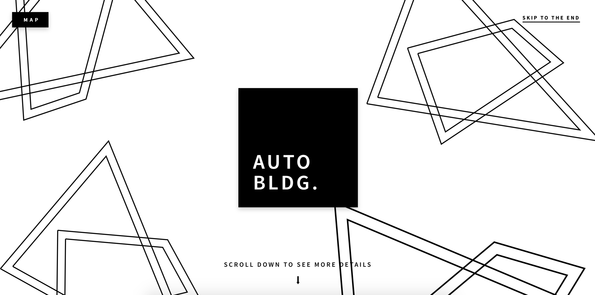
The Lower Junction’s website features a “Choose Your Own Adventure” feature, and their use of icons makes it so much more interactive and distinct.
Do you see how the use of simple icons takes the design and experience to a whole other level? The same can be true for the icons you use in your brand.
Consider your graphic style as you watch this Ellechat replay: How to Create Custom Brand Icons
Also consider how you might use these icons and what words you might need your icons to represent.
I’ve left space for you to sketch and describe your icon style on page 3 of your workbook, along with space to brainstorm specific icon ideas for keywords and offerings.
You’ll probably continue to add onto these icons throughout the life of your brand and business, but developing a distinct icon style at the outset will help you differentiate your brand and make it easier to create new icons in the future.
18 | Design custom patterns
Just like icons, patterns are another fun way to add interest to your brand and make it more memorable.
When you create a custom pattern that’s unique to your brand alone, you have the opportunity to stand out from competitors, communicate the message of your brand, and add some flair to your stationery, packaging, designs, and website.
Adobe Illustrator is a fantastic tool for creating both custom icons and patterns that fit your brand’s aesthetic and color palette.
I share step-by-step instructions on how to create custom patterns in my upcoming Adobe Illustrator Basics course (which launches in just a few weeks!)! If you’re interested in more details and first access, sign up for the waiting list below:
You can also find pre-made patterns on sites like Creative Market.
But be forewarned - other people have the ability to purchase the same patterns and use them on their website and collateral, which can hurt brand recognition.
That’s why, again, it’s helpful to know programs like Adobe Illustrator to bring your patterns to life.
I’ve left space for you to sketch out patterns in your workbook on page 4, along with some creative ideas for using patterns throughout your brand. Be sure to take a look!
19 | Determine your photography style
You can do a killer job on all of the steps we’ve covered over the past 3 weeks.
But if your photos are amateur or inconsistent with the rest of your brand, your brand will fall short. Every. Single. Time.
So, based on your keywords and the brand decisions you’ve made up until this point, consider which photography style would best suit your brand.
Should it be minimal and bright? Dark and moody? High contrast? Colorful and abstract?
Set the standard for the photo style of your brand.
Don’t base is off of what your current photo style looks like; try to take an objective look at what it should look like (within reason, of course).
It might also be helpful to look at the photo styles used in your inspiration board.
The next step will be learning how to implement this style, finding/purchasing photos that fit this style, or hiring someone who can implement this style for you.
I’ve left space for you to outline your photography style on page 5 of your workbook for future reference.
Don’t overlook the visual impact that photos can have on the consistency and effectiveness of your brand!
20 | Put it all together in a brand style guide
Congratulations! You’ve officially made it through Elle & Company’s Brand Challenge.
But before you start implementing your new brand on your website and collateral items, take some time to compile all of your hard work and create a beautiful reference for your brand by creating a brand style guide.
A brand style guide is a multi-page PDF that outlines all of your brand standards, including your:
Mission statement
Ideal client
Brand adjectives
Logos
Color palettes and color system
Graphics (patterns, icons, etc.)
Basically, it’s a cleaned up version of all the notes you’ve made these past 4 weeks in your workbook.
Graphic designer Melissa Yeager is a pro at putting together brands style guides, so I asked her to join me for this week’s Ellechat webinar to walk you through exactly how to create a brand style guide from start to finish.
If you can’t make the live webinar, no worries! Follow that same link to register and watch the replay.
You’ve officially made it through our first Elle & Company Brand Challenge!
I hope these last 4 weeks have helped you create a consistent brand you’re proud of. All that’s left to do is implement the systems you’ve created this month on your website and collateral items!
Best wishes and please keep me posted on your progress in our new Facebook group. I can’t wait to see what you’ve come up with!

