

Creating a brand can be a little overwhelming at the outset.
With so many details to pull together - colors, fonts, patterns - it can be difficult to know where to start.
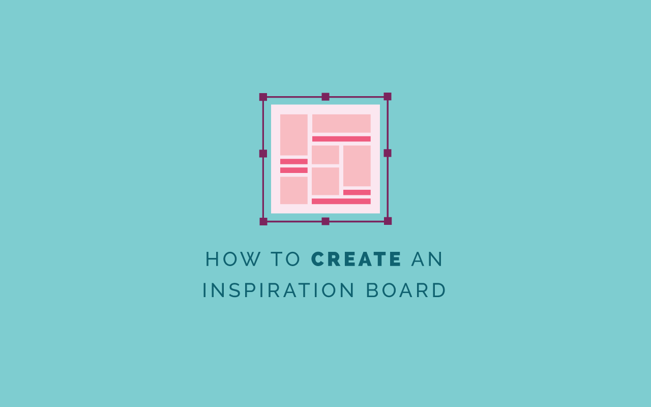
That’s where an inspiration boards comes in.

In one of last week’s Ellechats, I shared an inside look at my process for creating and using a creative, cohesive inspiration board.
Whether you're a designer or professional who's seeking a starting point for an upcoming project or a client who is preparing to undergo a rebrand, you’ll walk away from this webinar replay with all the knowledge and resources you need to create and utilize an inspiration board.
You can watch the replay by registering through the Crowdcast window below, or keep scrolling and take a look at the webinar slides and transcript.

Lauren Hooker: Hello, everyone and welcome to today's Ellechat on how to create and utilize an inspiration board.
I'm just going to go ahead for the sake of time and just jump right into the content. Some of you might have a great idea of what an inspiration board is and how it's useful and some of you might be following along with the brand challenge and are a little unclear of what an inspiration is and how it can be used for your business. Some of you might be great at creating inspiration boards, but maybe you don't know how to utilize it for a project. Inspiration boards are great not just for your brand, but if you work in a creative field like design or it could be interior design, event planning, anything like that, inspiration boards can come in handy as well.
First, why inspiration boards? Inspiration boards are great for a visual starting point for your brand. A lot of times, and if you've been following along with the brand challenge you've seen me talk about or read my content on the starting point, laying the groundwork, creating a mission statement, creating those brand keywords, identifying your ideal client, coming up with a tone of voice for your brand. That's all great, but when it comes to visuals, it's kind of hard to create a logo or a color palette off of those words. I like to jump on Pinterest, which I'll show you in a moment and compile some visual inspiration and put it into an inspiration board so that as I'm designing the logo or color palette or choosing fonts or anything like that for the remainder of the brand, I can refer back to that inspiration board.
It's also really helpful if you use inspiration boards for client work. It can be extremely helpful to make sure that you and your client are on the same page. When I'm creating brands for my clients, an inspiration board is a great visual starting point. I can compile those images, come up with a color palette, present it to my client and say, "Is this a good direction? Does this reflect the kind of brand that you had in mind?" If they say yes, we'll continue to move forward. If they say no, I might have some revisions to do, but it'll save me time in the long run and make sure that we are both on the same page visually. Inspiration boards can be extremely helpful for creating that visual starting point for your brand or whatever project it is that you're working on.
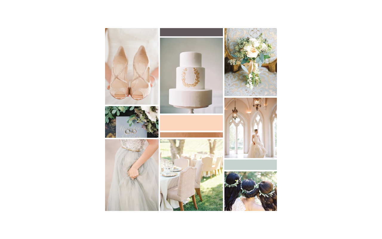
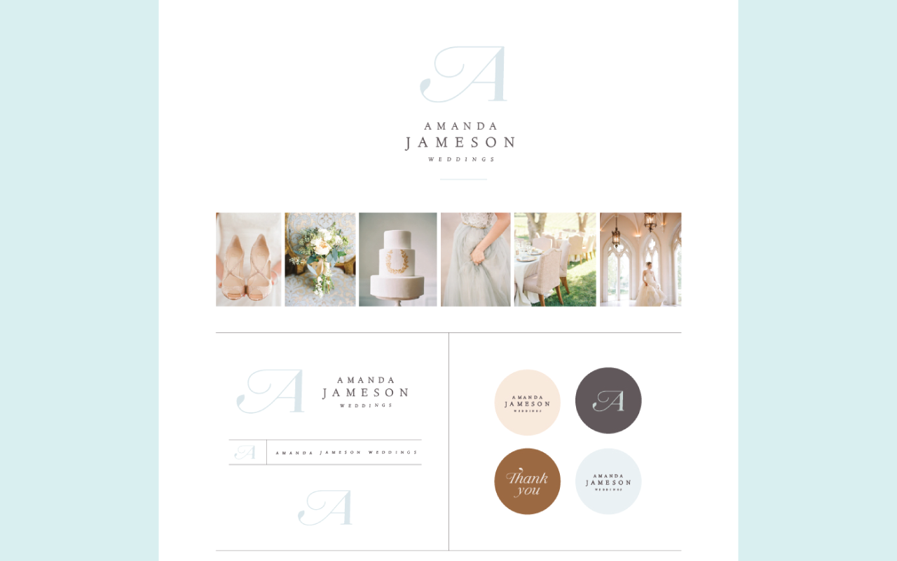
For example, this is a visual inspiration board that I did for my client Amanda Jameson, who is a wedding photographer. You can see how we pulled in some of that wedding inspiration. You can see a color palette start to arise. The way that this board makes you feel, it's just elegant, it's very classy, very feminine. This is what her brand ended up turning out to look like. We took these images and you can even see them across here and I was able to build a logo and color palette and all of these aspects of her brand, based on that visual starting point.
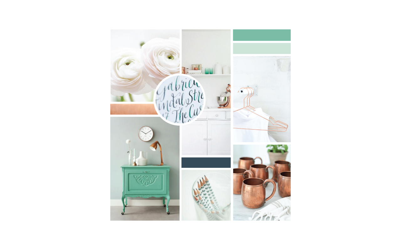
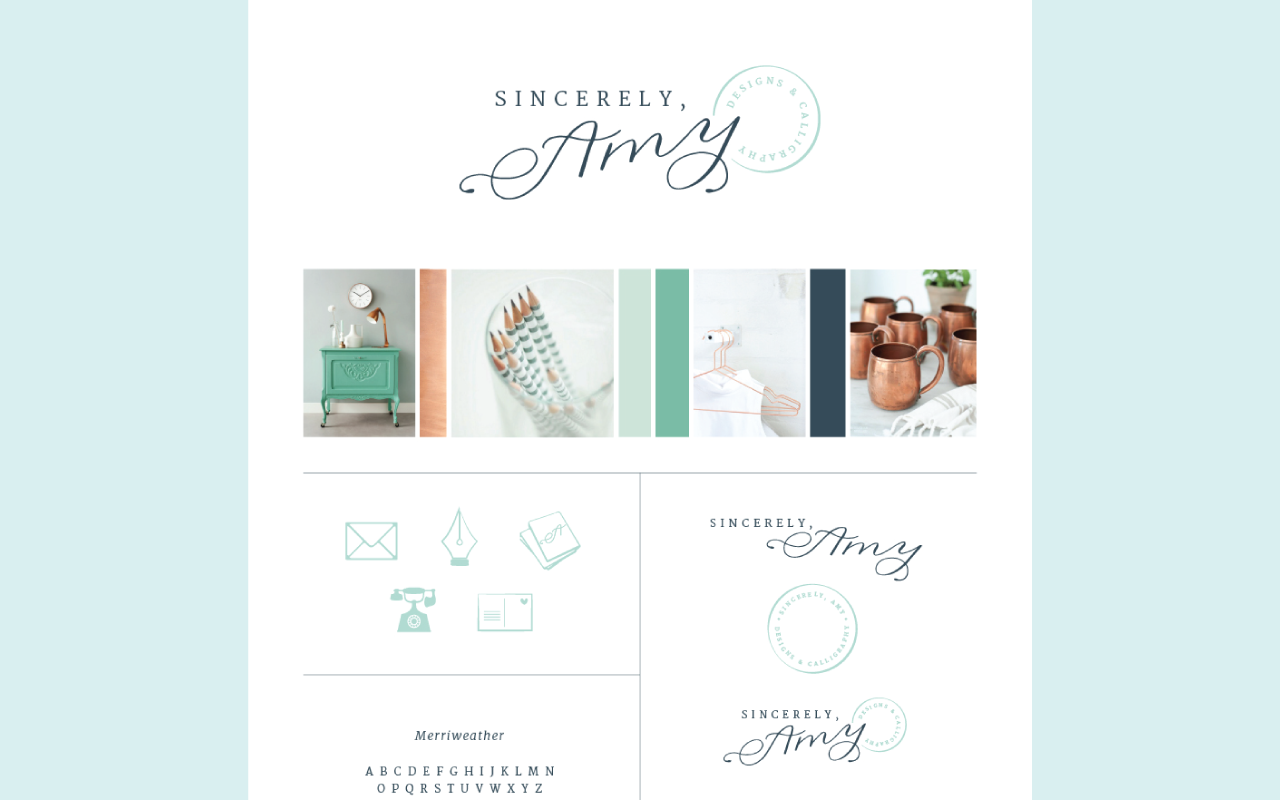
Same goes for another client of mine who's a calligrapher, Sincerely Amy Designs. We've started here with the inspiration board, kind of got on the same page, she even wanted kind of a postage theme, but she liked the copper elements and the greens and the blues and the whites. We ended up with this brand and the little postage inspired stamp there too, but that board provided a good starting point for the project.
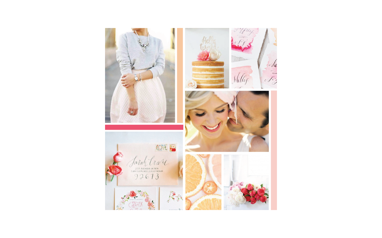
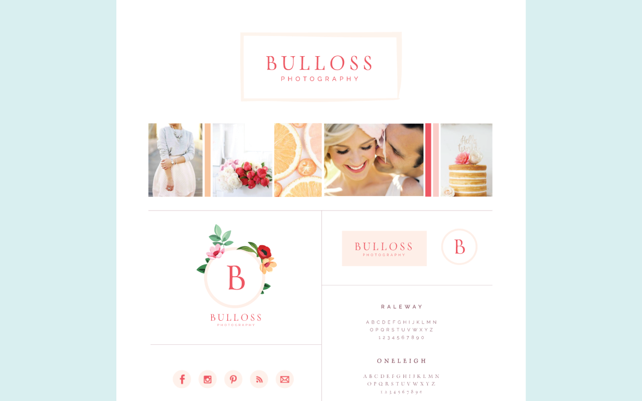
Then one more. This was for Bulos Photography. It's bright and cheerful. She wanted to attract cheerful brides who are very easy to work with, very excited over their wedding day, feminine and so we ended up with one of my favorite brands probably to date. You can see how it makes sure that we're on the same page and we're headed toward a final result that we are both happy with. That mimicked that same inspiration board from start to finish.
That's how inspiration boards can come in handy, but how do you create one? Where do you start? I'll walk you through step by step and then I'll even demo how to create one. Number one is to create a secret board on Pinterest. Pin images that reflect your brand. Hopefully you've already done the groundwork, laid the groundwork for your mission statement and your adjectives and your ideal client and you have all of that in mind. Then go on Pinterest and pin images that reflect that. A good rule of thumb is if you look at that image, does it make you feel what you want your ideal client or customers to feel when they look at your brand? Is it a good representation? If so, pin it to your board. Don't worry too much about having all the colors look pretty at first and everything looking cohesive. You might start to see a trend as you pin, but go ahead and pin them.
As you pin them, make sure that you use the descriptions. In the pin description, make sure that you're explaining why you chose that pin. That's super helpful. I tell my clients to do that too so that as I'm looking through the board, I know exactly why they chose the image that they chose, whether it was for the color palette or the texture or whatever it might be. That can really come in handy and as you look over the board again, you might start to see trends in why you chose the images. I encourage you to take full advantage of the pin descriptions.
Brianna, I saw your question in the comments. Do you do the Pinterest board, or do you ask your clients to do the Pinterest board? I ask my clients to do the Pinterest board and sometimes I'll go in and pin images myself too, but I want to see what images they would choose based off their brand homework and see their reasoning for it because they know their brand better than I do at that point. It's really helpful for them to do that. If they don't know how to use Pinterest, you might, depending on who your clientele is, you might go in the back end and pin to a Pinterest board. I've had clients do that or misunderstand the purpose of the Pinterest board and so I've spent a little bit more time going down and hunting down images that I think would reflect the brand and then working from there. Great question.
All right, so a few things to consider and a few things I tell my clients to consider. Steer clear of pinning other brands, so steer clear of pinning other logos, other brand boards. One of the best benefits of branding is differentiating yourself and separating yourself from all the other businesses in your industry. Your brand has a great opportunity to make your business distinct. Even if you're pinning and saying, "Well I just like this one aspect and I'm not going to copy it completely," subconsciously it can get in your head and as a designer, I find it really hard to move past that inspiration. I don't even want to see it on there. I'd rather just see other images on there, rather than logos so that I can create a one-of-a-kind logo. I would recommend that you steer clear of pinning brands and logos as well.
Number two and I already said this, but I'll touch on it again. Utilize the pin descriptions. Go in there and say why you chose it. It also makes you actually think through it, that you're not just choosing that image just because it's pretty, that you're using intention for why you're choosing those images and why they might be a good fit.
Number three, take a peek at the related pins section. Underneath a pin if you keep scrolling, it'll have related pins. A lot of times if you're trying to hunt down images, especially for your brand, those related pins can really come in handy.
Then number four is to consider the color, but also consider the subject matter. Does the subject in the photo, does it go in line with your brand or is it just a pretty photo? Think about the subject matter as well as the colors that you're choosing for your board.
All right so once you've utilized that secret brand board or Pinterest board, you can make it public if you want to, but a lot of times people want to keep it secret and that's okay too, is to look for similarities among the images. As you're going in and looking at those photos, try to see, "What do all of these images that I've pinned have in common?" That's a good place to start because then as you create your logo and other brand items, maybe it's icons or color palette or patterns, you can go back to those similarities and say, "What was it that really made this Pinterest board pop for me? Why did I choose those images and how can I implement those similarities in my brand?"
Lynn, I see your question about there's hundreds of images, where to start in terms of looking for photos. Sometimes in your own Pinterest boards, so I went back to my Pinterest boards and looked at a lot of the home décor that I posted and the outfit ideas that I posted and food and flowers and all of that sort of stuff and just looked in there to see what I was drawn to already. A lot of times, that's a good starting point and then the related pins section, sometimes objects or subjects might come in your head like for Amy's, she loved the Moscow Mule mugs, those copper mugs and so I typed in copper mugs to see which image might be best. That sort of thing can be really helpful.
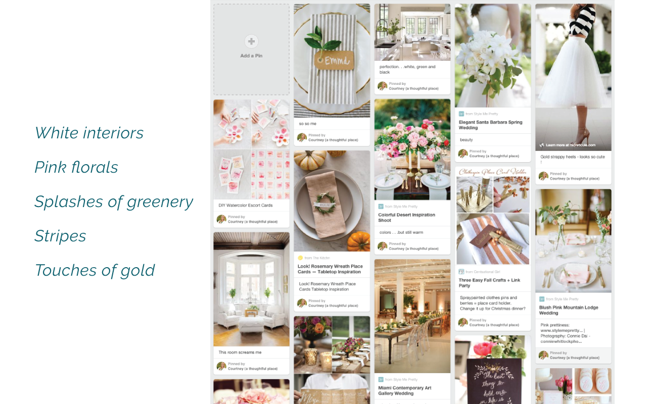
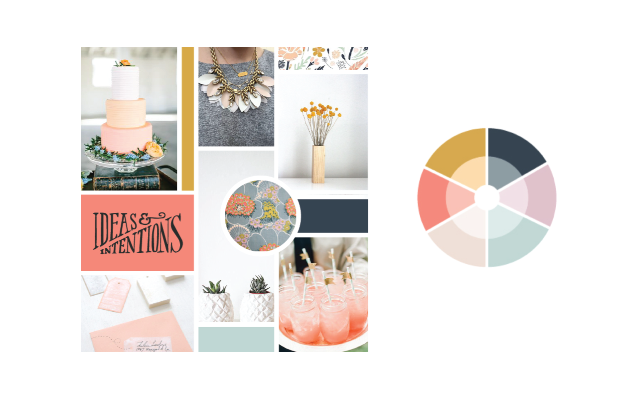
Number two is to look for those similarities among the images to see what stands out. An example, here is a Pinterst board for one of my clients. I scrolled through and I said, "Okay what do these images have in common? What are some common themes here?" White interiors was a common theme. You can see it up here, down here, pretty white linen tablecloths. You see a lot of white space. Pink florals, you can see them popping up everywhere, all these pink flowers. Splashes of greenery all over the place, stripes both up here in this napkin, over here in this place setting so I was seeing tons of stripes and then touches of gold as well, just scattered throughout this board. As I'm going to create this brand, I'm thinking, "White space, pink florals, splashes of greenery, maybe we can incorporate some stripes, maybe some touches of gold here or there in icons," so I'm starting to get ideas for what this brand could look like based on this inspiration board or this Pinterest board.
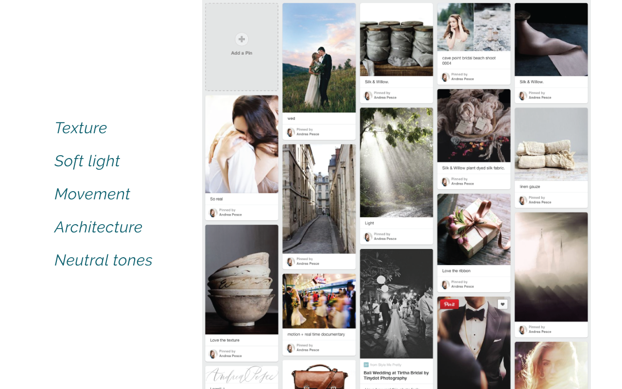
This one is very different. It's kind of moody. It has a lot of texture, both through the ceramic bowls, the ribbon. Down here is a rocky coastline and some fabric and so you can see a lot of texture in this Pinterest board. I'm keeping that in mind, "How could we use texture for this brand?" You see a lot of soft white, movement in these photos, architecture. You can see it in the buildings here so I'm thinking, "Kind of linear, but also some movement, neutral tones.” Okay so texture, soft white, movement, architecture, neutral tones, so I'm keeping that in mind.
Then here for this Pinterest board, this is actually for a client who photographs babies, bumps, and births is her tagline. She pinned a lot of different kinds of images so I looked for those similarities and saw a lot of neutral grays going on, both dark, light, and mid-tone grays. Some bright whites as well in the palette, golds you can see in here and here, even up here. Then there's a playfulness to the board. Her maiden name was Ferris. She put a Ferris wheel here. Here's a storybook, kind of Beatrix Potter look which I thought could be really neat for a storybook kind of theme. You just see youth here as well so those were some common themes that I saw in her board. I'd encourage you after you pin to your Pinterest board, go back through and see some similarities. Even if at the outset, the photos don't seem to have much in common, dig a little bit deeper. You can probably find a lot more similarities than you originally think.
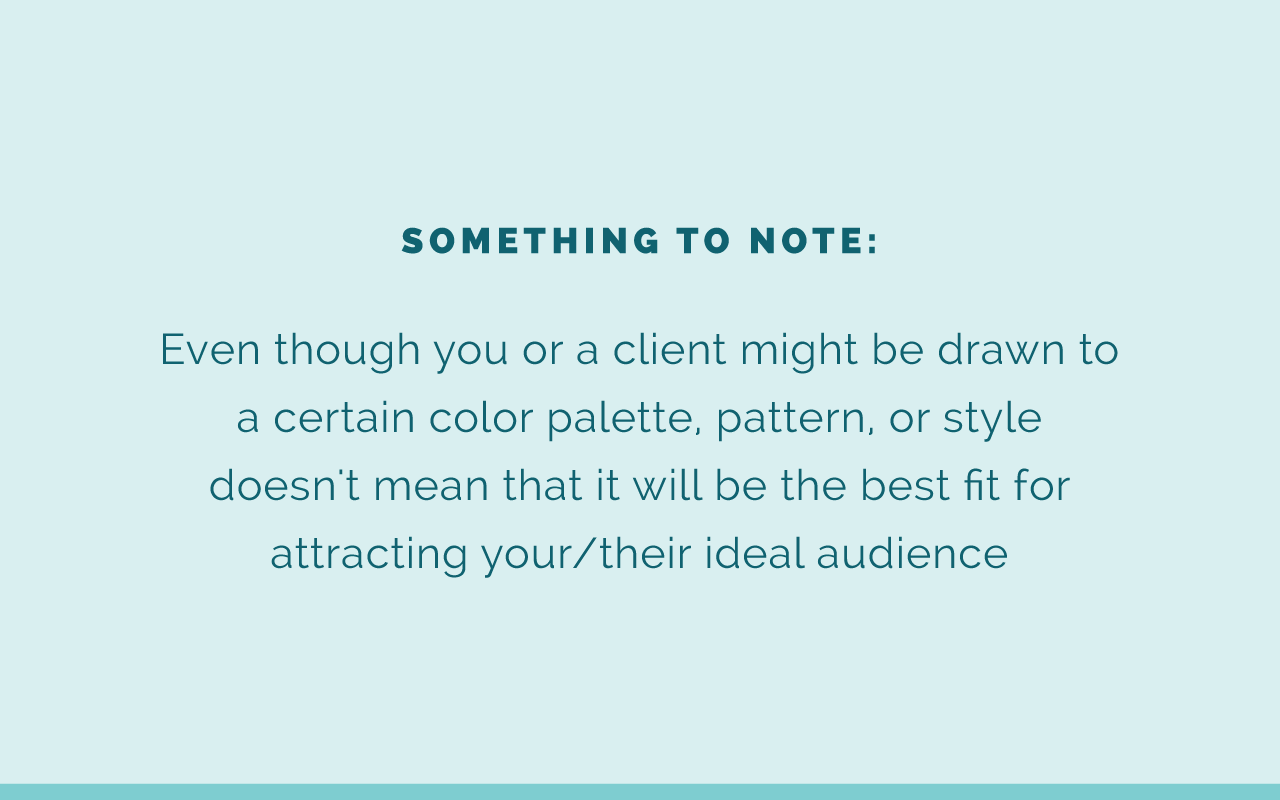
Something to note as well is that even though you or your client, depending on who you're creating this board for, might be drawn to a certain color palette or pattern or style, doesn't necessarily mean that it's the best fit for attracting your ideal audience. As you're pinning, keep those brand keywords in mind. Keep your mission statement in mind and think through use and intention to decide whether it really is a good fit for your brand. I've mentioned this story several times, but it's worth mentioning again. I had a client who came to me and she wanted to do, or she was starting an event planning business trying to attract Southern brides, but she wanted to use her favorite colors, purple and teal. Just because they were her favorite colors and probably she had some Pinterest boards full of things with purple and teal didn't mean that it was a good fit for her audience so we went back through and pared down that Pinterest board and added flesh and navy and pearls and Southern charm into her Pinterest board and built it from there. Do keep that in mind.
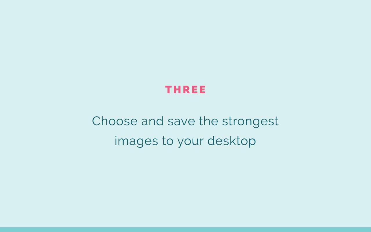
Number three is to choose and save the strongest images from your board to your desktop so you can pull them into a program like Adobe Illustrator and start creating your inspiration board. I save them to my desktop just because that's an easy place to grab them and then I usually save them into another folder or something, but nevertheless just choose the strongest ones off of your board. You don't need to choose every single one. You might have 100 images in there, but I would recommend having more than 20 just to have some to pull from. Then save the strongest images to your desktop.
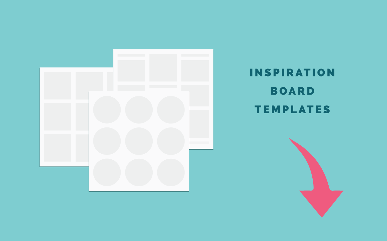
Number four is to pull those images into Adobe Illustrator and arrange them. I'm going to show you how to do that. I'm going to make sure I didn't ... Another thing to note, I just added last week some new inspiration board templates to the Elle & Company Library so they're ready to go in Adobe Illustrator. There's actually four of them and I'll show them to you in a moment. You can use those to get started, pull your images right in, and you'll be good to go.
All right so I'm going to stop sharing this screen for now. Bear with me just one moment and I'll share another screen with you. Let's see. Screen share, all right. I'll share my entire screen with y'all. Okay so, and I'll make this one bigger so you can see it nice and big as well. Sorry for the tunnel vision. All right, hopefully you can see my screen right now. Let me make sure, yeah. We're good.
Okay so underneath here I've created three secret Pinterest boards and this is what I was talking about for the poll, one that's classic and simple. I don't have the 20 images that I told you all about, but I went and grabbed some images. We'll pretend this one is an interior design business. Sarah Scott, I saw that you're in here so I thought you'd appreciate this. Classic and simple so you can see we grabbed some interior photos, some patterns for fabrics, and some other photos as well. That's classic and simple. I didn't utilize the pin descriptions for the sake of time, but you get the gist. That one's classic and simple.
This one is rustic romance. We'll pretend this one is an event planning business, has some sparkles and pinks, some copper, some rustic elements in there as well. You can vote on this in the poll section if you like one more than the other.
Then pretty in pink. This one we'll pretend is a personal lifestyle blog with some fun, pink patterns, travel inspired, fashion inspired. This is what this looks like. Let me go back to the screen and see which one y'all have chosen. All right, classic and simple.
Caroline, you asked where the templates are found in the Library. On the screen there's a green button that says, "Elle & Company's Inspiration Board Templates." You click it. It'll take you to My Library and you can log in. Right here, you should be able to see it right here.
Awesome, so it looks like we're going to do classic and simple, which is great. I'm going to pull up Illustrator. These are those templates that I was telling you about that are in the Elle & Company Library. I'm just going to add another art board so for the sake of demonstration and I'll copy and paste. I'm going to use keyboard shortcuts for the sake of time. We'll just copy and paste it back here. I've gone ahead and saved the images on my desktop so I'm going to open those. We went with option number one. Usually, I just go up to File and Place and just grab all of the images all at once and then click Open.
File, Place, there we go. Now I'll grab all of these. I'll just place them all at once over here to the side. All right, so here are the four to choose from. You can make your inspiration boards look like whatever you want them to look like. I've just found these formats to be really helpful, but we'll go with this one for right now. What I normally do is just play with trial and error to try to create my board. I'll kind of experiment.
This one is a vertical image so I'll just go ahead and place it right up here and kind of resize it and create a clipping mask. I'll just go ahead and Object, Arrange, send this to the back. If I select both of them and then go up to Object, Clipping Mask, Make, it'll clip it right down to that size so it fits well right there in that spot. Maybe to balance it out a little bit, we have some black and white shapes up here so we can put some black and white stripes down here. I'll grab this image and do the exact same thing. I'm going to use some shortcuts for the sake of time and add that clipping mask, maybe move this up a little bit.
I usually try to create some balance. If there's some black and white stripes up here, maybe I can balance it out down here. If there's some blue up here, I might try to add some blue down here. I like using the eye-dropper tool in Adobe Illustrator and I can just come here and grab a pretty blue color right from that photo. I might also want to use this pattern up here so up here in the big image that spans across the top, this one, I'll create that clipping mask. Here we go. Are y'all still with me? Okay, there we go, just wanted to make sure you can still see my screen.
Maybe we can use, I'm trying to see all the images that I have left. I like this chair a lot, but we have some greenery right here. Maybe we'll add this photo to balance out the greens and you can see a little green in the background of this image too. I'm all about balance for the inspiration boards. There we go. Let me also use this chair down here. That works.
You can also adjust these so I might move this in a little bit more so that I can get a full square here and use this ampersand. I'm a fan of ampersands so we'll do that. Maybe instead of these two blocks, I'll make this one larger, delete that second block. I love doing these. This is one of the most fun parts of my job is creating inspiration boards. Oops, zoom in a little bit so you can see it a little bit better. All that's left to do is just pull some more colors in so again, I like to use that eye dropper tool to grab maybe a darker blue. Maybe here we'll grab one of these gray colors, maybe something a little lighter. You'll notice that we didn't use all of the images, but it provides some visual direction. We're already starting to get a color palette. I'm going to go ahead and delete these. Maybe too, maybe I don't want the ampersand there. Maybe I want to see what this looks like instead. I like the look of that too. Maybe the ampersand is better. There we go.
We have our inspiration board. Then if you want to save it, I usually save it as a PNG file or a JPEG so I'll come up to File, Save As, and oops, sorry. File, Save for Web. I'm going to optimize it, art optimize it, save it 1,000 by 1,000, and I'll save it as Inspiration Board Example, My Desktop, and it's good to go. I can pull it up from my desktop. We can see what it looks like not on the portal. There we go. Here is the inspiration board that we just created.
If you know how to use Adobe Illustrator, this is really simple just to go in and create clipping masks. If you don't know how to use Adobe Illustrator and you want to learn how to use Adobe Illustrator, I have my annual course coming up so I'd be happy to share more details about that as well. It's great not only for inspiration boards, but also for any other part of your brand and for business, creating your logo, doing multiple page PDFs for things like workbooks. You can use Illustrator for just about anything.
There is the demo for creating an inspiration board, but now I'm going to stop sharing my screen again. Evelyn, how do you save only one art board as a PNG file? You just select it and then go to File, Save for Web, and it'll only allow you to save one art board at a time, super helpful.
All right so, I will try to get back to the questions in just a second, but I'm going to share my screen again for those slides.
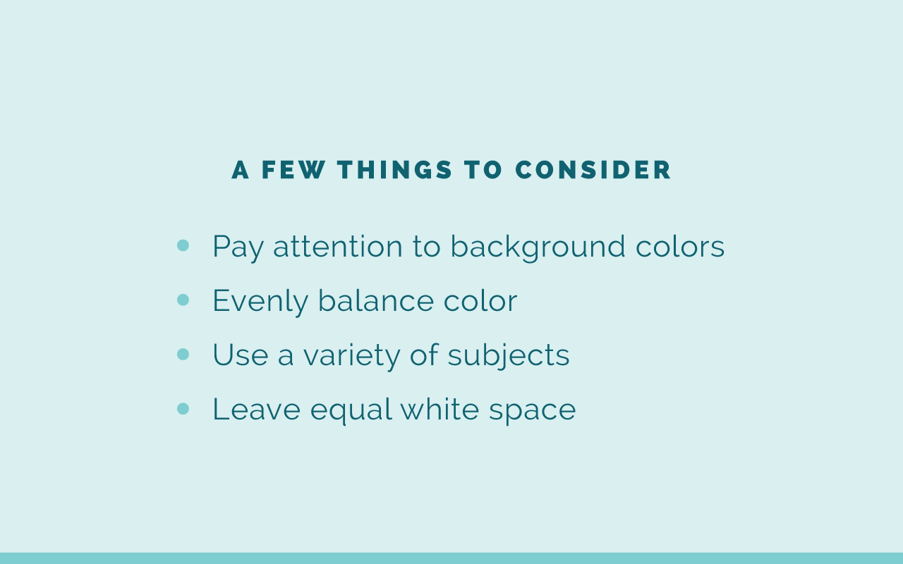
A few things to consider and you may have seen this when I was demoing the inspiration board. First, pay attention to background colors. They are just as important as the foreground colors. If you have some crazy background colors, your board isn't going to look super cohesive so keep that in mind. Evenly balance color. If you have a little blue on one side, you might want to choose a color with blue on the other side just to make it look visually cohesive. Use a variety of subjects that make sense for your business. Like I said, don't just choose images just because they look pretty and leave equal white space. In those templates I just shared with you, it already has equal white space around it, but it's good to create some separation between the images, instead of just stacking them on top of each other, or side by side.
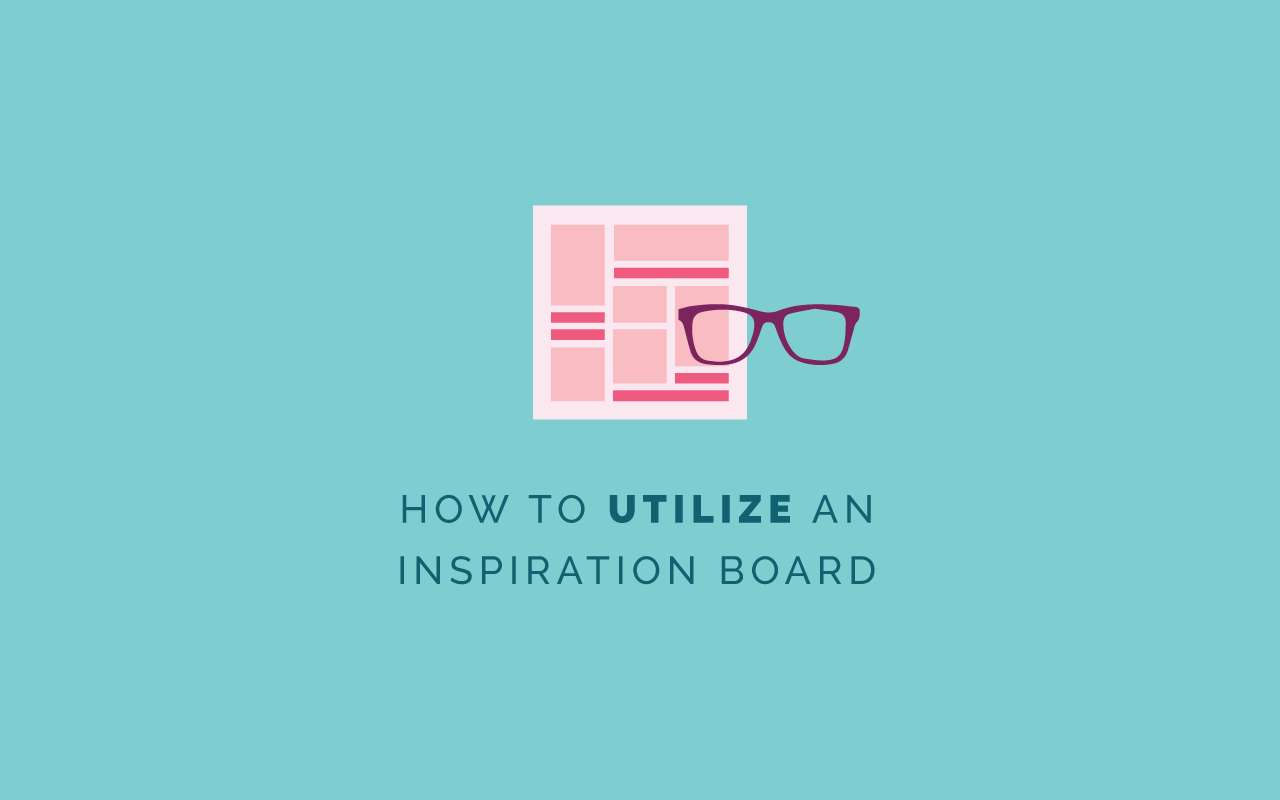
How to utilize an inspiration board, so we've covered how to create one, but now that you have an inspiration board, how do you utilize that inspiration board for your brand? I have a few helpful tips, hopefully helpful tips, for you. The first is to refer back to those similarities and look for the common themes like I told you about. Go back and see what does this board have in common? What do the images have in common?
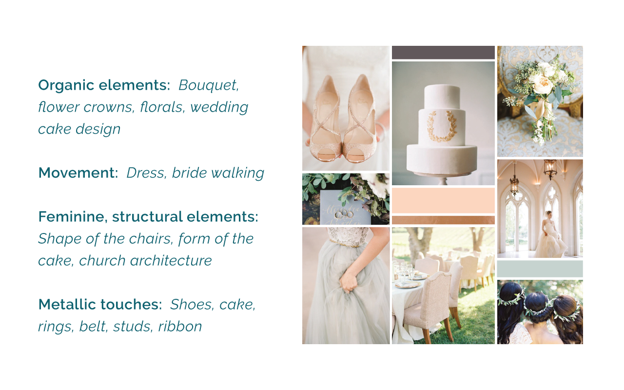
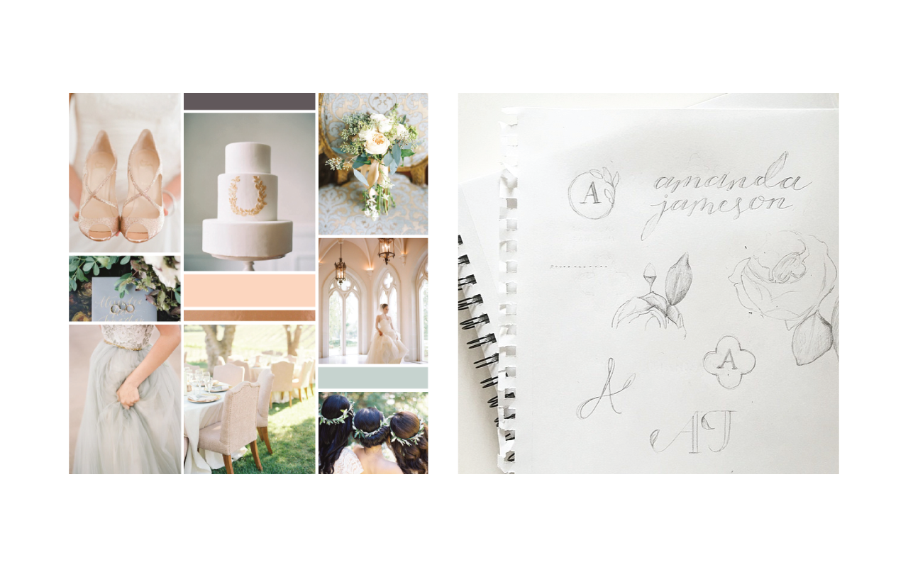
For instance, going back to this brand, or this inspiration board for Amanda Jameson, I noticed a lot of organic elements in her board. You can see that through the bouquet here, even this design on the cake. You can see it here. There's some flowers and leaves and for the flower crown, so I'm taking note of there's a lot of leafy greens and organic elements. There's also a lot of movement. This woman is walking and her dress is kind of flowy. You can also see the bride here is walking and so there's some movement in this board.
Feminine and structural elements. This brand is very feminine with the shoes and the dresses, but you also have some structural elements in the shape of the chairs. You can see there's this neat detail. Let me make this bigger for you guys too. I'm sorry, so you can see it a little bit better. Hopefully that helped. Oops, all right so the church architecture too has some feminine flair to it.
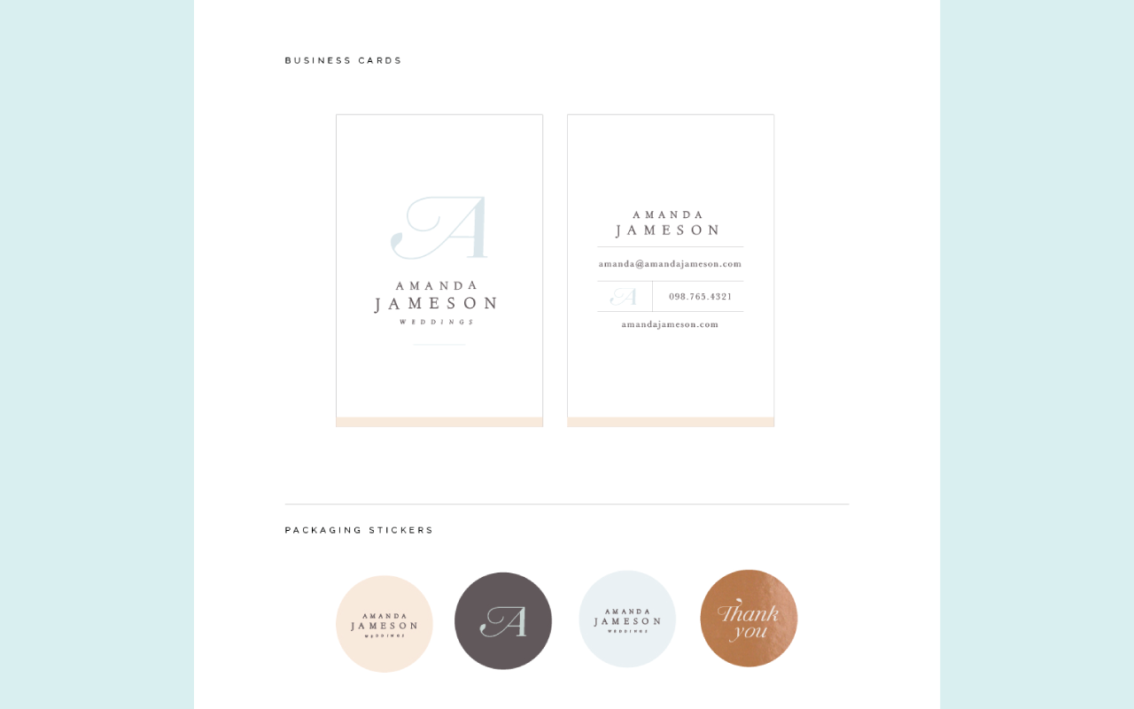
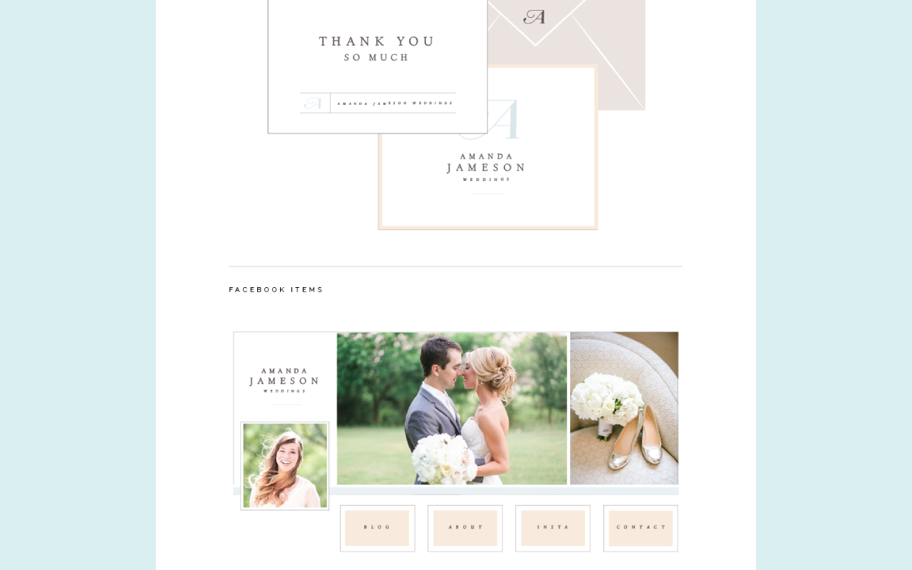
Then there's some metallic touches. You can see it in the shoes. They're sparkly. There's even gold on the cake. The rings are metallic, the belt of the dress so I'm picking up on all of these different themes in the board. Then this is what we ended up with for Amanda's brand. You can see there's structural elements through the A, but there's also some of that movement and a little tiny leaf that mimics that organic element of her board. Then we also brought in some metallics. These were stickers. She sent out client gifts and so these were packaging stickers and we made one metallic, which was kind of fun. You can also kind of see some structural elements, even in the way that we designed the business cards and the way that we stacked the text on top of each other. Again, these were some collateral items for Amanda.
Two, pull from those similarities and start sketching out logo concepts. When I sit down to sketch those, I have the board right beside me as I'm sketching. You can even see this little A with the shape around it. That shape came from the architecture in this image. The leaves came from all the leaves in here on the board. I was even sketching out florals from the bouquet and trying to incorporate leaves into her name, just with the flowy text. You can see how I'm using this board to kind of inform the choices I'm making even in sketching out the logo concepts. Down here is kind of what we went with. I combined the two letters into one, but even with your sketching, look back at that board and look for shapes. Look for elements of the board that you might be able to pull into the logo.
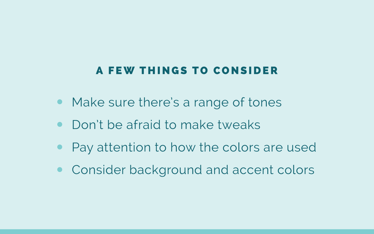
Number three is to create a color palette. The inspiration board is extremely helpful for coming up with a solid color palette and a few things to consider when you are pulling together a color palette is to make sure that there's a wide range of tones. I talked about this in the brand challenge. You want to have light colors, mid-tone colors, and dark colors just for some contrast. That'll really come in handy as you build out your brand. Don't be afraid to make tweaks to the colors. Just because you may have pulled out a color in your inspiration board doesn't mean that it's the perfect color. You can go in and make tweaks to it. If it's blue, you might want to add a little green to it and so on.
Pay attention to how the colors are used and if some colors in your board are used a lot and if some are just used in small doses, that'll be helpful. Maybe the ones that are used a lot will be your primary brand colors and the ones that are used sparingly can be your secondary brand colors. Then consider your background accent colors too. Don't just think about what color the images are in the foreground, or the subject matter is. Think about background colors and that sort of thing too and how you might be able to incorporate those into the branding.
For example, Prairie Letter Shop was one of my clients. This was her brand board and so we pulled out the navy blue here, that yellow color that was seen time and again in some of these images, the pink, but also there was a little bit of purple here in this image here and also kind of in the necklace so we pulled that one out as a secondary color. The blue, you can see it here and there sparingly. We pulled that one out. Then as kind of just softer neutral, I pulled out this off-white, tan little pinky color there. I don't know what to call it. You all can come up with the name for it, but I kind of saw it here and there in these images and pulled that out as well. You can get creative with it. You don't just have to pull from the color blocks that you have.
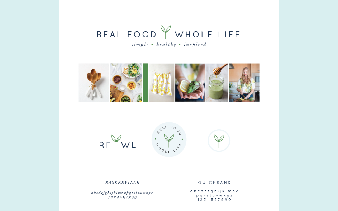
Number four is to choose fonts and other brand elements based on the overall theme of your board. You don't have to use every single element in every single spot on your board, but think about the overall theme. For Real Food Whole Life, this was her board and it was very clean and streamlined. You can even see that in her graphics, so we just kept things really simple and I'm really thrilled with how this brand turned out. Robin was great to work with.
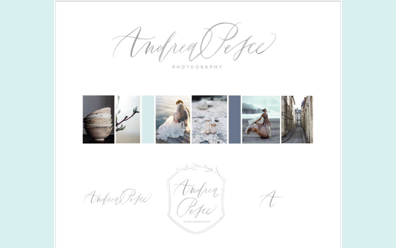
Same thing for Andrea Pesce, hers was that moody Pinterest board that you saw earlier. It had a lot of movement and so this logo was perfect for her, but then in a secondary logo we kind of brought some of that structure in with kind of a crest and we played off the branches that you can see here in the board as well. You can use it elsewhere throughout your brand.
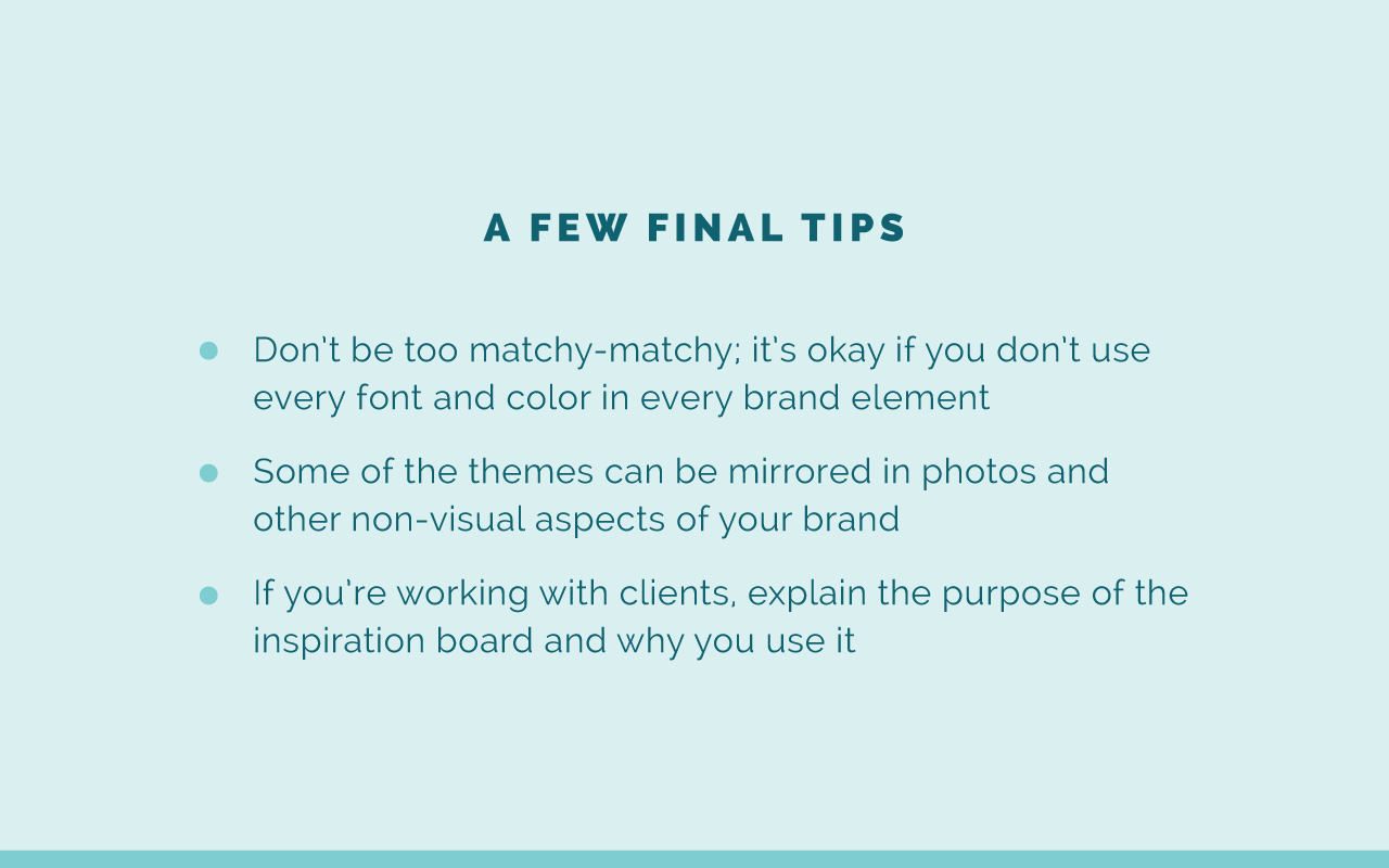
Then just a few final tips on inspiration boards before I try to answer some questions before our time is up. Number one is to not be too matchy, matchy. It's okay if you don't use every font and color in every brand element. Some of the best brands are curated so everything doesn't match exactly. Don't worry about that with your inspiration board. Sometimes it's good to have that collected look. Some of the themes can be mirrored in photos and other, non-visual aspects of your brand so don't feel like you have to use green if you're using a lot of greenery.
If you remember with Amanda Jameson's brand, we can see that we didn't use green in her brand colors, but you can see green elements all around it. She had a lot of green. Actually, she photographed a lot of outdoor weddings so green was already seen all throughout her website and collateral materials when we incorporated her images. Don't feel like just because there's a color that you see often in your board that you have to make it one of your primary brand colors or even secondary brand colors. Some of your images might bring in those colors so keep that in mind.
Then lastly, if you're working with clients, be sure to explain the purpose of your inspiration board and why you use it. A lot of clients are really confused, I've found, about inspiration boards. They don't know the exact purpose of the inspiration board and so they will nitpick every image that you've chosen. Instead, you just need to explain, "Here's my inspiration board. Here's how we use it. I use it as a visual starting point. I keep it by my side as I design the rest of the project and it's really just for the overall look and feel of the board." I wouldn't say this to clients, but say it to you. You don't have to nitpick every single photo in there because nobody else is going to see it. It's just that visual starting point.
Those are my few final tips, but I'm going to close out this window and start answering some questions. The first, and I'll try to get through as many as I can in the next seven minutes before the next Ellechat starts. Mckenna, hopefully I'm not botching your name. She asks, when you're pinning to a Pinterest board for inspiration, what kind of topics and keywords should you use in your search to find relevant images? It depends on your industry. For me, I love bright colors. I would go for stationary and desk space, like desk office photos and start there and just look through what boards I've already hit or pins that I've already pinned to my boards and start there and then go and look in a related pins section.
If you're an interior designer, you probably have pinned a lot of interiors so start there as well. Look for fabric patterns and that sort of thing. You might even find pinners whose style you really like and they might have some good boards with pins on them. I would just encourage you as you are on Pinterest, if you find good photos, pin it to your board. As you're searching around, you might come across pins. I'm trying to collect more and more just inspiration photos for my Pinterest boards and I need to go back and share those three that I shared with you all today and you're free to pull from those as well, kind of a hodge podge there. If anybody else has found other ways to come across relevant graphics, feel free to share it in the comments, but that's what I would suggest, good question.
Yari asks, “do you ever get a client whose responses to your questionnaire don't match up to what they're collecting on Pinterest? Thoughts on how to proceed there.” Yes, that has definitely happened on several occasions. That's what's really interesting. I would go back through and pin to the board as well and see if there's any similarities between what you've pinned. I feel like as you read over client homework and questionnaires, especially if you've done a good job of what you're including in that questionnaire, you'll have a really good idea of what would be appropriate. Sometimes I will hardly use any photos from what a client has pinned to their Pinterest board and I'll just go back through and pin some images of my own. As a designer, I'm always pinning to secret boards just for future reference if it would come in handy for a client. Just explain and hopefully they'll like your direction too if you're able to explain why we chose certain images and color palettes and that sort of thing, but great question. I hope that's helpful for you, Yari.
Sarah asks, “where do you find the photos for your inspiration boards? Do they need to be royalty free to display on your website as part of a case study?” This is something I've just gone on Pinterest and pulled images. You might link so if you share the inspiration board, if you're just going to share it between you and your client I don't think it's a big deal. You're not publishing it anywhere. You're not technically getting paid for it, although it's part of your process. It's not like you're selling them the inspiration board. You're not selling them the images. If you aren't planning on sharing it with anybody else, I would say you don't need to worry about it. If you are going to share it on your blog, maybe you can keep a link to all those Pinterest pins and just underneath the image give credit there for the photos, but that's what I would do, Sarah. That's a great question. That would be a good question for Christina Scalera for legal advice on that question.
Joe asks, “how can I protect my business when it comes to sharing photos from Pinterest that I don't legally own the rights to? It's a common theme here. Is there a way around this when they are just part of an inspiration board?” Again, I would recommend if you're not sharing it with anybody, it shouldn't matter. You're not selling the inspiration board. If you're going to post it to your blog, I would just put the attribution underneath the image of the inspiration board. Maybe you could even do it back to the Pinterest pin or you can follow that pin and see what website they got it from and share that. That's what I would recommend.
Gabbie says, “do you ever experience restlessness in regards to branding? When is it a good time to rebrand?” That is a great question. Yes, sometimes I do get restless, but I know that if I just stay consistent it will create brand recognition and it will pay off in the long run. I think that it's also important to have a timeless brand and when you're choosing especially your logo, maybe once in a while you can add an accent color in there.
A lot of times I'll create new icons or something like that if I'm getting a little restless and it's still in keeping with my brand, but it's not a complete overhaul. It's a good time to rebrand if you feel like you aren't attracting your ideal clients. If you're not attracting the type of people that you want to work with or who are going to buy from you, then it might be a good time to rebrand, but I definitely don't encourage rebranding every year. I think it's maybe every 5, 10 years and it's good to invest in a good designer who can give you a brand that you won't have to rebrand every couple years, so great question.
All right, guys. Sorry that I didn't through all of them! You can grab the inspiration board templates below and if you go to elleandcompanydesign.com/courses if you want to know more about that Illustrator course, I will be sending out a special surprise to everyone on my waiting list for the Adobe Illustrator course that is launching in just a couple weeks. If you're interested, it's only offered once a year. This is a fifth time offering that Adobe Illustrator course so feel free to go there and sign up for the waiting list and for more details.
Thank you all for tuning in today. I hope that this was helpful for you! See you soon, guys. Bye.
Have you created an inspiration board for your brand? How have you used your inspiration board to create other elements of your brand?


