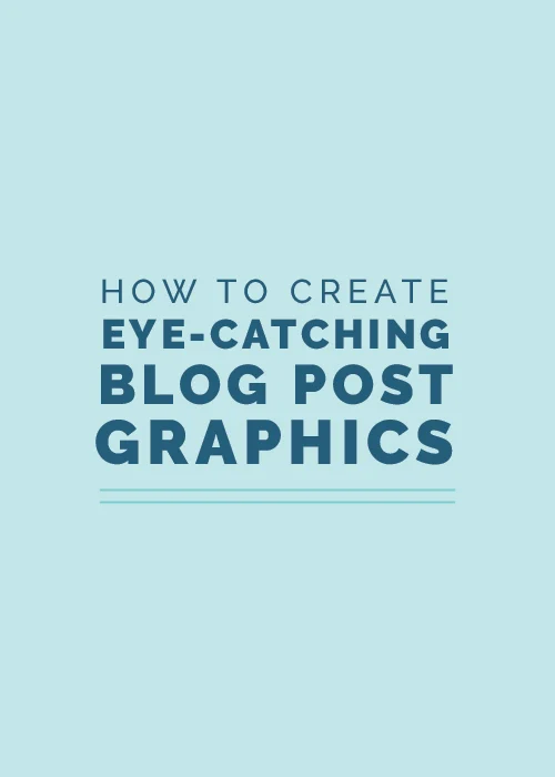
First impressions are crucial, especially in business.
Potential customers and clients make judgments about your business within the first few seconds of coming into contact with it, whether it’s through your website, your social media accounts, or a simple blog post graphic.
And those initial thoughts - whether they’re spot on or far off from what you want them to be - are within your control. You have the opportunity to make a killer first impression through high-quality, branded visuals.
If your blog is a large part of your business or you’re hoping to drive more traffic back to your site through your blog, you have to have eye-catching blog graphics to not only generate a positive first impression, but to encourage readers to share your posts on sites like Pinterest and be seen by an even wider audience.
So how do you create eye-catching blog post graphics? And better yet, how can you set them apart so they’ll stand out from the rest and be recognized time and time again?

First up, a few design pointers
1 | Go easy on the text
One of the key benefits of using blog graphics is to quickly catch the attention of potential readers.
Studies show that visuals are processed 600,000 times faster than text, so let your visuals do the “heavy lifting,” whether it’s by including a photo background or an illustration/icon that hints at the content in your post.
Highlight your catchy blog post title to give people an idea of what they’ll be reading when they click on your graphic, but go easy on the number of words you include in your blog post graphic.
Use taglines sparingly and when you do use them, keep them short.
2 | Create consistency
Consistency is they key to professionalism; people equate high-quality, branded graphics with a high-quality, branded business.
So set color, type, photo, and layout guidelines for your blog graphics.

Consider what color your type will be on photo backgrounds and what color your type will be on flat color backgrounds. What elements of your graphics - lines, patterns, etc. - will be included in every graphic? What will you try to change or differentiate between each graphic? Will you take your own photos or use stock photos?
Answering these questions ahead of time will not only create consistency, but it will make it easier on you each time you need to create a graphic for a new post.
And as a result, your audience will begin to recognize your posts when they pop up on Pinterest, Bloglovin’, and any other platform where your graphics will be shared.
3 | Utilize negative space
One of the keys to professional-looking, eye-catching blog graphics is utilizing negative space.
Negative space is the area in your graphic that’s around your subject; it’s the “empty” area in an image.
When you’re using photos in your blog graphics, it’s always wise to place your text in the negative space to make it more legible and easier to see. If you lay text right overtop of your subject, it isn’t easily decipherable at first glance.

You should also be aware of the negative space around your graphic and leave some cushion around the edges to give a viewer’s eye a place to rest. For some reason it makes us all subconsciously uncomfortable when text is too close to the edge in an image, so provide a little room.
4 | Stick with square or vertical layouts
Size and layout are key in order for your graphics to catch the eye of potential readers.
While each social media outlet displays images differently and has their own unique optimal size for images, you can stay on the safe side by using a square or vertical layout for your blog graphics.
On Pinterest, especially, vertical formats display larger in the newsfeeds of potential readers because the columns constrain the width of the graphic. So horizontal images shrink down while images with a square or vertical format appear larger.
Keep that in mind as you create your blog graphics. You might choose to use one vertical format across the board or come up with different templates to accommodate each optimal size for your social media outlets.
5 | Pay attention to file types
Saving a graphic in the wrong file format has the potential to make it look fuzzy and unprofessional, so be sure you’re saving your files correctly.
If your image includes a photo, save it as a JPEG at high resolution and use the Art Optimization setting.
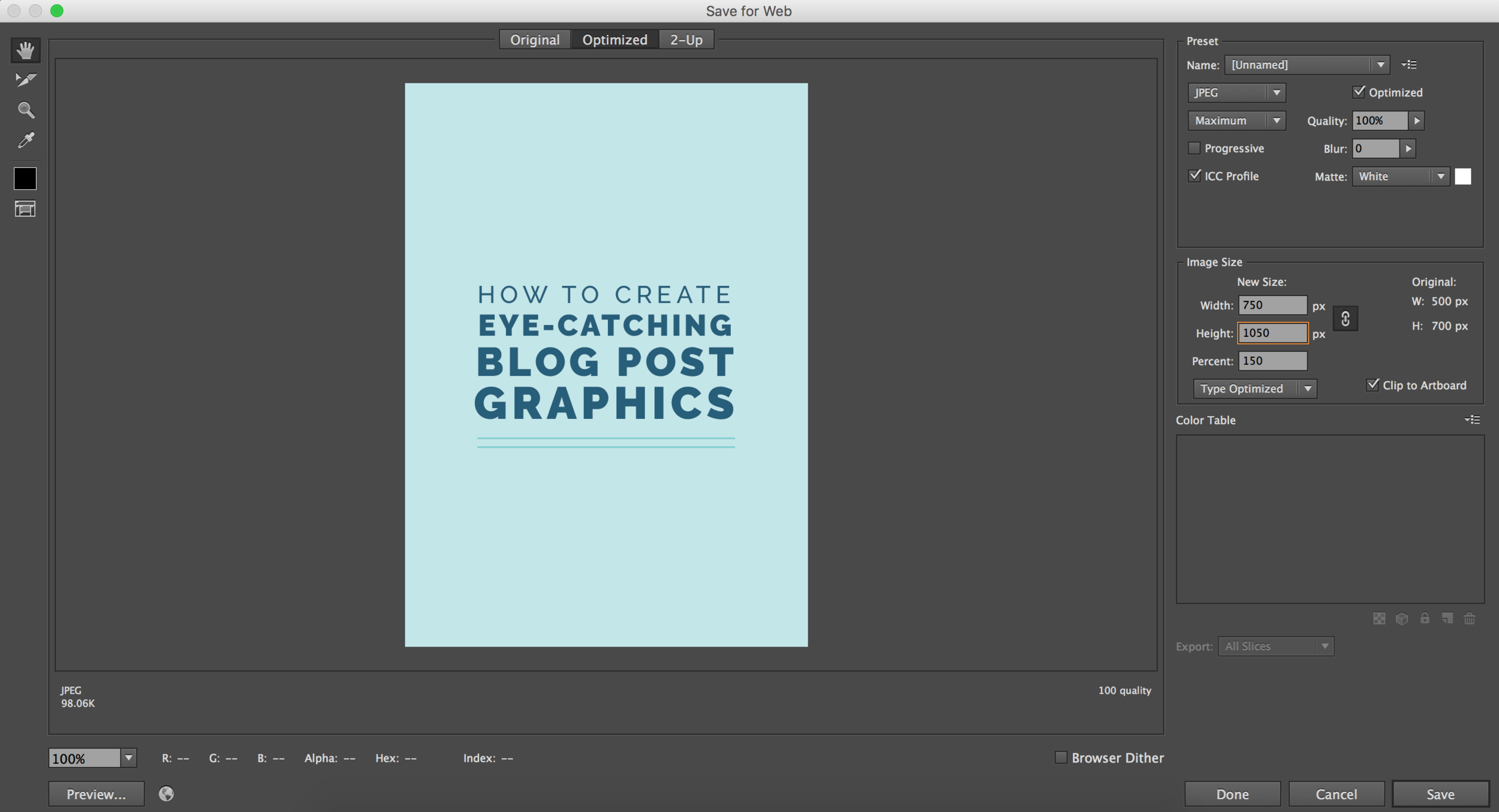
If your image is mainly text, save it as a PNG-24 or a JPEG at high resolution and use the Type Optimization setting.
6 | Strive to be different
You’re a creative entrepreneur, so this one’s a given.
In order to demonstrate that you’re innovative and separate your graphics and your brand from every other graphic designer, photographer, interior designer, etc. out there, don’t copy what’s been done before; come up with your own style.

Copycats will never have graphics that look quite as good as the originals; they can’t pull it off quite as well.
So don’t look to what’s already out there. Utilize your own creativity and break the mold.
Now let’s talk about tools
Adobe Illustrator
Adobe Illustrator is my personal favorite because it’s the most customizable.
The possibilities are endless with Illustrator; you can manipulate text, add illustrations, crop photos, draw patterns, and access your vector logo all in one place.

You can also create templates, which saves a lot of time in the long run. Simply switch your colors, change the text, and/or drop in a photo and you’re good to go.
Canva
If you don’t have experience with Illustrator and you feel a little intimidated at the thought of designing graphics from scratch, Canva is a great resource. Its pre-made templates make creating blog graphics quick and easy.

While other bloggers and businesses might use the same layout, you can switch things up with your consistent brand colors, fonts, and photos.
The Elle & Company Library
This option combines the two above. There are now 4 different blog graphic templates in the Elle & Company Library, both in square and vertical formats!

Simply download the file, open it in Adobe Illustrator, customize the fonts and colors, add your blog post title, and save.
Lastly, split test your graphics to see which receive the most engagement
If you want to see the highest return and engagement from your blog post graphics long-term, conduct some split testing.
Create 2-5 different blog post graphics with different colors, layouts, etc. and post them all to your social media platforms to see which receive the most engagement.
Platforms like Facebook, Pinterest, and Twitter allow you to take a peek at your analytics to see which posts get the most click-throughs and impressions, so use that data to determine which graphics are the most successful and eye-catching among your audience.

Once you’ve experimented and come up with some solid results, you can use that blog post format and style over and over again to achieve the best results and interaction.
Eye-catching blog post graphics have great potential to create a positive first impression, drive more traffic to your site, and bring in more sales and bookings in the long run.
How do you currently create your blog graphics? How do you maintain consistency and differentiate yourself from all the other blog graphics out there?