
Creating a brand can be a little overwhelming at the outset. With so many details to pull together - colors, fonts, patterns - it can be difficult to know where to start.
That’s where an inspiration boards comes in.
An inspiration board is a collection of images and color blocks that provides a starting place for many designers at the outset of a project.
While many of them are gorgeous and well-curated, inspiration boards are more than just a pretty collection of photos.
By coming up with an inspiration board at the outset of a project, designers are able to give their clients a visual representation of what they have in mind for their brand before they get started on it, just to be sure they’re on the same page visually.
These boards help create consistency throughout the entire branding process and make it easier to arrive at an appropriate outcome.
I shared a post last year on how to create a clean and cohesive inspiration board, but today I’m walking you through how to utilize an inspiration board throughout the entire scope of the branding process.
Whether you’re working with clients on the design of their brand or you’re building your brand from scratch, this post will help you create consistency from start to finish.
2 free inspiration board templates

Use these 2 Adobe Illustrator templates to create an inspiration board for your brand or for your clients.
1 | First, look for similarities and overall themes
Consistency is created by looking for common themes.
So before I start developing a color palette or creating a logo, I search for similarities among the photos I’ve chosen for the board.
Often times I’ve already made note of those similarities as I select photos for the inspiration board, but I always find other repeating shapes, objects, patterns, etc. that aren’t quite so obvious when I take the time to look for them.
The commonalities might be color, shape, texture, structure, typography… The possibilities are truly endless and vary from board to board.
For example, this inspiration board for Lori Hedrick Photography has several similar elements.

First, the imperfect charcoal gray lines. You can see them in the ribbon in the top left photo, the pattern in the circle, and the pencil drawing of a female silhouette.
Next, the natural wood and woven basket elements. The chair, the bracelet, the baskets, the plant holder, and even the belt the woman with the green jacket is wearing are all similar.
There’s also some structure in the photos, seen in the box, the clean lines of the bathroom, the plant holder, and the green trellis pattern.
As you look for similarities among the photos, you’ll begin to notice key elements and overarching themes that can be carried into the design of your brand.
This board for Amanda Jameson Weddings has several overarching themes that we carried into her brand.

There are several organic elements in this board - the bouquet, the flower crowns, the florals in the ring image, and even the design on the wedding cake. I knew that I would need to incorporate some sort of leafy element to Amanda’s brand, whether it was in the logo or a pattern.
Movement was another key element, seen in both the dress in the bottom left photo and the bride walking in the middle right photo. I knew I could replicate that through soft organic lines in some aspect of the brand.
Another thing I loved about the board were the feminine, structural elements. The shape of the chairs, the form of the cake, and the church architecture provided some forms that could be used in icons, patterns, or even the logo.
And lastly, there were some metallic touches throughout the inspiration images, which could be incorporated in the color palette, packaging, or even a signature pattern.
You might recognize some of those elements in the final outcome of Amanda’s brand:
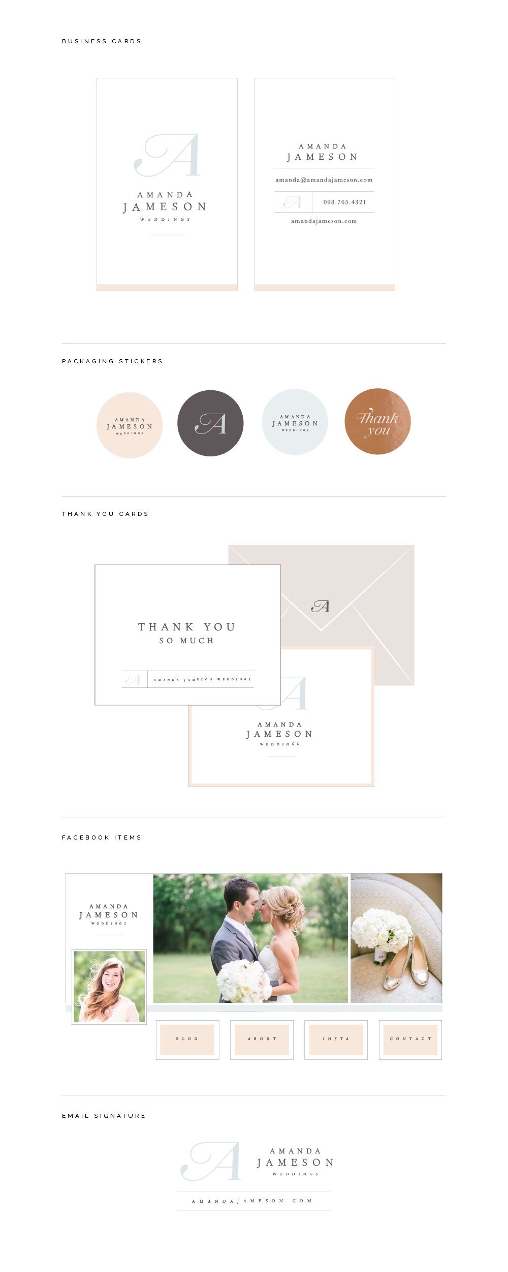
The leaf in Amanda’s logo brought in an organic element, the rounded lines of the logo brought in the movement, the straight lines and varied weight of the “A” brought in structure as well as the stacked serif font in the logo, and we added a touch of metallic in the shimmery copper packaging sticker.
Do you see how simply looking for similarities brings out the key elements of the board? They may not be super noticeable at the outset, but with a little creativity and attention to detail, you’ll find them.
2 | Pull from the different elements to design a logo
After I’ve taken note of the similarities in the board, I get to work designing the brand.
And I always start with the logo.
Keeping the inspiration board by my side, I sit down with my sketchbook and a pencil and began to sketch out ideas, based on the shapes and elements I already took note of a moment ago.
I stay away from my computer or any other distractions and let my imagination run wild.
Sometimes I sketch out a unique form or shape that I found in the board. Sometimes I take the letters of the business’s name and try to add one of the elements of the board to it (like Amanda Jameson’s logo).

The purpose of this crucial step is to get all of my thoughts and concepts on paper.
No one sees my sketches and there’s no pressure to find the perfect solution right off the bat. I don’t erase, because sometimes I’ll come back to a promising concept that I may have tossed out at first glance.
I take breaks once in awhile to gain a fresh perspective and try to fill up at least a couple pages with ideas. Which may seem a little extreme but the more options I have to choose from, the better (and you would be surprised at how many you can come up with if you just give yourself the leeway to make mistakes and get creative).
I go back through the sketches, highlight the best concepts (making sure they line up with the direction of the inspiration board), and then take them into Adobe Illustrator to digitize them.
I keep the concept in black and white during this stage to make sure that I’m more focused on the form and shape of the logo rather than getting wrapped up in color. That comes next.
3 | Create a color palette
Once I’ve come up with a solid logo concept that incorporates some of the major themes of the inspiration board, I move onto developing a color palette for the brand.
The color blocks used in the board come in handy for this step, but they often need to be tweaked and refined.
When I’m pulling colors from the board to create a color palette, there are a couple things I keep in mind.
First, I want to make sure there’s a range of tones.
One sure-fire way to make your brand look washed out and amateur is to overlook this step of creating a color palette. In order for your brand colors to function well together and look professional, your palette needs to include at least one light color, one midtone, and one dark color.
This inspiration board for Emily Gerald Photography includes white and light gray (light colors), gold (midtone), and charcoal gray (dark color).


This inspiration board for Prairie Letter Shop includes white, a soft seafoam green, and lavender (light colors), a peachy pink and mustard yellow (midtones), and navy blue (dark color).


By pulling out a range of tones for your color palette, you’ll create balance and contrast throughout the remainder of your brand.
Next, consider how the color is going to be used in the overall brand.
Great brands function as a system. Designers use intention in how they choose and use certain colors; they set standards.
For example, in this brand for Jen Neal Photography, I developed a system for her brand colors.


On navy, light gray, and hot pink backgrounds, the logo is always gold. But on a blue background, the logo is navy. The floral pattern is only seen in the lighter blue on a navy background, and pink should be used in small doses like thin borders.
By creating a system for the colors at the outset, I was able to create consistency throughout the entire brand (and make things easier on my client and myself in the long run when we developed the website and collateral items).
So keep this in mind when you’re pulling colors from your board.
You can use the eyedropper tool in Illustrator to extract colors from your photos, but feel free to alter them to make them blend well with the overall direction of the brand. It doesn’t need to be too matchy-matchy, but it does need to be consistent.
4 | Choose fonts and other brand elements based on the overall theme
Elements of the inspiration board also help you make decisions on the types of fonts you should use for the brand you’re developing.
If there are a lot of clean lines and structural elements in your board, you might choose a clean, modern sans serif font.

If there’s a lot of movement and soft, feminine elements in your board, you might choose a script font.


Those same characteristics will also help you choose and create other design elements in your brand, like patterns and icons.
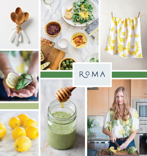
In this board for Christina Fox, I pulled from the thistle painting and plant illustration to create a custom pattern for Christina’s website and collateral items.


So continue to look to your inspiration board at every step of the process to gain ideas and ensure that every individual aspect of your brand stays consistent. From your logo to your patterns, your board will come in handy and keep you on track.
A few extra tips
- Don’t be too matchy-matchy; it’s okay if you don’t use every color/pattern/font in every brand element. The best brands are made up of elements that look collected and curated.
- Some of the themes and elements of the board can also be mirrored in photos and other non-graphic aspects of your brand. You may not include the greenery and plants in the inspiration photos in your logo or color palette, but you can include them in the photos on your website. You may not include the wood tones in your brand, but you can include them in your packaging. Continue to look for and incorporate the similarities you find in your inspiration board into other areas of your brand.
- And if you’re working with clients, be sure to explain to them what the purpose of an inspiration board is and why you use it. Sometimes they can get confused and take the board very literally, which usually leads to several revisions and frustration. Make sure they know that it’s purely for inspiration and to ensure that you maintain visual consistency throughout the scope of the project.
2 free inspiration board templates
Use these 2 Adobe Illustrator templates to create an inspiration board for your brand or for your clients.
Inspiration boards are crucial to the overall success of a design project. They provide a starting point and visual direction, help generate new ideas throughout the scope of a project, and keep you on track to develop a consistent, cohesive brand.
Have you developed an inspiration board for your brand? How did you utilize it?


