
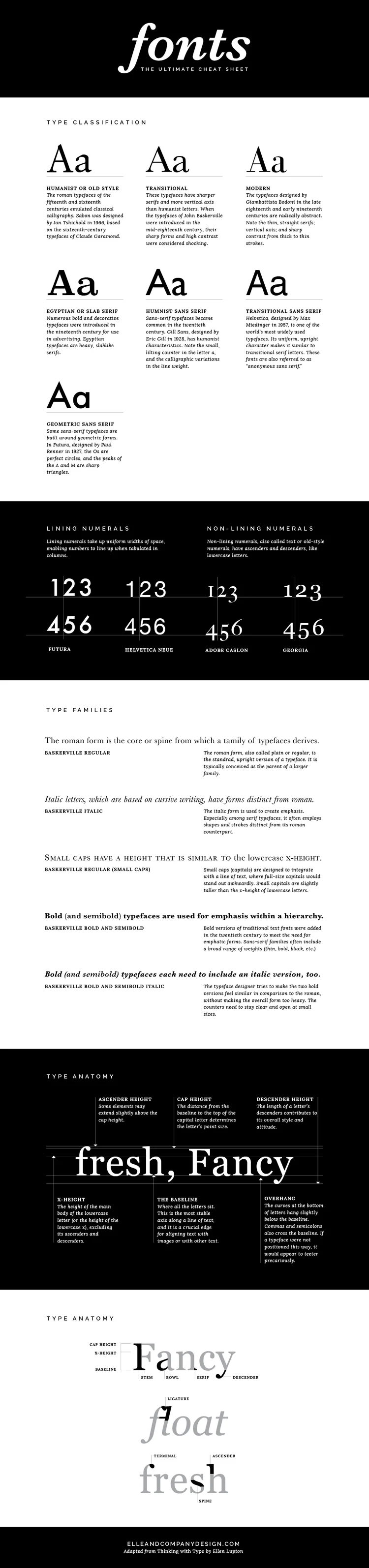
Fonts are everywhere. You see them hundreds of times each day, whether they're on the label of your shampoo bottle, the date on your lock screen, or the road signs you pass on your drive to work. And whether you realize it or not, fonts are just as important to design as colors and composition. There are reasons why some fonts pair well together and others don't; why some fonts seem trustworthy and classic and others feel sleek and modern; why certain fonts are easier to read or why some catch your attention before others.
As bloggers and business owners, it's important to have a knowledge of fonts for several reasons:
- Branding. Whether you've designed your own logo or you're working with a designer on the details, it's important to have a background knowledge of type to ensure that your brand will accurately portray your business/blog and attract your ideal audience.
- Online presence. Website text, blog graphics, even your email signature - the fonts you choose on all of these items determine how your blog or business will be received by your audience. You can come across as sophisticated, trendy, sloppy, friendly, or indifferent just by the fonts that you choose.
- Professionalism. As an entrepreneur, it's important that you appear to know what you're doing. Being well-versed in design is an asset, because no matter what you're field is - culinary arts, fitness, floral arrangement, photography, (fill in the blank) - design affects your business in some way. Whether you're putting together a promotional graphic for social media or coming up with holiday signage for the doors of your shop, font choices have a large affect on how professional you will appear to your customers and clients.
If you're a designer or just a creative business owner or blogger who enjoys learning new things, these basic typography terms that will expand your knowledge of type.
Was this post helpful for you? Which items did you already know and which ones had you never heard before?


There are a couple designer secrets that aren’t often shared when it comes to choosing brand fonts.
The first: Steer clear of using your logo font throughout the rest of your brand (unless it’s a secondary font that you’ve used for your tagline). This makes the logo distinct and keeps it from getting lost among other text on your website and collateral items.
The second: Give each brand font a “job.” Choose one font for your headers, one font for your body text, and maybe one other accent font (maybe). This streamlines your brand by creating consistency.
But even after learning these secrets, you might still have some questions about brand fonts.
How do you go about finding, choosing and pairing fonts that will accurately represent your business and appeal to the right customers?
I’ve got you covered.