

As a designer, I'm frequently asked which fonts I use and prefer. So today I'm rounding up some of my favorite serif, sans-serif, and fun fonts along with links so that you can download and make use of them, too!
Serif font - a font that has a small line attached to the end of a stroke in a letter or symbol

Garamond // St. Marie Thin // Josefin Slab // Vidaloka
Lora // Sanchez // Merriweather // Copse
Sans-serif font - a font that does not have the small projecting features called 'serifs' at the end of strokes
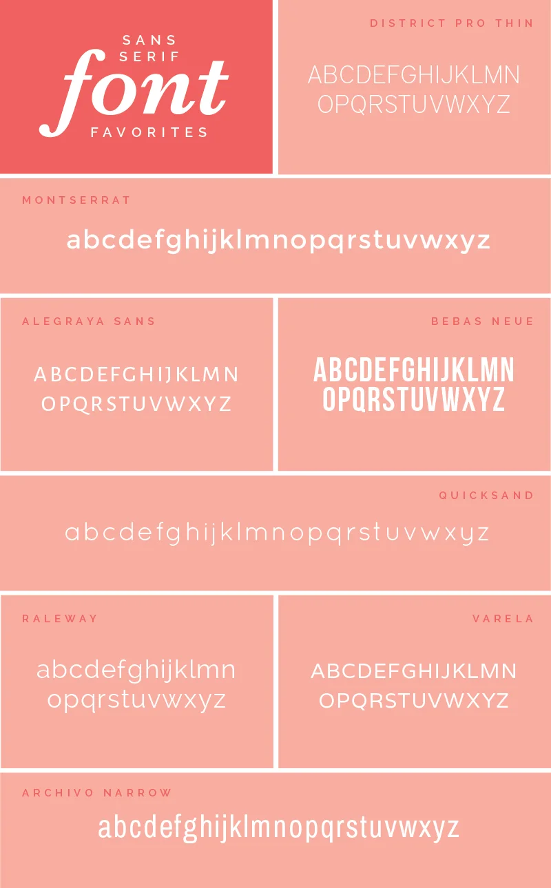
District Pro Thin // Montserrat // Alegraya Sans // Bebas Neue
Quicksand // Raleway // Varela // Archivo Narrow
Fun font - my term for a font that doesn't fit into either of the above categories

Bellota // Kailey // Naive Inline // Fertigo Pro
Sansita One // Mr. Moustache // Sail
My favorite fonts are fairly simple and easy to read. My personal style doesn't get too crazy with fonts; I often choose to keep them clean and instead add interest to my designs through color, illustration and composition. When it comes to fonts, I hold to the rule that less is more.
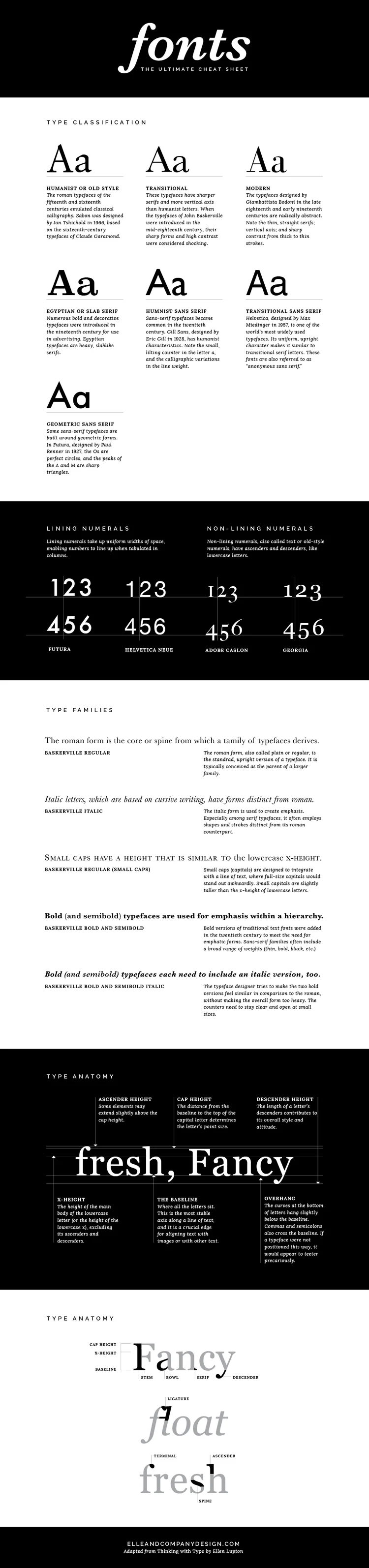

There are a couple designer secrets that aren’t often shared when it comes to choosing brand fonts.
The first: Steer clear of using your logo font throughout the rest of your brand (unless it’s a secondary font that you’ve used for your tagline). This makes the logo distinct and keeps it from getting lost among other text on your website and collateral items.
The second: Give each brand font a “job.” Choose one font for your headers, one font for your body text, and maybe one other accent font (maybe). This streamlines your brand by creating consistency.
But even after learning these secrets, you might still have some questions about brand fonts.
How do you go about finding, choosing and pairing fonts that will accurately represent your business and appeal to the right customers?
I’ve got you covered.