
As a designer, it’s easy (and very tempting) to make updates to my brand and website regularly. And when I first started, that’s exactly what I did. But over time I began to see how important consistency can be within a brand, even within the smallest details.
Until this past Sunday evening, the Elle & Company site hadn’t seen any significant updates in well over a year. I had been making a long list of updates and additions with the intention to make the changes in one fell swoop.
I jumped at the opportunity of using my off-week in between clients to to make the changes, and with all of the exciting things in store for Elle & Company this summer, the timing couldn’t have been more perfect.
You might be considering making some changes to your site, too, so today I’m taking you behind the scenes to explain the intention behind every update. My hope is that you’ll walk away from this post with several new ideas and strategies to make a great first impression with your visitors when they land on your site.

We created a homepage
Since Elle & Company launched in January 2014, the blog served as the landing page. And because the blog was the showcase and main focus of the website at that time, it made sense.
But over time we’ve added more services and features to this site in order for it to be a resource to our audience.
As our site traffic increased, we feared that new visitors to our site wouldn’t have a clear idea of Elle & Company’s purpose and all that we have to offer by landing on the blog page first.
So we decided to create a homepage to highlight the larger features of our business and improve our user experience.
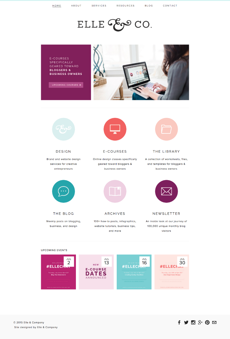
The carousel at the top calls attention first and foremost to the about page, where visitors can gain a clear understanding of the Elle & Company mission and learn a little bit about us in the process.
We also used it to highlight our e-courses and our weekly newsletter. The style of the images allowed me to incorporate both photos and color onto the page, and I carried it through to the other interior pages, as well.
The buttons below are a fun way to call attention to our services and offerings, and they’re personally one of my favorite additions to the site.
They reflect the Elle & Company brand through bright colors and simple illustrations, and I would like to think that they make the user experience a little more interactive. They also call attention to important pages within the site.
And toward the bottom of the homepage, I added a new scrolling feature for upcoming events. With our weekly Twitter chats and upcoming launch dates for design services, consultations, and e-courses, I thought it would be helpful to have a space on the website for our audience to keep up with the latest happenings.
There’s also a feature within each individual event that allows users to easily add it to their Google Calendar (thanks, Squarespace!).
We shared more insights on the effects that a homepage might have on our analytics and our goal toward 100,000 unique monthly blog visitors. If you aren’t a subscriber, fill out the form on our newsletter page and the latest email will be sent to you right away!
We updated existing pages
We saw last week as a great opportunity to update our existing pages, too.
About page
Many bloggers have posts out there with tips and wisdom for writing a “killer” or “attention-grabbing” about page, but I choose to keep it simple and on the shorter side.
The most important takeaways from this page are (1) the mission of Elle & Company and (2) a little bit about Jake and I and how we got here.
While I could have told visitors more about what we like to do in our spare time or my favorite ice cream flavor, they probably don’t have much to do with why visitors are stopping by the site and they could most likely pick up on those details over my social media accounts.
Instead, I want to share information that’s pertinent to my audience and would encourage them to want to work with us or follow along.

My previous about page wasn’t terrible, but there were several details in there that weren’t important. I revisited the wording, added a header for consistency with the other pages on the site, and shared a few photos. I also focused on linking to other pages within my site to create actionable steps and an outcome for users.
Library page
The Elle & Company Library is undergoing a transition, so an update to the Library landing page was also in order.
When we launched the Library almost exactly 1 year ago, our audience was very broad. Because the business appealed to women of all ages, we filled the Library collection with a wide-array of files, from invitations to gift tags and everything in between.
But as Elle & Company grew, our audience became more specific to bloggers and creative entrepreneurs. There’s been a disconnect between what’s been offered in the Library and the needs of our audience, so we’re in the process of aligning the two.

Today marks the first official day of the new direction, and I’ve brought on two other designers to help me: Jillian of Hazel Berry Design and Jamie of Spruce Rd.
I’ve followed along with these talented ladies and admired their work for a while now, so I’m thrilled to have them join me in this venture. Each month they will be partnering with me to fill the Library with files specifically geared toward bloggers and business owners, including business card templates, workbooks, sidebar button templates, and more.
In fact, Jillian helped me create 3 new office art prints that are being added today!
The new Library page is simple and straightforward, with a colorful header, information about the Library, a button to subscribe, and designer profiles. There’s also a slideshow to display the latest additions.
Design services page
While one of the biggest goals in the design of the Elle & Company site is easy and intuitive navigation, I also want it to be interactive and engaging.
Jake had the idea of displaying an infographic on our design services page last year and it was a hit, so I took a new spin on the infographic with these new site updates (and created continuity by mimicking those colorful icons from the homepage).
I also added an opt-in form at the bottom of the design services page for those who are interested in my 2016 package instead of directing them to my contact page.
It’s one less step for my visitors to take and it creates a new list for me within MailChimp so that I can send updates and news with prospective clients.
We added new service and product-specific pages
This was a big one.
We have a lot of exciting things happening around here, from sharing our big goals with our audience in the newsletter to launching new e-courses (and we also have something pretty big launching in August), so we wanted to highlight each within it’s own page on the site.
Newsletter page
This was long overdue. While we’ve highlighted the purpose of the newsletter in detail within blog posts and briefly in our blog sidebar, there’s been no “home base” for information about the newsletter and an opt-in.
I was also excited to share some testimonials from some faithful newsletter subscribers. It’s short, simple, and to the point (with a pop of color in the new header, of course).

E-Course pages
We discreetly added a new e-course into the mix with these new updates, and we thought it would be more intuitive to have an e-course landing page with links to the 2 different course offerings.
Each individual e-course page has information, a colorful header with a photo, and an opt-in form at the bottom for those who want to stay up-to-date with course dates and pricing.
For those who are interested in learning more about the new Design Your Brand e-course, we’ll be sharing a post on the blog with more details in the coming weeks. Stay tuned!
Consultation page
We also snuck in a consultation page with the new updates.
This is an exciting new venture for both Jake and I, because he’ll be partnering with me for brand strategy consultations. I’ll also be offering design and brand consultations, and we plan to share more details (along with details about the new 2016 design package) within the coming month.
Until then, we’ve posted a little announcement with an opt-in form for those who are interested in dates and pricing.
All of these opt-ins not only help to gauge interest and build a mailing list of potential clients, but they also create an actionable step for visitors. We don’t want any “dead-ends” on our site; we want to guide visitors around by linking to other interior pages or encouraging an outcome.
We updated the blog sidebar
Because a lot of our traffic comes from sites like Pinterest, linking directly to blog posts, we wanted a brief summary of Elle & Company’s mission to be near the top of the page.
While we could’ve achieved that through a tagline, there’s just something about the plain, no-frill Elle & Company logo that I personally love. So instead, I created a new graphic that links to our about page, includes a photo, adds a pop of color, and succinctly sums up our business.

Color-bar category buttons are also becoming popular among other blogs, so in an effort to be a little more original and create consistency throughout the site, we added some fun new category buttons to the sidebar.
Our old category buttons used to point visitors back to a sorted display of our blog posts, but we took it one step further by creating an archive for each category. This allows visitors to see a larger selection of posts at a glance and makes it easy to find a specific article.
We also added a section for upcoming events within the sidebar to highlight the Elle & Company Twitter chat, new launch dates, etc. Our hope is that by making these events more prominent and visible, more of our audience will add the events to their calendar and join in.
Tangible Takeaways for Your Site
So to review, here are 4 major items that I highlighted in today's post that might be beneficial for the design of your website:
- Exercise intention over every decision on your website. Instead of making sporadic changes and updates, begin creating a list of changes you would like to make and think through each one before taking action.
- Get rid of dead-ends. Think through the action that you want each visitor to take on every page on your website.
- Instead of following trends or mimicking other sites, get creative. Find ways to infuse your brand into the details of your site and make it more engaging for your audience.
- Create consistency among all the pages of your site by developing styles for your headers, photos, and graphics.
We would love your feedback on these new changes!
What do you think about these new Elle & Company updates? What is your favorite new feature? What are some strategies and ideas that you've found helpful in the design of your blog and website?


