Color is one of the most noticeable, tangible components of a brand.
It plays a large role in how a brand is perceived, it helps with recognizability and memorability, and it has the potential to attract the right kind of customers, clients and blog readers.
But coming up with a color palette is often a challenge for many creative entrepreneurs when they’re developing their brand. They don’t know which colors to choose, how many colors they need to include, how to use the colors together, and how to make their color palette distinct from others in their industry.
Do these struggles sound familiar? If so, I have some great news for you.
Coming up with a distinct color palette doesn’t require any special skills.
All you need is a basic understanding of color psychology, a little creativity, and these 4 steps!
The Psychology of Color
Color is a powerful communication tool and is often used by designers to encourage action, influence mood, and tap into emotions.
It’s a tool that gets your audience to see what you want them to see, feel what you want them to feel, and do what you want them to do.
In fact, research has confirmed that 60% of people will decide whether or not they’re attracted to a message based on color alone. How you use color also affects the visibility of your brand and reinforces brand recognition by up to 80%.
If you want to create a color palette that attracts your ideal audience and accurately represents your brand, you have to have a basic understanding of color psychology.
So before you dive into the steps below, take a look at these common color associations. (You’re probably already subconsciously aware of many of these!)
Common color associations
Yellow is a go-to color for positivity, happiness, and warmth. This color is attention-grabbing (which explains why taxis are yellow) and it can also represent caution (think yield-signs and traffic lights). Men usually perceive yellow as a very lighthearted and childish color, so you don’t see it very often in expensive product advertising for car manufacturers or men’s clothing stores. Yellow is also viewed as being spontaneous and unstable.
Some common associations with yellow include caution, cheerfulness, cowardice, curiosity, happiness, joy, playfulness, positivity, sunshine, and warmth.

Blue is perceived as trustworthy, loyal, dependable, and serene. It’s a popular color with financial institutions (IBM, Citibank, Bank of America, Chase) and social media sites (Facebook, Twitter, LinkedIn) due to its message of stability and trust. Blue is also a popular color for promoting products related to cleanliness (water purification filters, detergents), air and sky (airlines, air conditioners), and water and sea (cruise lines, bottled water). This color is usually avoided in restaurant logos and food packaging because it’s said to suppress appetite. Studies have also shown that blue is the preferred color of men.
Some common associations with blue include authority, calmness, confidence, dignity, loyalty, success, security, serenity, and trustworthiness.

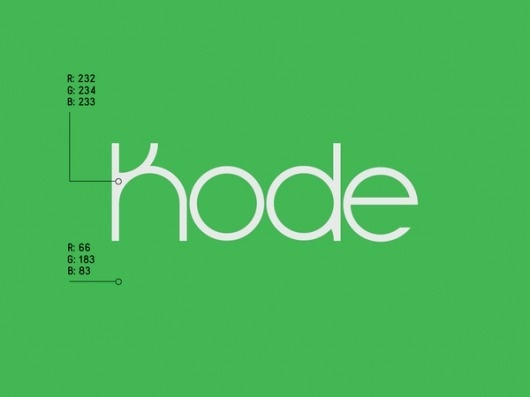
Green is the color of nature. It symbolizes growth, freshness, serenity, and healing. It also has a strong emotional correspondence to safety and balance. Darker greens are closely related to money, banking, and wealth, while lighter greens have a calming effect.
Some common associations with green include freshness, harmony, health, eco-friendliness, healing, inexperience, money, and nature.


Purple is closely associated with royalty, nobility, luxury, and extravagance. It’s a very rare color in nature, and many relate it to creativity and mystery. It is also said to stir up feelings of nostalgia.
Some common associations with purple include fantasy, mystery, nobility, royalty, and sophistication.


Red is the color of fire and blood, so it’s often associated with energy, war, danger, and power but also passion, desire, and love. It’s an emotionally intense color, has very high visibility, and is often used to grab viewers’ attention (think red tag clearance sales and “buy now” buttons). Red has also been known to raise people’s blood pressure and stimulate appetite, so it’s frequently used by food industry brands like Nabisco, Kellogg’s, Frito Lay, Heinz, McDonald’s, and Chick-fil-A.
Some common associations with red include action, adventure, aggression, blood, danger, drive, energy, excitement, love, passion, and vigor.


Orange is less intense than red but still packs a lot of punch; it’s energetic and warm. Like yellow, orange is also associated with joy, sunshine, and playfulness. You often find it used in logos to stimulate emotions or even appetites.
Some common associations with orange include creativity, enthusiasm, lightheartedness, affordability, and youth.


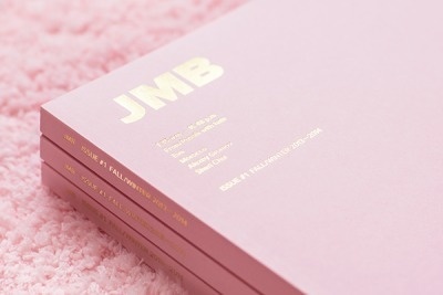
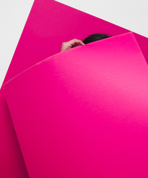
Pink is a feminine color that conjures feelings of innocence and delicateness. However, bright and vibrant shades of pink often evoke a bold and modern appeal. Overall, pink is known for its friendly and light-hearted.
Common associations with pink include gratitude, romance, gentleness, innocence, softness, and appreciation.


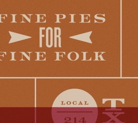
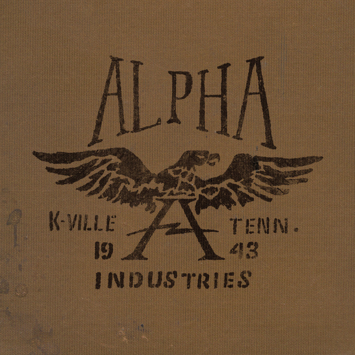
Brown indicates nature and utility and is often used in logos related to construction and law due to its simplicity, warmth, and neutrality.
Common associations with brown include depth, earthiness, roughness, richness, simplicity, seriousness, subtlety, and utility.


Black represents power, elegance, and authority. It’s often associated with intelligence, but it’s also associated with evil and grieving. It’s a serious color that evokes strong emotions.
Common associations with black include authority, class, distinction, formality, mystery, secrecy, seriousness, elegance, and tradition.


Tones, Tints, and Shades
Tones, tints, and shades also have an effect on how we perceive color.
Tones are created by adding black and white to pure colors. You often hear people saying that a color needs to be “toned down,” meaning it’s too intense and they want to drop the level of intensity. Adding different amounts of black and white to a color subdues the intensity.
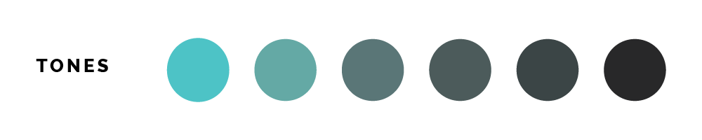
Tints of color are created by mixing a pure color with white. They convey a lighter, more peaceful, and less energetic feel and are also considered more feminine.

Shades of color are created by mixing a pure color with black. They communicate a more mysterious, dark feel, and they’re often considered more masculine.

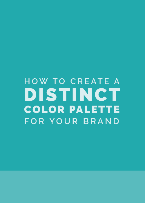
How to Create a Distinct Color Palette for Your Brand
It’s one thing to learn about color psychology, but it’s another to put everything you’ve learned into practice and figure out where to start when you’re choosing a color palette for your brand.
That’s where these 4 helpful steps come in.
Step 1 | Gather color inspiration
After reading over those color associations above, you might have an idea of at least 1 or 2 colors that would be fitting for your brand.
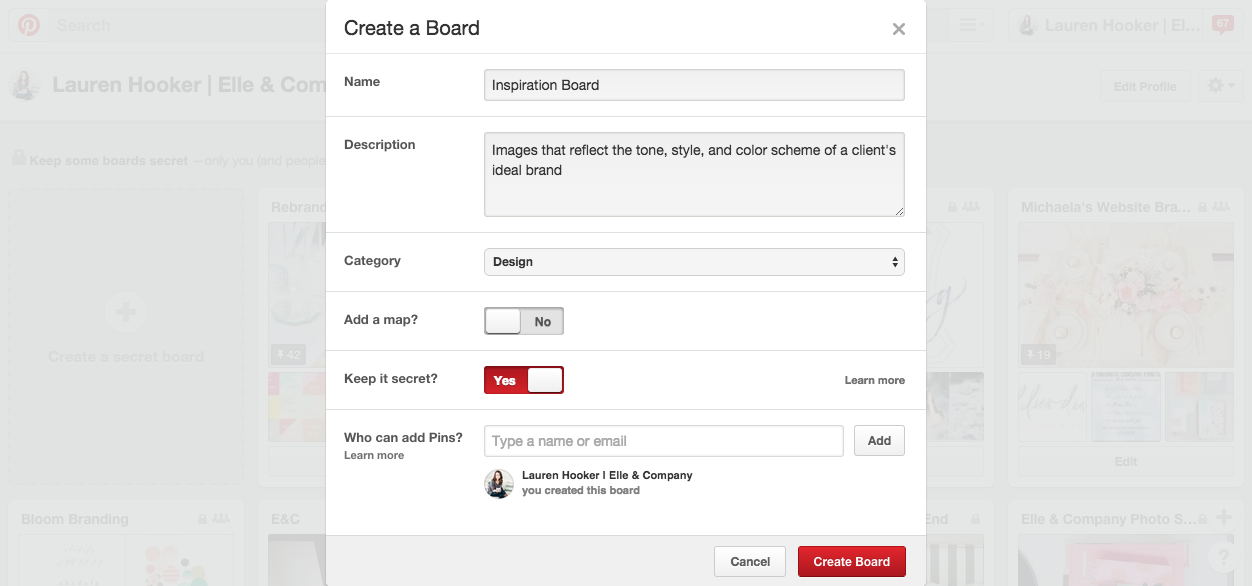
With those colors in mind, create a secret board on Pinterest and look for images that incorporate them. Pin images to the board that represent the same look and feel you want your brand to evoke.
You’ll more than likely see a trend in the colors you gravitate toward. As you continue to fill up your board with inspirational images, look for color similarities.

The Pinterest board above was created by one of my clients, Emily Gerald. Emily is a baby, bumps, and births photographer, and she wanted a gender-neutral, storybook themed brand that would appeal to expectant mothers.
Shades of gray, white, and gold are consistently seen throughout her Pinterest board, and they were all very appropriate for her ideal clients and the overall aesthetic of her brand.
If you’re having trouble coming up with your initial colors, you can also take a look at Designspiration.net and Adobe Color CC.
Designspiration.net is a great site for both color and design inspiration. You can search for designs that include certain colors by clicking “color” at the top of their website. Beware though, it’s easy to get sucked in and lose track of time on there!
Adobe Color CC is another helpful resource that allows you to look through different color rules, create/save color palettes, and glance through preexisting color palettes for inspiration. I always like looking through the Most Popular and Most Used categories under the Explore tab.
Once you’ve gathered inspiration, pull 6 colors for your color palette.
You can do this through Adobe Color CC, but I love creating color palettes in Adobe Illustrator. The eyedropper tool is especially useful for pulling colors from inspiration photos!


Keep in mind that the colors you choose during this step are simply a starting place. You’ll continue to revise and refine your color palette as you go.
Step 2 | Determine the color combination you’re starting with
The color wheel plays a big role in how you develop a color palette for your brand. There are 3 different color combinations that can be formed by those 6 colors you’re starting with.
Monochromatic color palettes include many tints and shades of a single color. They are soft and subtle, but they can often make brands appear washed out because they lack contrast.
If your 6 colors are all tints and shades of one color, you may consider switching it up by adding in other colors from the color wheel.


For example, this brand for Canary Grey is very muted and monochromatic, using white, black, and gray. It’s using shades of 1 color, black, which makes it subtle and understated.
If that’s the look you’re going for, you might consider using a monochromatic color palette, too. However, be cautious and use an array of light and dark tones to create contrast if you go in this direction.
Analogous color palettes involve colors that sit next to each other on the color wheel. They’re related - a family of colors - and they create a pleasing, relaxed palette. Analogous color palettes usually include all cool colors or all warm colors.


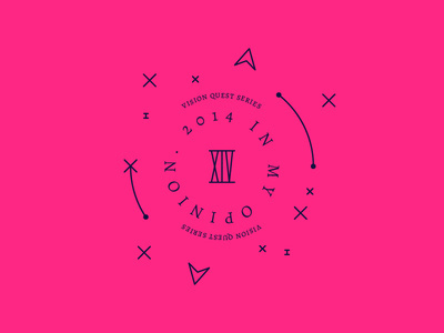
For example, this brand primarily uses analogous colors: orange, pink, and purple. They’re all warm colors from the same side of the color wheel. However, this analogous palette is a little less relaxed than most because of the pop of contrast added by their use of black.
Depending on the look and feel you’re trying to achieve with your brand, you might choose to add a complementary color if your 6 colors are analogous, just to help your brand stand out and become more distinct.
Complementary colors are opposite each other on the color wheel, so complementary palettes often include both warm and cool colors.
I usually strive to create complementary color palettes when I’m designing a brand. Not only does this type of color combination create more dimension, but it also creates balance.


For example, the colors of this brand by MaeMae & Co. include both cool colors (shades of green and mint) with warm colors (shades of peach, orange, and pink). These complementary colors create dimension and interest because they’re opposite each other on the color wheel; the hues one color family has, the other lacks and vice versa. They create a nice balance.
Consider which color combination you’re currently starting with. Is it monochromatic, analogous, or complementary? Does that work for the overall direction of your brand? If not, make adjustments as needed.
If your 6 colors are monochromatic, consider adding colors that are next to your main color on the color wheel to transform it into a relaxed, understated analogous palette or add colors that are opposite your main color on the color wheel to transform it into a balanced, vibrant monochromatic palette.
If your 6 colors are all warm, analogous colors but you’re hoping for a creative palette with dimension, add a cool color from the other side of the color wheel. And vice versa.
And if your 6 colors are complementary but you’re going for a less-vibrant, understated, and refined brand, you might consider taking out some colors from one side of the color wheel so that they’re all warm or all cool colors.
Step 3 | Include both light and dark tones
One of the largest mistakes I see among inexperienced brand designers is the use of a color palette that lacks contrast.
A strong palette includes a balanced mix of light, medium, and dark tones, regardless of whether it uses a monochromatic, analogous, or complementary color scheme.

Take a look at your 6 colors. Do you have at least one dark neutral in the mix? If not, add black to one of the colors to create a darker shade or replace one of your existing colors with a darker color.
Do you have at least one light color in the mix? If not, add white to one of the colors to add a lighter shade or replace one of your existing colors with a lighter color.
Make adjustments to your palette to ensure that the colors you’re using include an array of light and dark tones to not only add contrast, but to give you more versatility when you implement your brand into your collateral items and website.
Step 4 | Choose dominant and accent colors
Now that you’ve settled on a color combination and a good mix of light and dark tones, it’s time to decide on 1-3 dominant colors and 3-5 secondary colors.

You usually won’t use every color in your palette for each collateral item, logo variation, or page of your website, so determine which colors will be used most often and which will be used as accents.
Do you have to use 6 colors? Of course not - you’re free to add more or less colors depending on the aesthetic you’re trying achieve. However, knowing the fundamentals of contrast, color combinations, and dominant and accent colors will be helpful in being intentional about your brand and creating a streamlined, versatile color palette.