Design

3 Reasons Why Eye-Catching Blog Images Matter (And My Secrets for Creating Them!)

3 Reasons Why Eye-Catching Blog Images Matter (And My Secrets for Creating Them!)

Creating one-of-a-kind blog images. It's a topic that I'm most frequently asked about and it's an area that many bloggers struggle with. So today I'm approaching the subject with a few reasons why well-designed blog images are important. And I'm not stopping there - I'm also sharing a few of my own secrets for creating attractive blog images, too. 

Top 10 Design Mistakes to Avoid

You've probably heard the popular quote "creativity is allowing yourself to make mistakes." Or perhaps you've heard "mistakes are proof that you are trying" or "every mistake can create a beautiful solution." While there is an element of truth in each of those sayings, it's wise to be well-informed and intentional about design if you're a blogger or a business owner. Visual mistakes have the potential to make you appear unprofessional and untrustworthy to your audience. 

Today I rounded up my top 10 design mistakes that everyone should be aware of. While some of these rules have been broken and the result wasn't terrible, it's best to be educated on why these mistakes are bad and make them on purpose instead of by accident. 

Top 10 Design Mistakes to Avoid | Elle & Company

My Branding Field Guide

Brandingfieldguide

Create a streamlined visual brand with my free Branding Field Guide!

Powered by ConvertKit

1 | Comic Sans

This is the number one no-no among graphic designers. Comic Sans is never ever ever a good idea. Why? Read this entertaining article.

2 | Too many typefaces

Using too many typefaces in a logo, website, etc. can make a design appear busy, non-cohesive,  and unprofessional. Play it safe and stick to the KISS principle on this one; settle on 2-3.

3 | Lack of hierarchy

Hierarchy determines which items you see first in an image. Designers pay attention to hierarchy and use it to their advantage by varying the size of their fonts (titles and headers should always be more prominent than body text), using color wisely (pops of color draw attention to text and images that should stand out), and paying attention to shapes (which give a design movement and lead your eyes around the design). The use of several different fonts, colors, and shapes have the potential to mess with hierarchy, resulting in an image that is visually displeasing and complicated.

4 | No Contrast

Contrast also helps with hierarchy. A lack of contrast can alter legibility and make an image appear washed out and undefined. A mix of both light and dark colors creates balance.

5 | Dizzy color pairings

When objects with similar color values are placed near one another, it can sometimes have a dizzying, vibrating effect. Use contrast and be cautious of color pairings, especially when you are layering colors on top of each other.

6 | Lack of negative space

The negative space around an object is often just as important as the object itself; it provides a cushion and a place for your eye to rest. Avoid cramming objects and text into a design and be aware of the entire composition, not just the main components. Check out these 25 clever and creative uses of negative space!

7 | Centered paragraph text

Large amounts of text should never be center aligned. It alters legibility, making text harder and more frustrating to read. 

8 | Failing to align objects/no grid system

Haphazardly placing objects on a page without rhyme or reason is never a good idea; it has the potential to make a design seem random and unintentional. Use a grid system and align objects to create order. 

9 | Using display fonts as text fonts

Again, this is a legibility issue. Script, hand-drawn type, and other display fonts should be used for headers and small amounts of text. It's always a good idea to use a simple font for large groups of text.

10 | Upside down text

It's simply hard to read. Don't do it. 

My Branding Field Guide

Brandingfieldguide

Create a streamlined visual brand with my free Branding Field Guide!

Powered by ConvertKit

It's your turn! What are some of your biggest design pet peeves?


Back to the Drawing Board (Step 4 of my Creative Process)

Like most occupations, it's helpful to have a process in place as I go about my work. I haven't seen many creatives approach this subject, so I thought it might be helpful to spend the next few weeks sharing my own creative process. While my method may not work for everyone, my hope is that these posts will encourage you to streamline your own process and think through the steps you take as you go about your work.

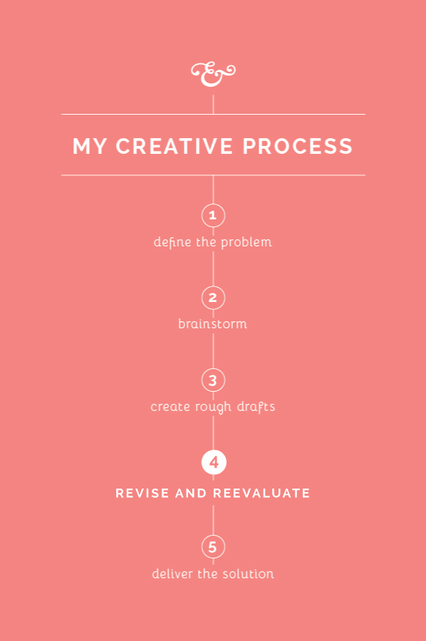
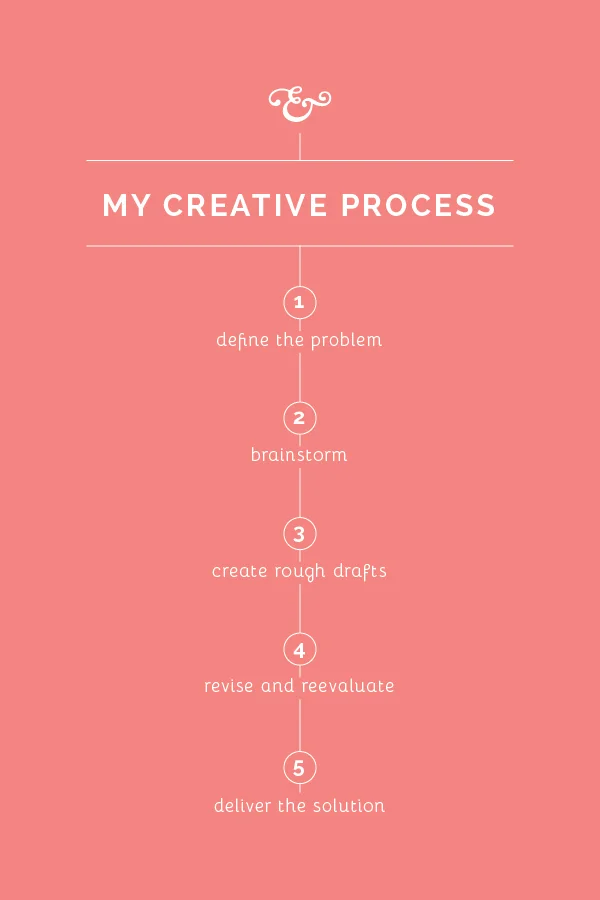
In a perfect world, first drafts would be the only drafts and no revisions would have to be made. But that isn't usually the case in the design world. It isn't always the most fun step, but revising and reevaluating allows me to refine my work, challenges me to become intentional in making design decisions, and results in an even better solution for my client. Here's a look at how Step 4 plays out for me in my creative process.

Self-edit

Before I reveal any work to my clients, I spend some time making revisions to my rough drafts. It's important for me to take a step back and evaluate so that I'm giving my clients the best representation of my work right out of the gate. I check for errors in spacing and composition, I double check colors in my Pantone book, search for any typos, etc. If this step is overlooked and mistakes are seen in the client meeting, it can make you look careless and unprofessional. Self-editing is a strong trait of any good designer.

Separate yourself from the project

In college, I dreaded critiques with a passion. I would walk into the studio after having spent countless hours working on a project, pin my design on the board, and shrink in my chair when my professor and classmates critiqued it to pieces. I can probably attribute my misery to my people-pleasing and perfectionist tendencies, but I think that every person struggles somewhat with taking criticism.

It's easy to get wrapped up in your work and become attached to what you create, especially when you've spent time and energy coming up with a great solution. But I've learned that in order to give your client your best work, you have to emotionally detach yourself and receive feedback and criticism with grace. As much as I hate to admit it, taking the feedback to heart from those class critiques in college always made my work stronger and challenged me to think through my design decisions. 

Clearly communicate with your client

I wrote on this subject a couple weeks ago in Step 1, but it's important throughout the entirety of each project. When I reveal drafts to my clients, I walk them through my thought process and explain why I made each design decision. I've learned that educating my clients is a large part of communicating well. 

Then it's my turn to listen and receive feedback. I take it to heart and ask a lot of questions along the way for clarification, just to make sure we're on the same page. 

Go back to the drawing board

Once I've met with the client and discussed what they like and don't care for about my first drafts, I go back to the drawing board. I make small edits, change one typeface for another, explore other options - whatever needs to be done to meet the needs of my client while staying true to the elements of good design. 


More posts in this series

The Most Difficult and Time-Consuming Step in My Creative Process

Like most occupations, it's helpful to have a process in place as I go about my work. I haven't seen many creatives approach this subject, so I thought it might be helpful to spend the next few weeks sharing my own creative process. While my method may not work for everyone, my hope is that these posts will encourage you to streamline your own process and think through the steps you take as you go about your work.

The most difficult and time-consuming step in my creative process // Elle & Company

The biggest fear of any perfectionist/designer is being unable to come up with a great solution that a client will love, which is why this step of my process always makes me a little nervous. Creating rough drafts is the most difficult and time-consuming part of my creative process, and the final design hinges on what I come up with during this step. That's why I spend so much time in steps 1 and 2, compiling information and preparing for this step in particular. So why does it take so long and how do I go about creating rough drafts? Here's a peak into what this step looks like for me.

Set aside uninterrupted time.  In the 4+ years that I've been designing for clients, I've learned that I can't sit down for 30 minutes and crank out 3 concepts. I've also learned that I don't work well when I divide my time and create rough drafts for the same project on different days. I have to have at least a 2 hour window of time to dig in and get lost in Adobe Illustrator, and for most of my projects, I set aside an entire workday to create my initial concepts. 

Set the mood.  It may sound a little ridiculous, but creativity doesn't come easily to me everywhere. I work best sitting at Starbucks with coffee shop tunes playing in the background and a vanilla latte at the ready (or, if I have to, I recreate that atmosphere at my kitchen table with Spotify and my coffee maker). For some reason that "mood" helps me concentrate and inspires creativity. 

Refer back to steps 1 and 2.  There's a reason behind each design decision I make when I'm creating rough drafts, which is why this step is the most difficult for me. I keep all of my client meeting notes and my inspiration board on hand so that I can refer back to them as I design. I'm careful not to choose a typeface or add an illustration without making sure that it's in line with the scope of the project.

Self-edit.  Before I show any concepts to my clients, I revisit and revise the designs I've created. I try to give myself a day or two away from those rough drafts before I make revisions so that I can see them with a fresh perspective (because after you've been looking at them on your artboard for hours on end, it all begins to run together). I check for oddities in spacing and composition, I clean up illustrations and fonts, and I double-check colors in my Pantone book.


That's step 3 in a nutshell! What does this step look like for you? Do you have to set the right "mood" in order to be the most productive? 

More posts in this series