
There's a lot more intention behind a brand than what meets the eye. While some logos seem simple and straightforward, there's often a hidden meaning behind the color choices, fonts, and composition of the overall design. Sometimes these clever touches go unnoticed, so today I thought it would be fun to call attention to them! Here are 8 popular logos whose hidden meaning you may have never noticed before:
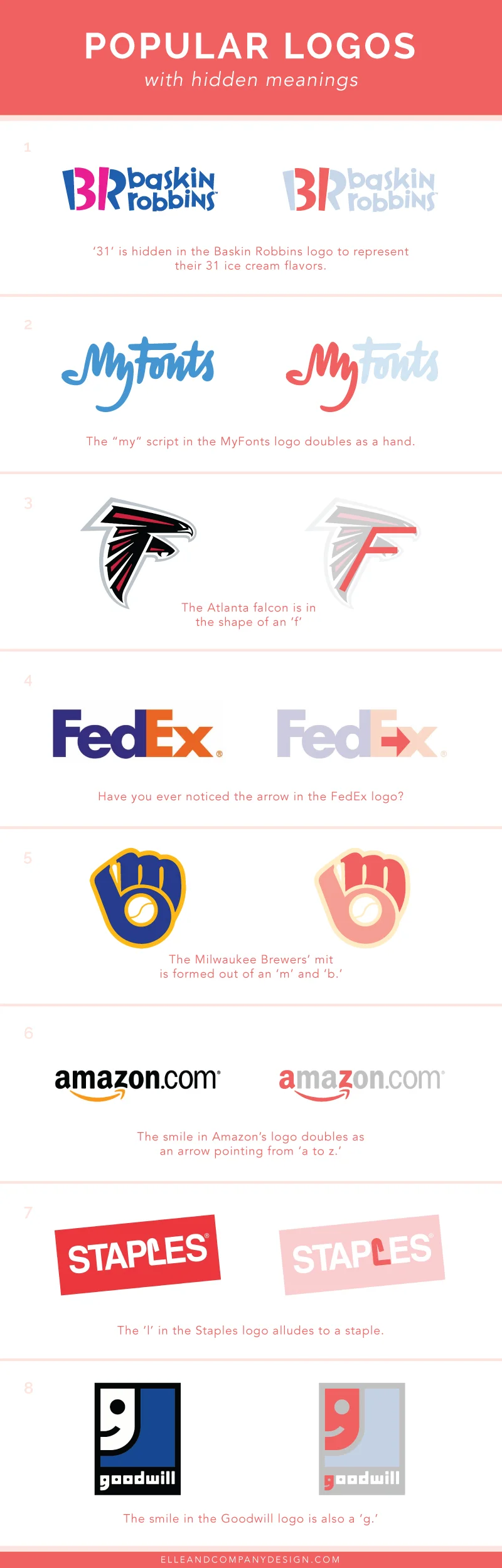
Which ones are you the most surprised by? For all you business owners, does your brand have any hidden meanings or clever, intentional touches?

Instagram is currently the fastest growing social media platform. It started as a simple photo-sharing app among friends, and it has since grown into a community of over 300 million brands and consumers. For business owners and bloggers, it's silly not to be engaging with followers on Instagram through likes, follows and comments; an active audience is right at your fingertips.
Since Instagram is all about visuals, it's important to have a professional, branded feed. We all appreciate those accounts with the seamless, gorgeous images, but we may not know exactly how to get our own feed looking cohesive and one-of-a-kind. Today I'm sharing a few fundamental tips to get you started in the right direction.

Studies show that 90% of all of the information transmitted to the brain is visual. Many of us are visual learners, so it's no wonder that infographics have become increasingly popular among blogs and businesses. They create interest and engagement among an audience. they're more visually attractive than pages of text for sharing information, they're more likely to be shared, and they're also a great way to break up and vary the content on your blog.
Infographics can be used in numerous ways to display information for your blog or business, from showcasing reader survey results to displaying your creative process and everything in between. But the problem for most creative entrepreneurs and bloggers isn't why infographics can be beneficial; it's how. So today I created an infographic about infographics as a little guide for how to go about designing these helpful images on your own.
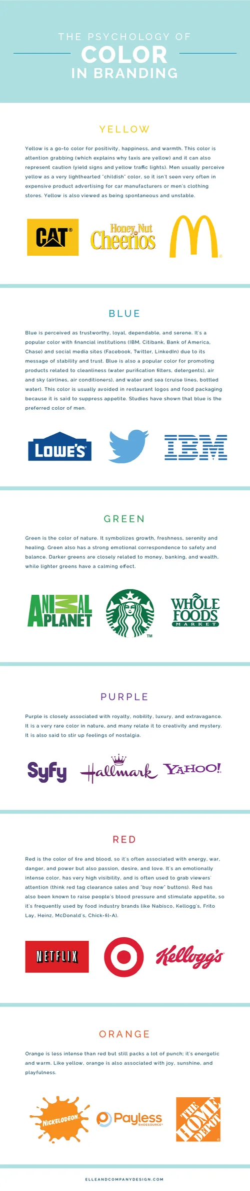
Design is all about first impressions, and one of the most important factors of any design is color. Color choices, pairings, and usage can affect how someone perceives a billboard, a website, or a box of cereal. Whether you realize it or not, colors evoke emotions, feelings, and memories, and designers tap into those emotions as they're choosing colors to appeal to a brand's ideal audience. There is more psychology behind color than you may have imagined, so today I'm sharing some color associations and data that you're already subconsciously aware of but may not have picked up on before.
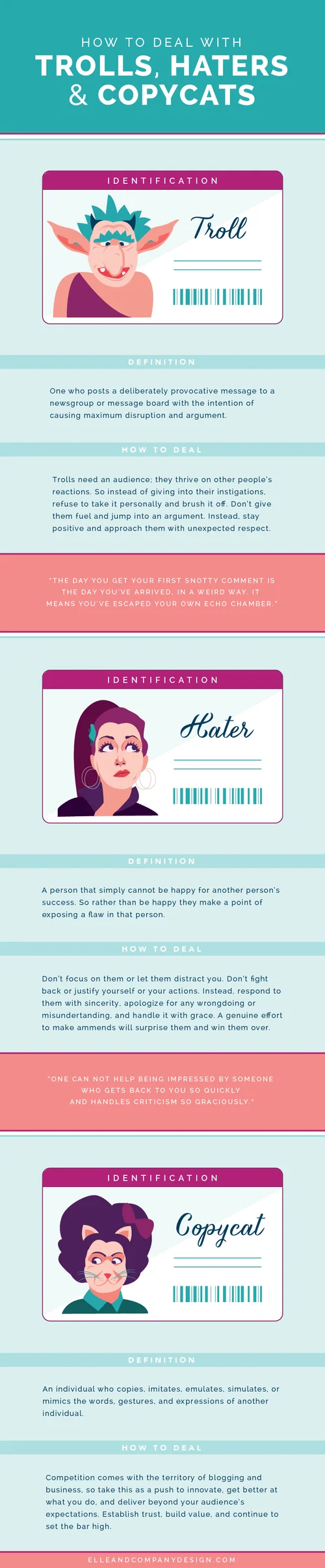
If you're a successful blogger or business owner, you're bound to come across negative Nancies. Their hateful feedback and hurtful comments probably stem from jealousy and insecurity, but often times it's hard not to their words personally. So how do you respond to these trolls, haters, and copycats? Today's infographic should help.

Have you ever wondered why some social media posts get more engagement than others? Studies show that certain days and times of the week affect the number of people who like, share, favorite, and retweet your posts. Most of you are fully aware that 3:00am on a Wednesday morning isn't the most optimal time to post an image on Instagram and expect engagement, but it's helpful to know specific days and times that your audience is most active. Today we've rounded up the data to help you gain more engagement with your followers over social media.
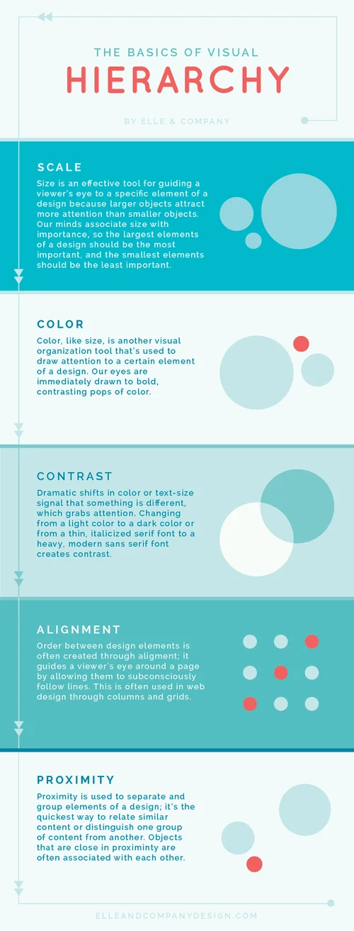
Design is all about communication. While every graphic designer strives to make their work visually pleasing, creating pretty things shouldn't be the only goal. Even more important is effectively communicating the right message to a viewer, and as designers we have several tricks up our sleeve to do just that.
One of those 'tricks' is hierarchy. This tool helps us call attention to the things we want you to look at first and bring less attention to the things we want you to look at last. You may not realize it, but each time you look at a website or a menu, your brain ranks the elements of the page in order of importance based on visual cues. Those rankings guide your eye around a page.
There are a 5 basic design principles that we use to help us achieve proper hierarchy: scale, color, contrast, alignment, and proximity.

As a designer, I'm frequently asked which fonts I use and prefer. So today I'm rounding up some of my favorite serif, sans-serif, and fun fonts along with links so that you can download and make use of them, too!
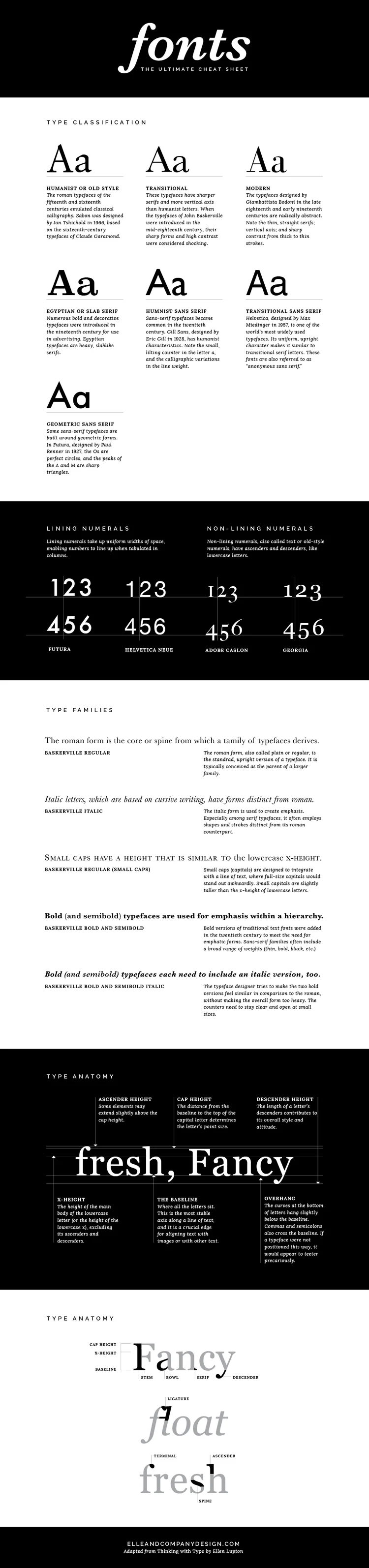
Fonts are everywhere. You see them hundreds of times each day, whether they're on the label of your shampoo bottle, the date on your lock screen, or the road signs you pass on your drive to work. And whether you realize it or not, fonts are just as important to design as colors and composition. There are reasons why some fonts pair well together and others don't; why some fonts seem trustworthy and classic and others feel sleek and modern; why certain fonts are easier to read or why some catch your attention before others.
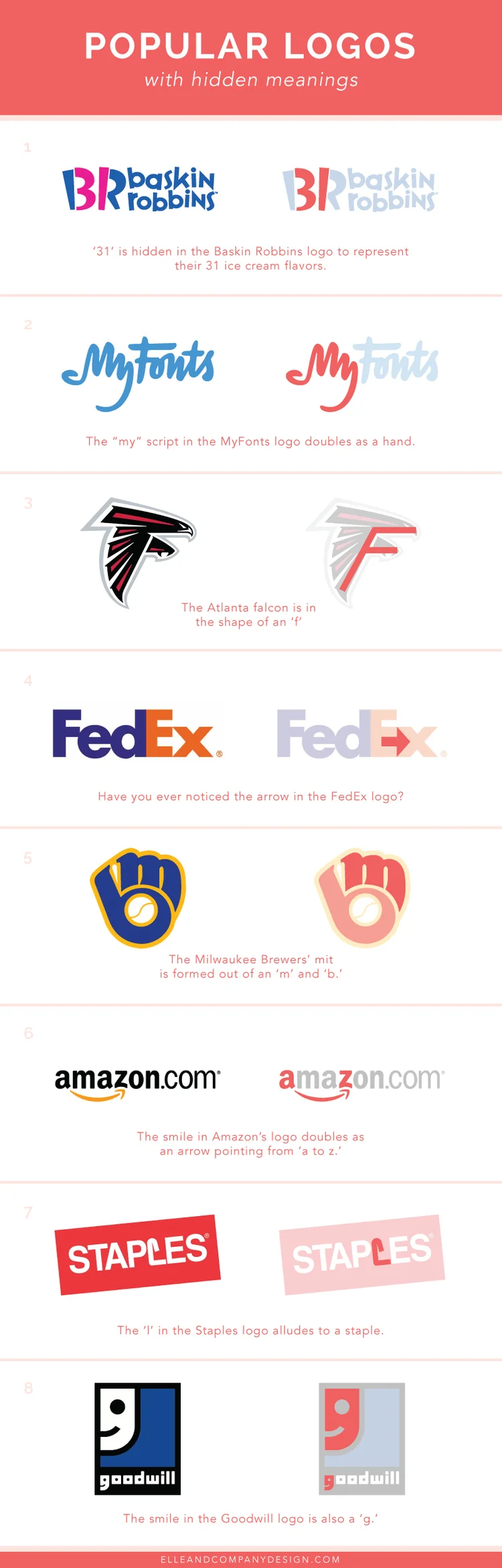
There's a lot more intention behind a brand than what meets the eye. While some logos seem simple and straightforward, there's often a hidden meaning behind the color choices, fonts, and composition of the overall design. Sometimes these clever touches go unnoticed, so today I thought it would be fun to call attention to them! Here are 8 popular logos whose hidden meaning you may have never noticed before:

You know those inconvenient tasks that always seem to creep up on you?
Maybe it’s an email reply you always find yourself sending or a URL you often visit but can never remember.
In instances like these, it’s beneficial to keep that information in a helpful place, create a template or bookmark it so you can easily refer back to it later and save yourself a headache.
That’s why I wrote this blog post.
It seems I’m constantly trying to track down image sizes for social media, both for Elle & Company graphics and client design projects.
And surely you’ve found yourself hunting down image sizes for your social media accounts, too.
So I decided to make it easier on all of us by rounding up ideal image sizes for blog posts and social media and creating an infographic.
Feel free to bookmark this post or pin it to Pinterest for future reference!